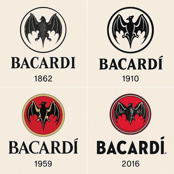
The Bacardi Logo: How a Bat Became a Rum Brand
Bacardi’s bat goes back to 1862, when Don Facundo Bacardí Massó found a colony of fruit bats roosting in the rafters of his Cuban distillery and decided they were a good omen. More than 160 years later, the same animal still sits above the name on every bottle.









Social media and apps
Iconic Logos
The Spotify Logo: History, Color and Design Lessons
Spotify picked green partly because nobody else in music had claimed it. Apple and Napster had blue and red, and a Swedish startup that wanted to look different from both went for a bright, slightly acid green that it still uses today.
· 9 min read
Iconic Logos
The Pinterest Logo: History, Color and Design
Pinterest’s logo is one letter, a curved red “P” whose tail doubles as the point of a pin. It has stayed largely untouched since 2011, through a decade in which almost every other social app redrew its icon at least once.
· 10 min read
Iconic Logos
The Snapchat Logo: History and Design of the Ghost
The Snapchat ghost has a name, Ghostface Chillah, borrowed from Wu-Tang Clan’s Ghostface Killah, and it was drawn by Evan Spiegel himself in 2011. It is one of the few big tech logos with no letters at all, just a white ghost on a yellow square.
· 9 min read
Iconic Logos
The TikTok Logo: History, Colors and Design
The TikTok logo is a single music note, and it looks like it is vibrating even when it sits still on your home screen. That effect comes from two offset colors, cyan and magenta, printed slightly out of register against black, and it has made one of the plainest symbols in music into one of the most recognizable app icons of the past decade.
· 10 min read
Iconic Logos
The Facebook Logo: History, Design and the Blue “f”
Facebook is blue because Mark Zuckerberg is red-green colorblind, and blue is the color he sees best. It is one of the few logo decisions in tech history that was made for the founder’s eyes rather than the customer’s, and it stuck.
· 8 min read
Iconic Logos
The Instagram Logo, From Polaroid Camera to Gradient
Instagram’s first icon was a little brown Polaroid-style camera with a rainbow stripe, drawn in 2010 when the app was a photo-filter toy. In 2016 the company threw out the camera’s textures and shading and kept only its outline, filled with a magenta-to-orange gradient.
· 9 min read
Iconic Logos
The YouTube Logo, From “Tube” to Play Button
The first YouTube logo was a joke about old televisions: “You” in black, “Tube” in white inside a red, rounded rectangle shaped like a cathode-ray screen. Twelve years later the screen became a play button, and the play button became the logo.
· 4 min read
Iconic Logos
The Twitter Bird Logo: From a $15 Stock Image to an Icon
Twitter’s first bird cost about $15. It was a stock illustration by the designer Simon Oxley, bought from iStock, and within a few years it had been redrawn into one of the most recognized symbols on the internet.
· 7 min read