The eBay Logo: How Four Colors Built a Marketplace
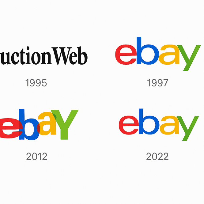
eBay’s first logo looked like a programmer made it, because one did. When Pierre Omidyar launched AuctionWeb in the mid-1990s, branding was not on his list, and the site’s mark was a plain black-and-white affair. The logo that replaced it is one of the most recognizable on the web: four lowercase letters in four colors, jostling each other like items on a crowded market stall. It has been tidied twice since, and it is still unmistakably eBay.
From AuctionWeb to Four Colors
By 1997 eBay had become a place to buy and sell almost anything, from Beanie Babies to rare coins, and it needed an identity with some personality. The answer was the multicolored logo: a red e, a blue b, a yellow a and a green y. It was a playful way of showing the variety of things, and people, on the site.
The letters overlapped and bounced slightly out of line, which made the whole thing look a little chaotic, in a good way. It said that eBay was for everyone, from odd collectors to sharp professional sellers. That early logo captured the company’s character remarkably well: open, eclectic and not at all stuffy.
Why the Colors Work
Each color brings its own associations: red for energy, blue for trust, yellow for optimism and green for growth. Put together, primary colors like these feel approachable and lively. The effect is something like a fairground, welcoming and a little noisy.
Google uses a similar set of primaries for a similar reason, to look accessible rather than corporate. The general lesson is that colors can be combined to say two things at once. A dependable blue next to a lively red tells people a brand is trustworthy without being dull, which is exactly the tone a marketplace full of strangers needs.
Lettering
Type has always been the whole logo. The 1997 design used quirky, overlapping letters that felt almost handwritten, like a note from a friend. In 2012 eBay switched to a sleeker sans-serif, Univers, to match a company that had grown up. The 2022 redesign went further, refining the alignment and reducing the overlap for a cleaner, more modern look.
The move to Univers was a sensible piece of growing up, closer to swapping a chunky sweater for a tailored jacket than to changing personality. The colors and the lowercase letters kept the friendliness. The new type added polish. Getting that balance between playfulness and professionalism right is most of the job in a wordmark like this.
A Logo Without a Picture
Unlike brands with pictorial logos, such as Nike with its swoosh or Apple with its apple, eBay relies on letters alone. The lowercase letters suggest modesty and approachability. In the older versions, the overlap between them suggested connection: buyers meeting sellers, and communities forming around shared enthusiasms. It is a quiet nod to eBay’s role as a kind of digital town square.
The lesson is that you do not need an icon to make an impression. A well-made wordmark can carry just as much meaning, as long as the letters themselves are doing some work.
The 2022 Update
The logo introduced in 2022 is a lesson in modernizing carefully. eBay streamlined the design and kept the color scheme, so it looks current without breaking with the past. It is the same logo after a good night’s sleep. The appeal comes from the simplicity: clean lines, bold colors and enough of the original to feel familiar in 2025.
A logo should change as the brand changes, and it should keep its core while it does. eBay’s core is four colors and four lowercase letters. Everything else has been allowed to move.
A Logo for Each Stage of the Web
eBay’s logo has followed the history of the internet. The 1997 design had all the excitement of the dot-com years. The 2012 and 2022 updates reflected the move to sleek, mobile-friendly design. Each version helped eBay stay relevant as Amazon, Etsy and others competed for attention. Through booms and busts, the bright colors and lowercase letters have kept the identity steady.
Fakes and Unhappy Fans
A global brand attracts copies, and eBay’s logo turns up on counterfeit goods of every sort, from fake Gucci bags to questionable electronics. The redesigns have caused their own arguments. In 2012 some fans mourned the quirky charm of the original, and on X people complained that eBay had swapped its garage-sale feel for a corporate boardroom. The 2022 update met less resistance but still divided purists who missed the overlapping letters of the 1990s.
Change always brings criticism, and standing still is usually worse. The practical answer is to test a redesign properly with real users before committing, so that you know which complaints are about the design and which are just about change.
The Business Side
eBay reported $10.1 billion in revenue in 2023, up 4.1% on the year before, according to Inkbot Design. A friendly, trustworthy look has helped the company keep a loyal base of users even as competitors like Amazon dominate online retail. A logo cannot lift a share price by itself, but recognition builds trust, and trust drives revenue. eBay’s standing is strong enough that Facebook Marketplace has agreed to start including some eBay listings.
For a startup, the lesson is that branding is an investment, even on a small budget. AI logo generators such as Semplr, Looka and Canva can produce professional-looking logos cheaply, which gives small businesses a fair start against bigger rivals. The judgment about what the logo should say still has to come from the founder.
The Same Logo Everywhere
The logo is the base of eBay’s identity and appears on everything from the mobile app to shipping labels. Its four colors and lowercase letters are recognized in New York and in Nairobi, because eBay uses the same logo around the world. Like a handshake, it sets the tone for everything that follows, and doing it the same way every time is what builds trust.
Lessons for Logo Designers
Four lessons come out of eBay’s logo. First, keep it simple. A cluttered logo is like a crowded party where nobody remembers anyone’s name. Second, color matters, and eBay shows you can be bold without being garish. Third, evolve carefully: each redesign has respected the original while moving it forward. Finally, test. Try the logo at different sizes, on different backgrounds and with different people before you commit.
Everyone Welcome
eBay’s logo speaks of inclusion and energy. Lowercase letters feel friendly, and the mix of colors suggests variety. The message is that everyone is welcome, which is exactly right for an open marketplace.
Your logo should speak to what your audience values. A playful brand can borrow eBay’s energy. A more corporate one can tone the color down and still keep the logo memorable. What matters is that the visual language matches the way the brand talks.
On Social Media
The logo does well online. Hashtags like #eBayFinds and #eBayDeals carry it across Instagram and X, where its colors stand out, and it appears constantly in ads, profiles and user posts. Any logo now has to be designed with screens in mind. One that looks good on a billboard but blurs on a phone is already out of date.
Technology and AI
Generators such as Brandmark analyze a brand’s industry, values and style and produce tailored options in minutes. eBay’s logo, with its clean lines and bold colors, would be easy to reinterpret that way. These tools are best thought of as a tireless junior designer: never perfect, but a useful place to start.
Imagine eBay’s team typing “marketplace,” “inclusive” and “playful” into one, with a red, blue, yellow and green palette. The results might look a lot like the 1997 classic, overlapping letters and bright colors, with a gradient or a 3D effect added. It is a fun thought experiment, and it also shows why the human decisions matter. The tool can remix what eBay already is. It cannot decide what eBay should become.
eBay itself is investing in AI, with features such as better search and personalized recommendations that have increased engagement. In 2025 the company announced plans to give sellers more AI tools, according to a press release on its site. A company this comfortable with the technology may well use it for future branding tweaks.
What Sits Behind the Logo
eBay’s logo covers a large business: a marketplace for new and used goods, authentication services for luxury items and a motors division for car buyers. From collectibles to electronics, the range is as varied as the colors in the logo. Its recent push for sustainability, encouraging secondhand buying to cut waste, also fits the inclusive branding. A logo should reflect the whole of a brand, its products and its values, and eBay’s does.
eBay Against Amazon and Etsy
Amazon’s minimalist arrow says efficiency. Etsy’s handmade look says craft. eBay sits between them, accessible and lively, with a playful boldness neither rival has. Looking hard at competitors’ logos is one of the most useful things a designer can do, because the goal is to occupy a space nobody else is using.
How to Make Your Own Logo
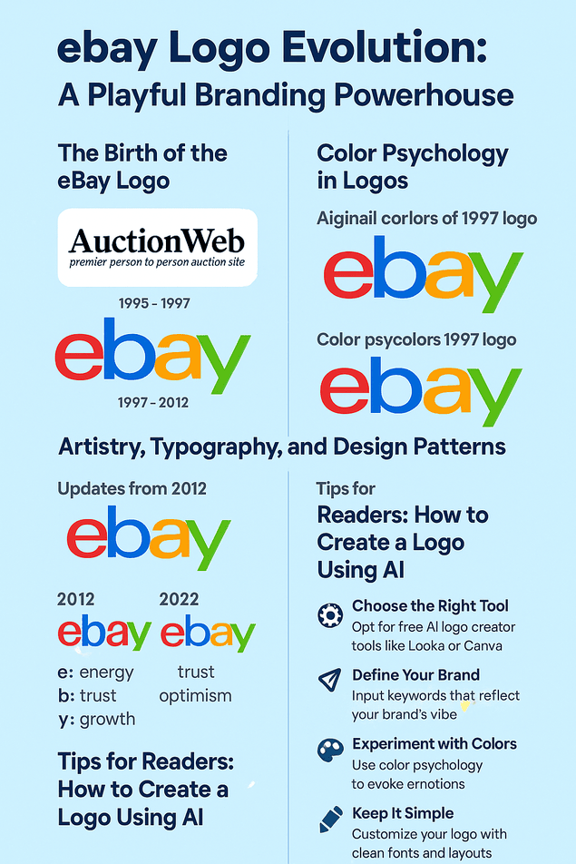
A short process, borrowing from eBay’s example:
- Pick your tool. Free and low-cost options like Looka, Canva and Hatchful are easy to use, though watermark-free downloads usually need a paid plan.
- Define the brand. Write down your industry, values and personality, playful or sleek. eBay’s would be inclusive and lively.
- Use color deliberately: blue for trust, red for excitement.
- Customize. Change fonts, layout and icons until the logo feels like yours and not a template.
- Test it everywhere, on social media, business cards and websites.
Keep it simple, flexible and memorable, and avoid trends that will date the design by 2030. Playful brands such as eBay and LEGO are good ones to study.
What eBay Gets Right
eBay’s logo went from a scrappy startup mark to a global one by holding on to two ideas: four bright colors and modest lowercase letters. The redesigns cleaned up the type and calmed the bounce, and some fans missed the old mess. The core held, and that is why the logo still works.
For a side business or a rebrand, the playbook is short. Choose a palette that says something, let the type carry the personality, and change the details without touching the core.


