Logoluv

Category

Sports Logos

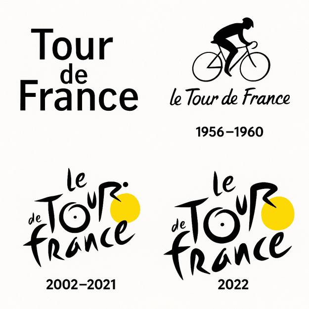
The stories behind sports logos and crests, from Manchester United’s Red Devil to the Olympic rings and the Tour de France cyclist.

Football

Sports Logos

The Real Madrid Logo: Crown, Monogram and Banda

Real Madrid’s crest is essentially a monogram with a crown on top, and the crown was a royal favor: King Alfonso XIII granted the club the title “Real” in 1920. Almost everything else about the badge has been adjusted over the past century, but those two elements have stayed.

· 9 min read

NBA

Sports Logos

The Minnesota Timberwolves Logo, From 1989 to Today

The Minnesota Timberwolves have redesigned their logo three times since joining the NBA in 1989, and every version has been a wolf. The animal stayed; the drawing got simpler, the blues got bolder, and by 2017 the fur and detail of the early years had been cut back to a clean, flat mark.

· 9 min read

Sports Logos

The Golden State Warriors Logo: History and Design

The Golden State Warriors have put a bridge at the center of their logo, which is a neat piece of symbolism for a team that changed its name from one city to a whole state. The mark is now a clean blue-and-gold badge, a long way from the franchise’s Philadelphia beginnings.

· 3 min read

Sports Logos

The Lakers Logo: History of the Purple and Gold

The Lakers are named after Minnesota’s ten thousand lakes, and they have played in Los Angeles, a city not known for its lakes, since 1960. The logo they adopted there, a purple-and-gold basketball with the team name across it, has outlasted the mismatch and become one of the best-known marks in American sport.

· 7 min read

Sporting events

Sports Logos

The Olympic Rings: History and Design of the Olympics Logo

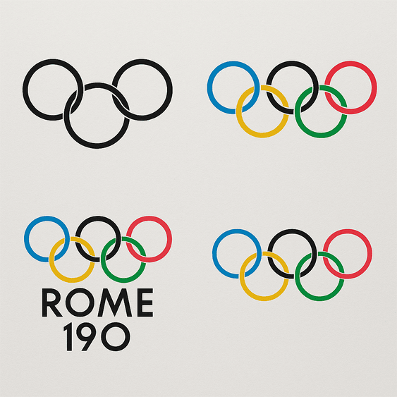
The Olympic rings were drawn in 1913 by Pierre de Coubertin, the French baron who founded the modern Games, and the design has not needed to change since. Five interlocking circles in blue, yellow, black, green and red, on white, stand for the five inhabited continents joined together.

· 11 min read

NHL

Sports Logos

The Winnipeg Jets Logo and Its Air Force Roots

The Winnipeg Jets logo is less a hockey crest than an air force badge. When the NHL returned to Winnipeg in 2011, fifteen years after the original Jets left for Arizona, the new team chose a fighter jet climbing over a red maple leaf inside a circle, a design that borrows openly from the roundel of the Royal Canadian Air Force.

· 3 min read