The FC Barcelona Logo: History of the Blaugrana Crest
FC Barcelona’s crest was not drawn by a designer. It was drawn by one of the club’s own players, Carles Comamala, who won a competition in 1910, and the badge on the shirt today is still recognizably his. Very few club crests in world football have changed so little over so long, and fewer still pack in as much meaning: a saint’s cross, a national flag, the club’s colors and a ball, all inside one shield.
The crest has come through more than a century of politics, controversy, commercial growth and, lately, the arrival of AI design tools. It is worth understanding why it has needed so little help.
How the Crest Was Made
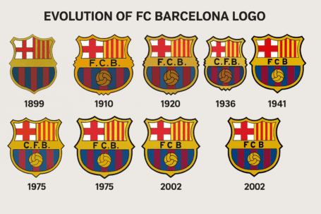
A group of football enthusiasts led by the Swiss founder Joan Gamper set up FC Barcelona in 1899. The crest came eleven years later, through the 1910 competition that Comamala won. His design was a shield divided into parts. At the top it combined the red and white cross of St. George, Catalonia’s patron saint, with the Senyera, the Catalan flag. Across the middle went the club’s initials, and below sat a football over the blaugrana stripes. Since then the badge has been adjusted, but the basic layout has stayed the same.
The crest was a statement of Catalan identity from a region that is fiercely proud of it. Like a Gaudí mosaic, it is bold, detailed and could only have come from Barcelona. That local root is the main reason it still feels genuine more than a century later. A logo built on something real has a story to tell, and a logo built on a list of adjectives does not.
Blue and Red
The blaugrana colors are the heart of the crest. Blue tends to suggest trust and loyalty, which fits a club that is a way of life for many of its fans. Red, or more precisely the deep garnet the club calls grana, suggests passion and energy. Together they are recognizable everywhere, from the streets of Barcelona to the markets of Mumbai.
The colors tell a story of devotion and energy without any words. That is the right way to think about color in any logo. Tools like Canva or Semplr make it easy to test palettes, and a free AI logo creator will suggest combinations, but the job is to choose colors that fit the brand, not just colors that look nice.
Shape, Type and Simplification
The crest is a study in balance. The shield shape comes from heraldry and suggests strength and tradition. The lettering, originally the club’s FCB initials and later simplified, is kept clean, and the design avoids decorative trends. In 2018 the club announced an update that removed the internal black lines to give the crest a more even, harmonious look.
That is a good model for any logo update: take things out rather than add them. A great logo is simple, memorable and understood at once. Generators make it tempting to pile on effects, and the better tools, such as Turbologo, offer plain, minimal templates closer to the clarity of Barça’s crest.
What the Symbols Mean
Every part of the crest has a job. The St. George cross and the Senyera tie it to Catalonia, while the ball and the stripes say this is a football club. It mixes regional pride and sporting ambition in one badge. According to accounts shared on X, the founding member Lluís Doso pushed for the shield shape and the Catalan symbols from the start.
This is the strongest lesson the crest offers: a logo should tell a story. Even if you are designing for a startup or a side project, you can use an AI logo generator to explore ideas with meaning built in. Tools like Fotor accept prompts such as “Catalan-inspired shield.” Do not expect the machine to get the details right, though. Those still need a person who knows what each part of the design stands for.
Why It Has Lasted
The crest combines tradition with the ability to adapt. It has been adjusted over the decades, most noticeably in the 2018 streamlining, but never replaced. A logo should evolve rather than be reinvented, and Barça’s has aged like a good Rioja, staying relevant without chasing fashion.
If you are designing a logo now, that is the target: something that will not look dated in ten years. Some generators, Looka among them, claim to weigh longevity as well as current trends. Still, the best test is your own: would you be happy to see this on a shirt in 2035?
A Badge Across Football Eras
From Cruyff’s Total Football to Messi, the crest has been a constant through huge changes in the game. It has been on the shirt for six European Cup wins and many La Liga titles, and it has come to stand for a style of football as much as a club. The 2024/25 kit, made for the club’s 125th anniversary, went back to the half-and-half design of 1899, with the crest at its center.
That kind of continuity is what lets a badge carry a brand across generations of players. Any logo should be just as flexible, working on shirts, social media and websites. Shopify’s free logo maker, for example, lets you preview a design in different settings before you commit.
Knockoffs and Politics
The crest has its problems. Fake shirts flood markets around the world and cheapen the badge. There is also a political side. The Catalan symbols have made the crest part of the debate in Spain’s charged politics, and the club has leaned into its identity, using the crest as a rallying point rather than playing it down.
A logo with strong meaning will attract strong opinions, and designers should expect that. On a smaller scale, it is worth checking that your design does not accidentally look like an existing one. Some tools, including LogoAI, offer similarity checks that can save you legal trouble.
The Crest as a Business Asset
FC Barcelona’s brand is worth $1.4 billion, according to Forbes, and the crest is a big part of that. It sells shirts and merchandise, attracts sponsors and brings tourists to the stadium. A logo is art, but here it is also clearly a source of income.
The same applies, on a small scale, to any business. A well-made logo, even one created with a free AI tool, can make a company look more credible and help it sell. Platforms like Design.com provide high-resolution files for professional use, which is the minimum you need to put a logo to work.
Consistency
The crest looks the same on shirts, billboards and social media, and that consistency builds trust. Fans always know what Barça stands for. Consistency holds a brand together, and it is the part most small businesses neglect.
Check that your design works everywhere you plan to use it. Canva’s drag-and-drop tools let you test a logo on mockups, from business cards to Instagram posts, so you can see whether it holds together as well as Barça’s does.
Design Lessons
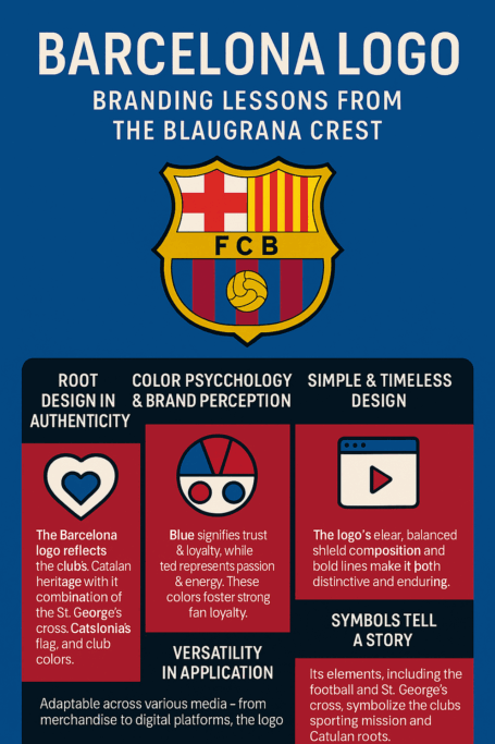
The crest suggests four rules. Keep it simple and do not overcrowd the design. Root it in meaning, cultural or personal. Make it versatile, so it looks as good on a mug as on a website. And when it needs updating, adjust it rather than starting again.
A generator can help you start. Turbologo and Looka offer templates inspired by well-known designs, but the useful part is the customizing that comes after. Treat AI as a brainstorming tool, and refine its output yourself.
Saying a Lot Without Words
The shield says strength, the colors say passion and the symbols say Catalonia. The top half of the crest is about the club’s regional history and the bottom half about football, and that split is easy to read even if you have never been to Spain. It is a visual language that works across languages and borders.
When you write prompts for a logo tool, describe the feeling you want, for example “bold, trustworthy, modern,” and let a tool like Fotor offer interpretations. Then pick the one that could explain itself without a caption.
Hashtags and Digital Reach
On social media the crest is everywhere. Hashtags like #ForçaBarça and #MesQueUnClub spread it around the world and turn it into material for memes. It reads clearly on Instagram and X. In 2025 the club’s 125th-anniversary visual identity won a World Brand Design Society Award.
Any new logo needs to work as well on screens. Choose crisp designs that scale cleanly and get the files to match. Shopify’s logo maker, for instance, provides SVG files that suit digital platforms.
Technology and AI in Logo Design
AI has made logo design available to almost everyone. Canva, Looka and Turbologo use machine learning to build designs from your inputs, which cuts the time and cost of traditional design a great deal. At their best they are like having a junior designer on call.
They have limits. Without good guidance they produce generic results. Barça’s crest, with its specifically Catalan character, is a reminder that personality has to come from somewhere. Give the tool detailed prompts and keep iterating until the design feels like yours.
If Barcelona Used an AI Logo Generator
Imagine the club’s branding team, in some parallel universe, refreshing the crest with an AI tool. They might start with LogoAI and type “Catalan shield, blaugrana colors, St. George cross.” The tool would offer sleek variations, and the team would rework them carefully: the stripes of the Senyera, the curve of the ball, the spacing of the letters.
They would also need clean files without watermarks, because a club of Barça’s size uses its crest on everything from shirts to stadium banners. Tools like Fotor or Ucraft offer watermark-free downloads. The result, in this imagined version, would be a crest that respects its history while looking a little more modern.
Making a Logo With AI, Barça-Style
If you want to use the crest as inspiration for a logo of your own, here is a simple process:
- Choose a tool. Free options like Looka, Turbologo and Canva are easy to use and offer plenty of customization.
- Define your brand. Enter your business name, industry and the feeling you want (for example, “bold, trustworthy”). Like Barça, anchor the design in an identity.
- Write detailed prompts. Something like “minimalist shield with vibrant colors” gives the AI a clearer direction. Fotor’s prompt box works well for this.
- Customize thoroughly. Adjust colors, fonts and layouts. Tools like Shopify’s logo maker let you preview designs on mockups.
- Download clean files. Platforms like Ucraft or LogoAI offer high-resolution files without watermarks.
- Test it everywhere. Check the logo on business cards, websites and social media. Canva’s mockup feature helps here.
More Than a Badge
The club’s motto is més que un club, more than a club, and the crest earns a version of that line. It is simple enough to read at a glance, full enough of meaning to matter to millions of people, and stable enough that a fan from 1910 would still recognize it. Try your own drafts in Looka, Turbologo or Canva, and judge them by the same three tests.