Logoluv

Tag

logo generation with prompt

79 LogoLuv stories about logo generation with prompt: logo history, design choices and what they mean.

Iconic Logos

The PlayStation Logo: History, Design and Influence

The PlayStation logo was drawn in 1994 by Manabu Sakamoto, for a company that made televisions and Walkmans and had never sold a games console. His answer was two letters, a P and an S, arranged so they seem to stand in three-dimensional space, which was exactly what the console was promising to do with games.

· 10 min read

Iconic Logos

The American Express Logo: Blue Box, Centurion and History

American Express started in 1850 as a freight company, hauling goods across the American West, and its first logo looked like it: a bold, plain “American Express Co.” with nothing to suggest luxury. The blue box and the Roman Centurion came much later, once the business had moved from shipping parcels to traveler’s checks and charge cards.

· 10 min read

Iconic Logos

The Bacardi Logo: How a Bat Became a Rum Brand

Bacardi’s bat goes back to 1862, when Don Facundo Bacardí Massó found a colony of fruit bats roosting in the rafters of his Cuban distillery and decided they were a good omen. More than 160 years later, the same animal still sits above the name on every bottle.

· 10 min read

Iconic Logos

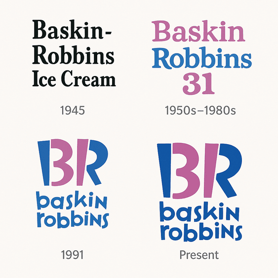
The Baskin Robbins Logo and Its Hidden 31

Look at the pink parts of the Baskin Robbins “BR” and you will find a 31, the number of flavors the founders promised, one for every day of the month. That small trick has done more for the brand than any color change.

· 10 min read

Iconic Logos

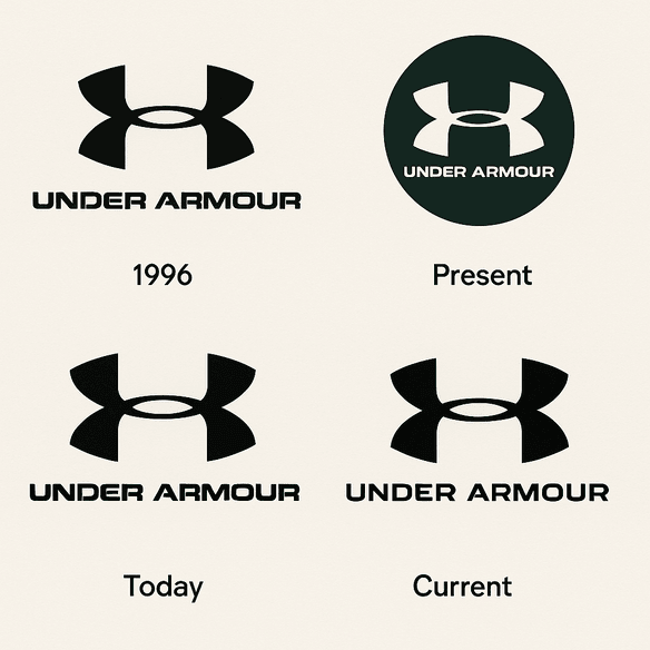
The Under Armour Logo: History, Design and Meaning

The Under Armour logo is two letters, a “U” stacked on an “A,” drawn so tightly together that most people read it as a single symmetrical X. It has barely changed since Kevin Plank started the company in 1996, and that refusal to change is a large part of why it works.

· 10 min read

Iconic Logos

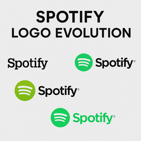
The Spotify Logo: History, Color and Design Lessons

Spotify picked green partly because nobody else in music had claimed it. Apple and Napster had blue and red, and a Swedish startup that wanted to look different from both went for a bright, slightly acid green that it still uses today.

· 9 min read