The Spotify Logo: History, Color and Design Lessons
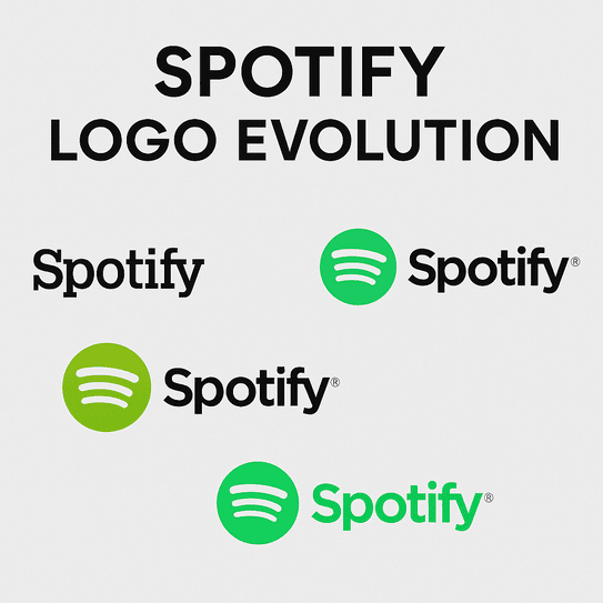
Spotify picked green partly because nobody else in music had claimed it. Apple and Napster had blue and red, and a Swedish startup that wanted to look different from both went for a bright, slightly acid green that it still uses today. Add a circle and three curved lines and you have one of the most recognized app icons in the world, a mark that has been through the move from downloads to streaming to podcasts without needing to be replaced.
Where the Logo Started
In 2006, when Daniel Ek and Martin Lorentzon founded Spotify in Stockholm, the music industry was a mess. CDs were fading, piracy was everywhere and iTunes was the new power in digital music. Spotify’s plan was to stream music legally. Its first logo, reportedly sketched by designer Andreas Kriborg with input from Ek, was purely practical: a green wordmark with none of the soundwaves people know now. The color was the deliberate choice. Competitors like Apple and Napster had already staked out blue and red, and green, with its associations with growth and a bit of rebellion, was still unclaimed.
By 2008 the logo had become the green circle crossed by three curved lines that suggest soundwaves. The new mark said something about the product: a service that would make music easy to reach and invite people to explore it. Next to the cluttered tech logos of the early 2000s it was minimalist before minimalism was fashionable, and it drew on the Scandinavian design habits that were about to spread everywhere.
Spotify Green
The signature shade is #1DB954, known as Spotify Green. It is vivid, close to neon, and it reads as energy and freshness. Color psychology links green with renewal and creativity, which suits a service built around finding new music. The green does more than catch the eye; it reads as an invitation to press play.
It also stands out against its rivals. Apple Music leans on muted grays and YouTube Music on an intense red, and Spotify’s green looks like a lime in a bowl of apples beside them. According to a 2022 study, 91% of U.S. digital music users recognize the Spotify logo. For many people the color is tied to the small pleasure of finding a new favorite song, which is about as good an emotional association as a brand can hope for. The lesson for designers is to choose a color for how it feels, not just how it looks.
Shape and Type
The icon is simple, but it is carefully drawn. The three soundwaves curve like the arcs on a spinning record. They suggest music without picturing an instrument or a note, which is a big part of why the logo has not dated. The typography started as a custom sans-serif and later moved to Circular, a typeface that is as legible on a phone screen as on a billboard. It is clear and confident without shouting.
Minimalism, symmetry and scalability make the mark easy to use. It sits comfortably on an app icon, a T-shirt or a festival stage without losing anything. A great logo does not need complexity. It needs to be clear and to adapt to wherever it is put.
What the Soundwaves Mean
The three lines carry the meaning. They stand for music moving, for the connection between artist and listener, and for Spotify’s role as the pipe in between. In that sense they work like a monogram, a shorthand for the company’s goal of making music available to everyone. Louis Vuitton’s interlocking LV signals luxury. Spotify’s waves signal access. They are recognizable instantly and still open to interpretation: sound waves, ripples, signal bars. The logo leaves that to the viewer, and that openness is one of its strengths.
A Modernist Mark
Plenty of tech logos are overdesigned, and the busy emblems of early tech startups are a good contrast. Spotify’s is closer to the Bauhaus rule of form following function: clean lines, nothing extra. The 2013 redesign refined the green and tightened the soundwaves, and the mark has since come through several app redesigns and cultural shifts without looking old.
Trends fade and simplicity lasts. Gradients and 3D effects are tempting, but a logo that looks very current today tends to look like MySpace a few years later.
The Logo Through the Streaming Wars
The logo has been a constant while Napster faded, Pandora stumbled and Apple Music played catch-up. Each era, from MP3s to streaming to podcasts, has brought small adjustments while the core stayed put. The 2015 tweak brightened the green for the mobile-first era so the icon would stand out on high-resolution screens. When Spotify moved into podcasts, the same mark started standing for audio storytelling as well as music.
That adaptability matters. A logo is used and reused for years, and the ones that last are those that can change in small ways without losing what people recognize. Spotify’s mark has managed it, which makes it a useful model for any brand going through a digital shift.
Ghost Artists and a Green Backlash
Spotify has had its controversies. In 2025 it faced scrutiny over AI-generated music, with reports of “ghost artists” such as The Velvet Sundown, a supposed band with 325,000 listeners and no human footprint. The logo was not directly involved, but it sits on top of every playlist where those tracks appeared, and the episode raised the question of whether platforming algorithm-made music dilutes the brand.
The 2015 color change caused a smaller fuss. When Spotify moved to a brighter green, some users complained it was “too limey.” The complaints died down quickly, but they showed how much ownership fans feel over a logo they see every day. Small changes can provoke big reactions, so test a new version with real users before committing to it.
The Logo and the Business
Spotify’s branding has been part of a very fast rise. Since going public in 2018 its stock (SPOT) has had plenty of swings, but brand recognition of 91% in the U.S. has been a steady asset. The same logo used across 178 markets helped the company grow from a startup into a $70 billion business by 2025.
Recognition is not just an aesthetic matter. A clear, memorable logo helps bring in users, and Spotify reported 600 million monthly active users in 2025. A logo that people can spot in a crowded app drawer is a commercial tool as much as a piece of design.
Consistency
Consistency is what Spotify does best. On a smart speaker, a billboard or a podcast cover, the mark is instantly recognizable, and that sameness builds trust in a service that holds millions of user-made playlists. The green circle is a simple promise: wherever you see it, your music is there.
Any brand can copy the habit. Make sure the logo works in black and white, at the size of a tiny app icon and in a bright advertisement. Spotify checked all three boxes years ago.
What It Teaches Designers
The first lesson is that simplicity wins. Three lines and one color carry more than a dozen decorations would. The second is to know who you are talking to. Spotify’s green is aimed at young, creative listeners, not at corporate buyers. The third is to test for versatility, and the Spotify logo works on screens, shirts and stages alike.
It also helps to write things down. Spotify’s logo comes with brand guidelines that keep every use consistent, and even a small business benefits from a one-page brand kit that sets out colors, spacing and minimum sizes.
Saying It Without Words
The visual language is efficient. The soundwaves say that music lives here without a single word, and the circle feels like an invitation rather than an instruction. That clarity is why the logo works across cultures, from São Paulo to Seoul.
Visual storytelling is the part to focus on. When a mark’s message is clear, it needs very little else, and Spotify’s logo is a good demonstration that less really can be more.
Wrapped and the Logo Online
On social media the logo has its own annual event. #SpotifyWrapped, the yearly campaign that shows users their listening habits, turns the brand into something people share across X, Instagram and TikTok, and the green has become tied to personal stories about music. Posts on X from 2022 pointed to a refresh of Spotify’s icon system, a reminder that even small updates help keep a brand looking current.
A logo now has to work online, from profile pictures to viral campaigns. Wrapped shows how far a brand can go when its mark is simple enough to be dropped into thousands of different designs and still be recognized.
Technology, AI and Logo Design
AI is changing logo design in the same way it is changing music. AI logo generators such as Looka, Semplr and LogoAI can produce professional-looking logos in seconds, with customization that does not require learning Photoshop. They are not infallible. Without clear prompts, something like “minimalist, vibrant, music-inspired,” they tend to produce generic designs with none of the character of a mark like Spotify’s.
The Spotify logo was not made by AI, but it does benefit from digital precision. Its scalability and color consistency come from modern design tools. It is easy to imagine Spotify’s own designers using a generator to try a few dozen variations on the curve of the soundwaves, in the way a producer remixes a classic track. The useful part would still be human: knowing which of those variations belongs to the brand and which only looks good.
Spotify’s Products and Recent News
Spotify now does far more than music. By 2025 it is a major platform for podcasts and audiobooks, with AI features such as Spotify DJ, which builds playlists from your listening habits. Growth in Latin America and Asia has fed its AI personalization, and users spend 25% of their listening time with the DJ feature, which in 2025 was upgraded to take voice requests. Editorial playlists such as New Music Friday and All New All Now keep people coming back, and plenty of Spotify’s less obvious features get daily use from power users.
Recent news has been more mixed. AI-generated “ghost artists” like The Velvet Sundown turned up on playlists such as “Vietnam War Music” despite being a 2025 creation, and critics argue that algorithm-driven playlists blur the line between human and machine creativity. So far the logo itself has come through untarnished.
Spotify also launched a video creator fund in June 2025 to boost podcast visibility, which fits its push to be a multimedia platform. The same logo sits over all of these products, and it is what holds them together.
Spotify Against Its Rivals
Beside its competitors, Spotify’s logo stands out. Apple Music’s stark black note feels cold and corporate. YouTube Music’s red play button is bold but has little personality. Pandora’s stylized P is forgettable. Spotify’s green circle is warm and memorable, the soundwaves give it movement, and the color separates it from all the tech blues and reds around it.
Differentiation is the point. Standing out depends as much on what you avoid as on what you choose, and Spotify avoided the colors and shapes its rivals were already using.
Playing With the Mark
The logo also leaves room for play. In the Wrapped campaign the green circle becomes a canvas for data-driven graphics, and at festival activations it glows in neon. Both show that a logo can be consistent and still be used creatively.
For your own mark, playful branding mostly means trying it in different contexts. Put it on mockups of business cards, social headers and merchandise. Spotify’s logo works in all of those places, which shows that playfulness does not have to cost a brand its professionalism.
Design Tips From Spotify
Spotify’s logo suggests a short checklist for anyone designing one:
- Keep it simple. Complexity ages badly, so stick to clean lines and few elements.
- Choose colors on purpose. Green for growth, blue for trust, red for energy.
- Test scalability. The logo should work from favicon to billboard.
- Plan for versatility. It has to adapt to print, screens and merchandise.
- Be specific about what you want. Vague briefs, to a designer or to software, produce generic results.
Why It Works
The Spotify logo went from a startup’s wordmark to a global icon by doing a few simple things well: an unclaimed color, a shape that suggests sound without drawing it, and years of using both the same way everywhere. Not every change landed, and the “too limey” complaints of 2015 show how protective people are of a logo they see daily. But the core was strong enough to absorb them. Start with your brand’s story, get the color and shape right, and the rest is consistency.


