Logoluv

Tag

Tech Logo

5 LogoLuv stories about Tech Logo: logo history, design choices and what they mean.

Iconic Logos

The PlayStation Logo: History, Design and Influence

The PlayStation logo was drawn in 1994 by Manabu Sakamoto, for a company that made televisions and Walkmans and had never sold a games console. His answer was two letters, a P and an S, arranged so they seem to stand in three-dimensional space, which was exactly what the console was promising to do with games.
· 10 min read

Iconic Logos

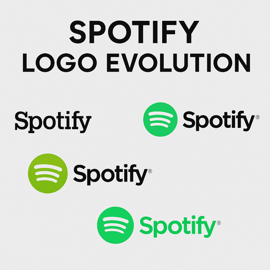
The Spotify Logo: History, Color and Design Lessons

Spotify picked green partly because nobody else in music had claimed it. Apple and Napster had blue and red, and a Swedish startup that wanted to look different from both went for a bright, slightly acid green that it still uses today.

· 9 min read

Iconic Logos

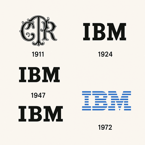
The IBM Logo: Paul Rand’s Stripes and How They Lasted

The IBM logo has not meaningfully changed since 1972. That is a remarkable run for a technology company, an industry that usually redesigns its marks every time it reinvents its products, and IBM has reinvented its products several times over.

· 9 min read

Iconic Logos

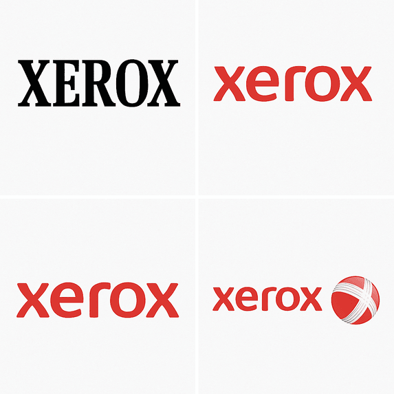
The Xerox Logo: History, Design and Reinvention

Few companies get turned into a verb. Xerox did, so thoroughly that it has had to fight to stop “xeroxing” becoming a generic word for photocopying, and its logo has had to carry that weight through more than half a century of reinvention.

· 10 min read

Iconic Logos

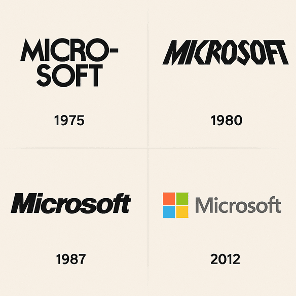
The Microsoft Logo, From “Micro-Soft” to Four Squares

Microsoft’s first logo spelled the company’s name with a hyphen, “Micro-Soft,” in lettering that made it obvious the founders were programmers, not designers. Its current logo is four colored squares and the word Microsoft in Segoe, and it took the company nearly four decades to get there.

· 9 min read