The Xerox Logo: History, Design and Reinvention
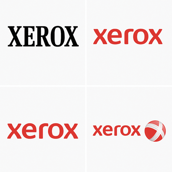
Few companies get turned into a verb. Xerox did, so thoroughly that it has had to fight to stop “xeroxing” becoming a generic word for photocopying, and its logo has had to carry that weight through more than half a century of reinvention. The red wordmark is plain and confident, and it has outlasted most of the machines it was printed on.
Anyone can now make a passable logo in minutes, which makes it more useful, not less, to look at one that was built to last. The Xerox mark has been redrawn several times, sometimes well and sometimes less so, and the reasons behind each change say a lot about how a brand should grow up.
From Haloid to Xerox
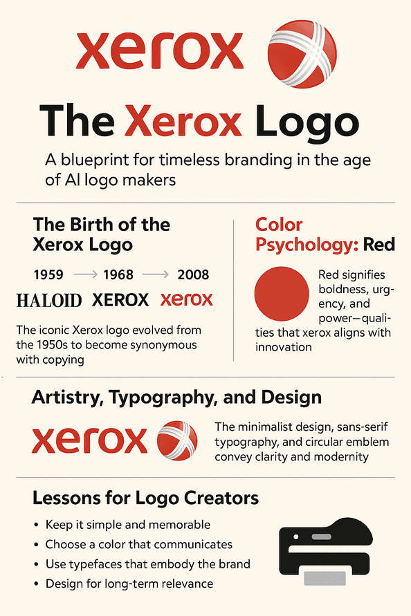
The company started in 1906 as Haloid, a small maker of photographic paper. In 1959 it released the Xerox 914 copier, which changed office work and gave the language a new verb. The product was a revolution, but the company’s first emblem, a heavy serif design, looked like it belonged to an older business. By 1968 Xerox had hired the design firm Gips & Danne to fix that. The result was a bold, sans-serif “XEROX” in capital letters that looked modern and sure of itself.
The new wordmark was about clarity and confidence. It had clean lines and unfussy letters, and it looked as efficient as the machines it was stamped on. That fit between the logo and the product is the first thing worth taking from it. A logo can be made in seconds now, but a logo with no connection to what the company actually does is decoration, and it will not survive the first rebrand.
Why the Red Works
Xerox red is close to fire-engine red. Red signals urgency, energy and power, which suited a brand that had just changed how offices handled information. It is also a color that can turn aggressive or start to look like a warning if it is overused. Xerox kept the balance by using red on its own against plenty of white, so the logo stands out without shouting.
Competitors went the other way. Canon and HP lean on cooler colors that read as calm and dependable. Xerox’s red reads as a challenge by comparison: we are bold, we are different. Tools like Semplr make it easy to try a dozen colors on a draft logo, but the useful skill is knowing why red suits Xerox and why blue suits IBM. If you cannot decide between two colors, put both in front of real customers, for example with a simple A/B test, and see which one they remember.
Typography and Later Changes
The Xerox lettering is minimal. Its custom sans-serif letters are geometric and precise, and they manage to feel modern without looking tied to a particular year. The type works hard. Unlike the ornate script of luxury brands like Louis Vuitton, Xerox’s lettering is all business, and it was meant to be legible on everything from a copier lid to a billboard.
The design changed gradually over the decades. The 2008 redesign was the biggest step: the name went lowercase, “xerox,” and a red sphere was added beside it, nicknamed “the meatball,” to suggest connectivity in the digital age. The change matched Xerox’s move from copiers toward IT services. It is a reasonable example of how to update a logo. The company changed it to match what it had become, and kept the color and the name’s shape so that it still looked like Xerox.
What the Sphere Was For
The sphere was meant to stand for global reach and digital transformation. Circles suggest unity and completeness, and here the idea was a company that connects the world’s information rather than one that just makes copies of it. The lowercase lettering helped soften the image too, making a big, old corporation look more approachable in a tech-driven decade. The message, roughly, was that Xerox was no longer only about paper.
Symbols only work when they mean something. A generator will happily offer abstract shapes, but a shape picked for its looks has nothing behind it. Before choosing one, decide what your brand needs to say. Is it stability? Squares tend to suggest that. Creativity? Spirals and looser forms might. The Xerox sphere is a reminder that a simple shape can carry a lot, as long as there is an actual idea attached to it.
Modernism and Staying Power
The 1968 logo came out of the modernist tradition that ran from the Bauhaus through mid-century corporate design, and that is a large part of why it lasted. Clean lines and a functional look fit today’s minimalism just as well as they fit the 1960s. Logos built on fashion tend to age badly (early Pepsi is a good example). The Xerox wordmark has held up much better.
The practical lesson is to be wary of trends. Gradients and 3D effects can date a logo within a few years. Simple, scalable shapes keep working on business cards, apps and billboards, and that versatility is what has kept the Xerox mark usable for so long.
A Logo for Each Era
Xerox did not just brand a company; it came to stand for a period of office history. In the 1960s the name meant the office revolution. By the 1980s it also meant research, thanks to the Palo Alto Research Center, where the graphical user interface was developed. The 2008 redesign was timed to the digital age, presenting Xerox as a leader in managed print services and IT.
Each version reflected the technology around it. A good logo can do that without losing itself, but only if the designer understands the industry. Fintech, fashion and food all have different visual conventions, and a logo that ignores them looks lost. Xerox kept moving with its industry while keeping enough of its look that customers never had to relearn it.
Knockoffs and Criticism
Being everywhere made Xerox a target. Shady print shops copied its red-and-white look to borrow its reputation. In the 1980s Xerox sued companies for trademark infringement and worked hard to keep the name a protected brand rather than a generic word for copying. More recently, the 2008 redesign split opinion. Some fans of the old mark saw the lowercase type and the sphere as a betrayal of the bold capitals they knew.
We think the critics had a point about the loss of weight, but changing nothing would have been the bigger risk for a company leaving its old business behind. If you are planning a bold change, expect pushback and decide in advance which parts of the identity you will not touch. For Xerox that was the red and the name.
The Logo and the Business
A logo is a business asset as much as a piece of design. Xerox stock (XRX) rose strongly in the 1970s as the brand became shorthand for innovation. In 2025, despite a tough market, analysts noted a 15% rise in the stock in the first quarter after a rebranding push that emphasized sustainability, which they tied to the move into digital services. The point is not that a logo moves a share price by itself, but that decades of recognition make a brand easier to trust when the company changes course.
For a startup the stakes are smaller but similar. A logo that looks considered helps signal that the business is reliable, to customers and to anyone thinking of investing in it.
For its 2025 reinvention, Xerox is leaning heavily on its channel partners. It is shifting revenue from print toward IT and digital services, and aiming to raise profitability through the $1.5 billion acquisition of Lexmark and new products such as the AI-enabled PrimeLink C9200, which is designed to win small and mid-sized business customers.
Karl Boissonneault, Xerox’s North American channel chief, has said the Lexmark deal and new, cost-competitive products like the PrimeLink C9200 show that Xerox is still committed to print, and that they give partners something to compete with in the SMB market.
Consistency
Through all the changes, the core of the Xerox look, bold lettering and red, has stayed recognizable. Consistency is what turns a logo into a promise customers can rely on. That is why Xerox’s brand guidelines are strict, and why the mark appears the same way on copiers, packaging and cloud software.
A new brand should hold itself to the same standard early. Check that the logo works on social media, packaging and in an app before you commit to it. A template can get you started, but deciding on fixed rules for color, spacing and size is what makes a logo look professional over time.
Lessons From Xerox
Simple shapes scale. Color matters more than most people expect. And a logo has to change when the company changes, without throwing away what people already recognize. A good process starts with a clear brief: what the company does, who it is for and what the logo must say. Generate or sketch options, then refine them until they tell that story. Test them for legibility at small sizes, for scaling and for the feeling they give. The Xerox logo works because people recognize it instantly. That should be the goal of every designer.
What the Logo Says
The visual language is easy to read. The red says energy and invention; the clean lines say efficiency. The 2008 sphere added an idea of connection, and it fit with Xerox’s “Work Can Work Better” campaign. Without any words, the logo says reliable and forward-looking.
The sphere also adds a bit of warmth. It balances corporate seriousness with something friendlier, which is not easy for a business-to-business company. Every brand has to decide where it sits between serious, like IBM, and quirky, like Mailchimp. Xerox found a middle position, authoritative but approachable.
Xerox on Social Media
The logo does well online. Hashtags like #XeroxInnovation and #XeroxLogo pick up activity on X during product launches and brand announcements. The mark works as a profile picture, in a banner and in AR filters, because it is clean and scales without losing detail. Digital platforms are hard on complicated logos, and this one has nothing to lose.
Any logo made today should be designed for screens first. Check it as a tiny avatar and as a full-width banner, and make sure you have clean, high-resolution files without watermarks before you publish anything.
Technology and AI in Logo Design
AI logo generators such as Looka, Semplr and Canva can produce logos in minutes, looking at trends and the user’s inputs to suggest designs. That opens design up to people who could never afford a studio. It does not replace having an idea. The Xerox logo was drawn by people who understood the company, and that understanding is still what makes a mark work.
AI is changing branding all the same. Xerox itself reportedly uses AI-driven analytics to test variations of its logo for different markets. The sensible way to use these tools is to start with your brand’s values, generate options and iterate, while keeping the important decisions for yourself.
Beyond the Copier
Xerox now sells much more than copiers: managed print services, IT solutions and cloud software. In 2025 it launched the VersaLink C7100 Series, a more sustainable printer line, along with AI-driven workflow automation tools. The logo is the visual thread that ties all of these together.
That is a test every logo should pass. It has to hold a whole range of products together, whether that is a startup’s app or a large company’s hardware. When you design yours, make sure it works across every product line, the way Xerox’s does.
Xerox Against Canon and HP
Next to Canon’s restrained wordmark and HP’s neat, geometric badge, the Xerox logo stands out for its bold lettering and bright red. Canon feels reserved and HP feels cool and technical. In our view Xerox has more character than either, and it looks like a brand willing to stand out.
Study your competitors, then do something different from them. If the rest of your industry is blue and subtle, red and bold might be your edge.
If Xerox Used an AI Logo Tool
Suppose Xerox wanted to refresh its logo in 2025 and typed “innovation,” “connectivity” and “red” into a generator. It would get back plenty of sleek options. A sensible team would then pull them back toward the existing typeface and sphere, keeping the heritage and updating the details. The tool would make suggestions, and people would make the choices.
That is about the right split. Generators are good at sparking ideas. The Xerox logo has lasted because people chose carefully what to keep, and no tool makes that choice for you.
Xerox in 2025
Xerox has had a busy 2025. Its first-quarter earnings report showed a 10% rise in revenue, driven by the push into digital services. A February 2025 campaign, “Print Less, Impact More,” focused on sustainability and put the logo front and center in its ads. Posts on X praised the move into greener technology, and #XeroxSustainability trended. The company is trying to present itself as a technology business, not just a printer maker.
The logo is what links that future to the past. It shows how much a brand needs a mark that can follow it through a reinvention without having to start again.
What to Take From Xerox
The Xerox logo is a story of invention and repeated reinvention, and of a company that kept its color and its name while changing almost everything else. If you are a founder or a freelancer starting on a logo, a tool like Semplr can give you a first draft quickly. Then do the slower work: pick a color for a reason, keep the shapes simple, and decide what about your brand should never change.


