The Louis Vuitton Monogram: History and Design Lessons
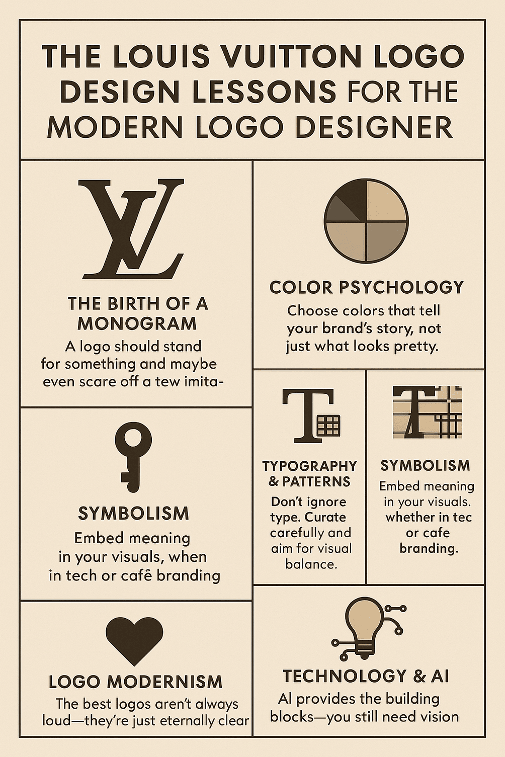
The Louis Vuitton monogram was designed in 1896 to stop people copying the company’s trunks, and it has become one of the most copied patterns in fashion. Georges Vuitton’s interlocking L and V, set among flowers and stars, has barely changed in nearly 130 years. It has covered steamer trunks, handbags and, more recently, sneakers, and it is recognized by people who could never afford any of them. The story of how it got there says a lot about what makes a logo last, and about the costs of becoming too famous.
How the Monogram Began
In 1854 Louis Vuitton was a trunk maker in Paris, building luggage for wealthy clients. In 1896 his son Georges created the monogram that would carry the family name. It drew on Japanese design and combined a quatrefoil, a star and the now-famous LV initials into a repeating pattern. It was a mark of prestige, but its first job was practical: Vuitton trunks were being copied, and an elaborate, distinctive pattern was much harder to fake than plain canvas.
So the monogram was both a shield against knockoffs and a status symbol, and Georges seems to have understood that the two roles reinforced each other. The broader lesson is that a logo should have a reason to exist beyond decoration. Vuitton’s had a specific problem to solve, and the design came out of that problem.
Tan, Brown and Gold
The color scheme does a great deal of the work. The classic monogram canvas uses tan, brown and gold, colors that suggest warmth, reliability and, frankly, money. The earthy tones read as heritage first and luxury second, which is the right order for an old house. Brown is not a fashionable color in most branding, and that may be part of why it works here. It says the brand does not need to shout.
The general rule is to choose colors for what they say about the brand, not for what looks nice on a screen. If you want to borrow some of Vuitton’s luxury feel, golds and neutrals will get you there. A neon green will send a very different message, which might be the right one for a different brand.
Letters and Pattern
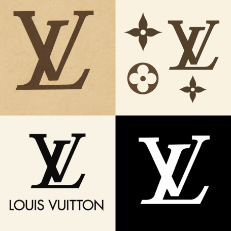
The typography is the core of the mark. The serifed L and V are bold but elegant, and they overlap in a way that makes them read as one shape. Around them, the geometric flower motifs give the pattern structure, so the whole thing feels both ordered and decorative. The repeating pattern is the key. It can cover a wallet or a billboard and look right at both sizes.
Type is easy to neglect in logo design, and it should not be. Lettering carries as much character as any symbol, and a bad font choice can undo a good idea. Vuitton’s monogram balances clarity and flair. The letters are legible and distinctive at once, which is the standard to aim for.
What the Symbols Say
Each part of the monogram carries a reference. The quatrefoil recalls Gothic architecture, the star suggests ambition, and the LV initials are a literal mark of ownership. Taken together, the pattern signals exclusivity, the sense that this belongs to people who paid for it. That meaning has kept the brand’s identity solid for decades.
Any logo can use symbols the same way, at a smaller scale. A café might use a coffee cup to suggest community, and a tech startup a rocket to suggest speed. The work is in choosing elements that reflect what you actually value, and then stopping before the logo turns into a puzzle.
Why It Has Not Aged
The most striking thing about the monogram is that it has not aged. Other brands refresh their logos every decade or so, and Vuitton’s has stayed largely as it was in 1896. It has clean lines and a balanced composition, and it avoids anything tied to a particular moment, so it looks as current now as it did during the Belle Époque.
That is worth studying, whether you work by hand or with AI logo creator tools. The longest-lasting logos are not always the loudest. They are the clearest. Trends like gradients or minimal swooshes date quickly, while a simple, versatile mark built on careful thinking can last more than a century.
The Monogram Through the Decades
From Audrey Hepburn to Kanye West, the monogram has followed the culture around. In the 1990s it was the ultimate status symbol, carried by pop stars. In the 2000s, Marc Jacobs’ collaborations with artists such as Takashi Murakami turned it into pop art. Today it is part of streetwear, remixed on Virgil Abloh’s sneakers and hoodies.
A great logo can be reinterpreted without losing itself. The best ones change with the times while staying true to their roots, and Vuitton’s is a good example. Any logo should be able to work across very different contexts, on a business card, a website, an NFT or a tote bag, and still look like the same brand.
Counterfeits and Cultural Criticism
The monogram’s fame has made it a magnet for fakes, and counterfeit bags turn up in markets from Bangkok to Birmingham. Vuitton’s legal team is known for being relentless, pursuing everyone from street vendors to Etsy sellers. The brand has also faced criticism for borrowing from African and Asian aesthetics without enough credit.
There is an irony here. A mark designed to defeat counterfeiters became one of the most counterfeited patterns in the world, simply because it worked so well as a status symbol. Any successful logo will be scrutinized, copied and questioned. Make sure yours is original to begin with. Templates are a fine starting point, but a logo that looks like everyone else’s cannot be defended.
The Logo as a Business Asset
Louis Vuitton’s parent company, LVMH, is a financial giant, with a market capitalization of around €400 billion in 2025. The monogram plays a central role. It is visual shorthand for luxury, and every monogrammed bag sold strengthens loyalty to the brand, which feeds sales and the share price.
Small businesses can get value from a strong logo too, and today a professional-looking design is available on a small budget. Glossier is a good example: its simple pink identity helped it compete with much larger beauty companies. A logo is a business asset, not only a piece of art.
Consistency
Louis Vuitton is extremely consistent. The monogram is everywhere, from perfume bottles to storefronts, and it reinforces the brand at every point of contact. That discipline is why Vuitton seems so solid and so unaffected by fashion’s swings.
The same applies at any scale. A logo should look the same on a website, on packaging and on social media. Brand kits, which several online tools now offer, help keep colors and fonts consistent. Without that discipline, a brand starts to look like a mood board rather than an identity.
Lessons for Logo Designers
The monogram offers a short list of lessons. Prioritize clarity, so the logo is legible at any size. Make it versatile, so it works in black and white as well as in color. Give it a story, through symbols or color. And think long term. Vuitton started as a single trunk workshop, not a global empire, and the logo it adopted then still serves it now.
Quick iteration helps with all of this. Trying many versions and testing each against these principles is the fastest way to find one that feels both personal and polished.
Visual Language
The LV pattern on its tan background says luxury, and it says desire. The symmetry and repetition give it a rhythm, like a chorus you cannot get out of your head. It works the way a well-cut suit does, signaling confidence before anyone says a word.
When working on your own logo, decide what it should say. Bold? Playful? Trustworthy? Then adjust shapes and spacing until the design says it. Every angle and every font weight carries some meaning, whether you intended it or not.
The Monogram Online
On Instagram the logo is everywhere. Hashtags like #LouisVuitton and #LVCrew have millions of posts, turning customers into unpaid ambassadors. The monogram photographs well, crisp, bold and instantly recognizable, and it has become a staple of selfies.
For any brand now, a logo needs to work on a phone screen, as a Twitter avatar or a TikTok watermark. Export high-resolution files and check how the mark looks at small sizes before you publish it.
Technology and AI
Technology has changed logo design, and AI is the latest shift. Anyone can now produce a logo with tools like Looka, which use algorithms to suggest layouts, colors and fonts. It is a kind of access to design that Georges Vuitton could not have imagined.
These tools are convenient, and many offer watermark-free downloads, so a small business can look professional without a big bill. They can also reflect current trends. What they cannot supply is the judgment about what to keep, which is still a human job.
If Louis Vuitton Used an AI Generator
Imagine LVMH’s designers deciding to refresh the monogram with an AI logo generator. They type “luxury” and “heritage” into a tool like Canva and see what comes back. The result would probably be a sleeker monogram with a futuristic touch, gold gradients and holographic flowers. Purists would be furious, and they would probably be right.
Still, the exercise shows where AI is useful. It gives brands of any size a cheap way to experiment without committing to anything. Vuitton is unlikely ever to abandon its monogram, but being able to test digital variations quickly keeps even a very old brand flexible.
Making a Logo With AI: The Short Version
If you want to try it, the process is straightforward:
- Define your brand. Is it luxurious, quirky or minimal? Write down three adjectives to guide the design.
- Pick a tool. Several free logo generators are easy to use and offer watermark-free downloads.
- Experiment with the elements. Try different fonts, colors and icons, and aim for something simple and versatile.
- Test it at different sizes and in different formats, from business cards to billboards.
- Get feedback. Show it to friends or colleagues and ask whether it feels like your brand. If not, keep adjusting.
- Download a high-resolution, watermark-free file and use it consistently everywhere.
Do those steps carefully and you will end up with a logo that has a reason to exist, which is more than most do.
What the Monogram Teaches
The Louis Vuitton monogram has outlived trends, fashions and a flood of counterfeits, and it has done so by staying almost exactly as Georges Vuitton drew it. It is a reminder that two well-placed initials, drawn with care and used with discipline, can carry a brand for well over a century.
Few logos will ever reach that status, and most do not need to. But the method is available to anyone: solve a real problem, choose colors and symbols that mean something, and then leave the design alone long enough for people to learn it.


