The Harvard Logo: The Story Behind the Veritas Shield
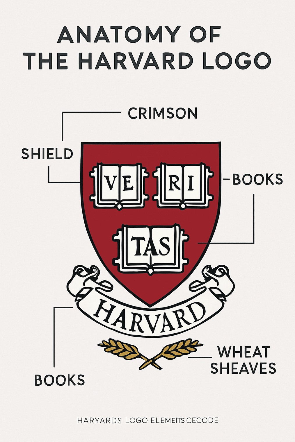
Harvard’s shield is one Latin word split across three open books on a crimson field. It is close to two centuries old as a formal emblem, it was never designed by a branding agency, and it works better than most logos that were. It is instantly recognizable, it reproduces on anything from a diploma to a hoodie, and it says exactly one thing: truth.
It is also a reminder that a logo’s meaning does not stay fixed. In the last decade Harvard’s heraldry has been pulled into arguments about slavery, free speech and federal power, and the shield has come out carrying more weight than it did before.
How the Harvard Shield Came to Be
Harvard College was founded in 1636 in the Massachusetts Bay Colony, but it was not until 1843 that the university formalized its seal. The design, inspired by the coat of arms of John Harvard’s family, was a red shield with three open books bearing the letters VE, RI and TAS. It was a statement of purpose: the pursuit of truth, however inconvenient.
Its roots are in heraldry, the visual language of the medieval elite. Heraldic shields were in many ways the corporate logos of their day, signaling lineage, authority and permanence, and those were exactly the qualities Harvard wanted to project. There was nothing quick about the process. Where a modern logo can be roughed out in seconds, Harvard’s seal was debated by scholars and drawn by hand.
Through the 19th century the seal was refined. The books, the wheat sheaves and the crimson were adjusted to match the institution’s growing prestige. By the 20th century the symbol had outgrown its official function and become a global brand, printed on sweatshirts, engraved on diplomas and attached to the ambitions of generations of applicants.
Why Crimson
Red is linked to passion, power and authority. Crimson, a deeper shade, adds richness and a sense of tradition, which suits a university more than a fire-engine red would.
The color has a sporting origin. According to the usual story, Harvard’s rowers wore crimson scarves at a regatta in 1858, and the color stuck. It has been used consistently in every version of the Harvard logo since, and that consistency is the real source of its strength. Crimson commands attention and carries a certain reverence, but mainly it is just always there.
Trying out palettes is easy. Committing to one color across print, screens and merchandise for more than a century is hard, and it is what turns a color into an identity.
A Study in Restraint
At first glance the logo is modest: a shield, three books, one word. That modesty is the design. The layout is balanced and close to geometric. Open books stand for inquiry, and the wheat sheaves for prosperity and community. It manages to look both ancient and modern.
A lot of crests, and a lot of quickly generated logos, err in the other direction, piling on ornament until nothing reads at small sizes. Harvard’s shows that a few elements, well arranged, go further than many. If you are designing a mark, the hard part is choosing what to leave out.
When the Crest Became Controversial
Even an old, revered emblem can become a flashpoint. In 2016 Harvard faced calls to remove parts of its logo associated with a slaveholding benefactor, which set off a wider conversation about historical accountability on campus.
Harvard chose a middle course. The main seal stayed, but the law school’s crest, the one tied to that benefactor, was retired. The episode is a reminder that symbols are never neutral. Whoever designs a mark, and however they design it, its cultural context matters.
More recently, Harvard has been in a standoff with the U.S. government and is facing threats to its ability to enroll international students after refusing to comply with federal demands related to hiring, admissions and antisemitism oversight. Homeland Security Secretary Kristi Noem requested records on alleged “illegal and violent” activities by foreign students, warning that noncompliance could cost Harvard its visa-sponsorship privileges.
The dispute follows a $2.2 billion funding freeze and threats from Donald Trump to revoke Harvard’s tax-exempt status, moves many critics see as politically motivated. Harvard has made some concessions, including leadership changes in its Middle Eastern studies departments, but has vowed to protect its independence and constitutional rights.
More than 27% of Harvard’s students come from abroad, so the university’s global brand, and the shield that represents it, now sits in the middle of a larger fight over free expression, campus safety and academic autonomy.
For a long time the shield simply meant prestige. To many people it now also means defiance, which shows how a logo’s meaning shifts with the institution behind it.
A Logo Across the Eras
You can read the history of the institution through what the logo stood for. In the 1800s it was the emblem of a growing college. In the 20th century it came to mean global intellectual standing. Today it is also a digital avatar, resized for Instagram, LinkedIn and online courses.
Each generation added something. Protesters in the 1960s carried banners bearing the shield. In the 2000s it became the center of a merchandising business. Now the crimson crest turns up in pixels, memes and even NFTs. The drawing barely changed through any of this. What changed was what people brought to it, and a well-made logo can absorb that kind of change without needing a redesign.
What the Shield Is Made Of
Broken into its parts, the crest is short and purposeful:
- The shield: strength, lineage and tradition.
- The books: open, for inquiry and learning.
- The wheat sheaves: nourishment, prosperity and growth.
- Crimson: depth and seriousness.
- Veritas: truth, stated plainly, which feels bolder now than it did in 1843.
Every element connects to Harvard’s mission, and nothing is there purely to fill space. That is the standard to hold your own mark to. A logo, however it is first produced, is the start of a story rather than a finished piece of art, and each part should earn its place in that story.
Lessons for Logo Designers
Three things carry over to almost any brand:
- Simplicity wins. Minimal designs like Harvard’s are easier to remember and to scale.
- Color consistency matters. Crimson was not chosen at random, and it has never been swapped out.
- Storytelling is the point. Each element, from the books to the wheat, means something. Yours should too.
Measured against the usual principles of logo design, the shield does well. It is clear, since you know what it is at a glance. It is versatile, working on hoodies, web headers and Harvard Law briefs. It is memorable, because crimson plus Veritas is hard to forget. And it is timeless: drawn in the 1800s and still in use in 2025. A logo is a silent ambassador for whoever owns it, and Harvard’s has been a good one.
From Campus to Popular Culture
The logo is not confined to academia. It appears in films, memes and novels as shorthand for “elite institution.” In The Social Network it is almost a character. In Suits it stands for ambition.
It has real economic weight as well. Harvard earns millions every year from licensing its name and logo, which makes the shield something like the Nike swoosh of higher education. Very few logos build that much cultural capital, and none of them do it quickly.
Modern Before Its Time
For a heraldic object, the shield is surprisingly modern. Its lines are clean, the lettering is bold, and the composition is balanced. There are no gradients, no sparkle and no unnecessary detail.
That sets it apart from many early-2000s logos that drowned in bevels and drop shadows and look dated now. When flat, minimal design came back into fashion, Harvard’s crest already fit, because it had never left.
Consistency
Harvard is disciplined about its branding. The logo looks the same in Harvard Yard as on HarvardX, and that uniformity builds trust. Strict brand guidelines make sure the logo, font and color are not misused.
This is where a lot of do-it-yourself branding falls down. Using an AI logo maker such as Semplr, a free AI logo creator tool, is a perfectly good way to get a first mark. The important step comes afterward: fix your colors, fonts and logo files, write them down, and stop changing them.
What the Logo Says Without Words
Read as a message, the shield says roughly three things:
- We are old, but still relevant.
- We are serious, but not out of reach.
- We are about truth.
Every element supports that message. Before you finalize your own logo, write down in a sentence or two what it is supposed to say without words, then check each part against that list.
The Shield Online
On social media, hashtags like #HarvardProud and #Veritas carry the logo around the world. Commencement photos and casual campus shots alike spread the crimson crest widely.
Because it scales well, it holds up on screens. If you want the same for your own mark, make sure you have vector files, a version with a transparent background and scalable SVGs, and test it at favicon size before you commit.
From College Seal to Global Brand
Harvard’s logo started as a college seal. It now appears on coffee mugs, online courses and at the table in high-stakes negotiations. That is the arc most organizations would like for their own mark, from local to iconic, and it is worth planning for early. Our look at Disney is a good example of how to think like a global brand from the start.
Logos in the AI Era
Not long ago, logos were carved, printed and inked by hand. Today a logo can be generated in minutes. That has opened up branding to people who could never have paid for a designer, which is a good thing. It has not removed the need for judgment about what a mark should mean and what to leave out.
Harvard’s logo was made in an analog age and does well in a digital one. That is the right target: use the new tools, but let the story drive the design.
A Logo for the Ages
The crimson shield combines meaningful symbols, a single consistent color and a long history, and that combination is why it remains one of the clearest cases of lasting branding anywhere. It has also shown that a logo can take on new meanings, some of them uncomfortable, without losing its identity.
If your design tells a story, carries real meaning and ignores passing trends, it has a chance of lasting. Harvard’s has managed nearly two hundred years.


