The Subaru Logo: Six Stars From One Merger
Subaru is the Japanese name for the Pleiades. Its badge turns a 1953 merger into a cluster of six stars.
A journal of iconic marks
The history, design choices and meaning behind the world’s most famous logos, plus ideas for designing your own.
Subaru is the Japanese name for the Pleiades. Its badge turns a 1953 merger into a cluster of six stars.
In 2021 Kia swapped its red oval for one unbroken line. It looked bold, and sent people searching for a car brand called “KN”.
Mitsubishi means “three water chestnuts”, and its logo joins two family crests. Over 150 years later dozens of companies still share it.
Michelin’s mascot began as a joke about a pile of tyres in 1894. Over a century later Bibendum is still the face of the brand.
Burger King spent twenty years with a shiny blue swoosh round its burger, then threw it away for a flat logo from 1969. It was one of the best rebrands of its time.
Samsung means “three stars” in Korean, and the first logos showed exactly that. Today the brand is a plain blue wordmark with two missing lines.
Lamborghini’s charging bull came from its founder’s star sign and a love of bullfighting. It was also a deliberate answer to the horse on a Ferrari.
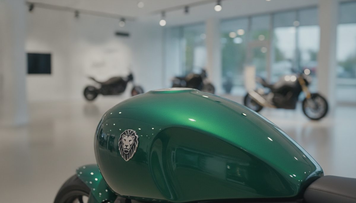
At EICMA in Milan, the Italian motorcycle maker showed a cleaner, one-colour version of its laurel, stars and lion emblem, and a lion that can now stand on its own.
The WNBA’s first champions are coming back in 2027, with logos that keep the old navy, red and silver but had to be new: league rules don’t allow an old primary logo to return.
Apple’s first redesign of Apple Music since 2015 drops the red, sets the name in lowercase, and gets its ripples from notes played into a pool of oil.
Borrow the lessons of the greats: simplicity, a memorable shape, a colour that owns a feeling. Then make your mark in a minute with our free logo maker.
Create a logo