How to Choose a Colour Palette for Your Brand
Colour is often the first thing people remember about a brand, before the name or the logo’s shape. Think of Coca-Cola red, Tiffany blue or Cadbury purple. Choosing your colours can feel like guesswork, but it doesn’t have to be. Here is a step-by-step way to build a brand palette that looks good, says the right thing and works everywhere, using free tools you can try as you read.
1. Start With What You Want People to Feel
Colours carry associations. Blue reads as trustworthy and calm, red as energetic and urgent, green as natural and healthy, black as premium, yellow as cheerful. Write down three words for how you want your brand to feel, then look for colours that match. Our article on colour psychology in logos goes deeper into what each colour says.
2. Look at What Your Industry Does
In our Brand Colour Index of 5,561 brand logos, blue is the most common colour (29.1%), and blue, black and red together cover 68.4% of all logos. But industries differ: 47.2% of airline logos are blue, 72.7% of fashion logos are black, and restaurants lean red (39.5%). Matching your industry makes you look like you belong; going against it helps you stand out. Both are valid, as long as you choose on purpose.
3. Pick One Main Colour
Your main colour is the one people will remember you by. It goes on your logo, your buttons and your social media. Choose a mid-tone that works on both white and dark backgrounds. Browse 5,000 named colours for ideas; each popular colour has a page with its codes, shades and the brands that already use it.
4. Build the Palette Around It
Put your main colour into the colour wheel to find colours that go with it. Complementary colours (opposite on the wheel) give strong contrast for accents. Analogous colours (side by side) feel calm and natural. Or press Space in the palette generator with your colour locked until something clicks. Aim for two to five colours in total.
5. Add Neutrals
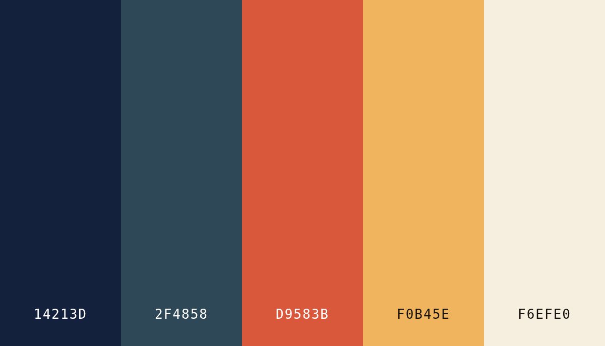
Every palette needs a dark colour for text and a light one for backgrounds. They don’t have to be pure black and white: a warm off-white and a deep navy or charcoal feel softer and more designed. A useful guide is the 60-30-10 rule: about 60% neutral background, 30% supporting colour and 10% accent.
6. Test It for Real
Colours that look great as swatches can fail on a page. Open your palette in the palette visualiser to see it on a sample website. Check every text colour in the contrast checker: normal text needs a ratio of at least 4.5:1 to meet the WCAG AA standard. And check your logo in one colour and at a small size, like a browser tab icon.
7. Write It Down
Once you’ve decided, record the exact codes: HEX for screens, RGB for digital tools, CMYK for print. If your website uses Tailwind CSS, turn your main colour into a full 50 to 950 scale with the Tailwind shades generator. A short colour guide stops your brand drifting into ten slightly different blues.
Need a Starting Point?
Our colour palettes page has 64 ready-made palettes grouped by mood, from pastel and earthy to dark and retro. Pick one that feels close, then make it yours in the generator. When your colours are ready, try them on a logo in the free logo maker.