12 Font Pairings for Websites, All Free
Fonts do more than carry words. A heading font sets the mood of a website before anyone reads a line, and a body font decides whether they keep reading. Get the pairing right and a site looks designed; get it wrong and it looks like a template nobody finished. Here are 12 pairings that work, all free on Google Fonts, with a link to try each one on a sample website.
How Font Pairing Works
Most websites need two fonts: one with character for headings and one plain, readable font for everything else. The simplest rule is contrast. Pair a serif with a sans serif, a heavy font with a light one, or a condensed font with a wide one. What doesn’t work is two fonts that are similar but not the same, like two geometric sans serifs: they look like a mistake instead of a choice.
The other safe route is one family in two weights, or two fonts from the same designer, which share proportions and details.
12 Free Font Pairings
Playfair Display + Source Sans 3
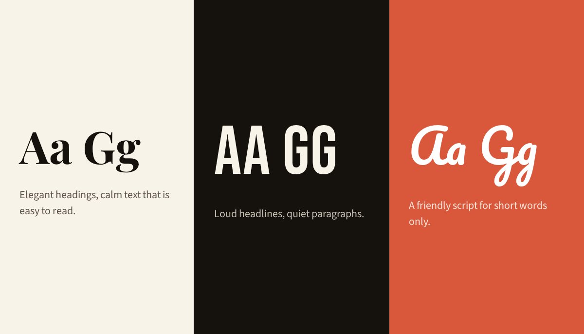
The classic. Playfair Display’s high-contrast strokes feel editorial and elegant, and Source Sans 3 keeps long text calm and easy to read. Good for: Magazines, restaurants, fashion and lifestyle brands. Try Playfair Display + Source Sans 3 on a sample site.
DM Serif Display + DM Sans
Two fonts from the same family, so the proportions match without effort. The serif adds warmth to headings; the sans keeps everything else clean. Good for: Startups, studios and portfolios that want a friendly, polished look. Try DM Serif Display + DM Sans on a sample site.
Montserrat + Merriweather
A turn on the usual rule: a geometric sans for headings and a sturdy serif for text. Merriweather was drawn for reading on screens, so it holds up at small sizes. Good for: Blogs, nonprofits and anything with a lot of reading. Try Montserrat + Merriweather on a sample site.
Bebas Neue + Open Sans
Bebas Neue is tall, all-capitals and loud. Open Sans is about as neutral as fonts get. Together they shout the headline and then get out of the way. Good for: Sport, events, gyms and bold product launches. Try Bebas Neue + Open Sans on a sample site.
Fraunces + Inter
Fraunces is a soft, slightly old-fashioned serif with lots of personality; Inter is the modern interface font. The mix feels warm but current. Good for: Food and drink, wellness and creative agencies. Try Fraunces + Inter on a sample site.
Cormorant Garamond + Lato
Cormorant is delicate and high-end, best kept large. Lato’s rounded details stop the pairing from feeling cold. Good for: Weddings, jewellery, beauty and boutique hotels. Try Cormorant Garamond + Lato on a sample site.
Oswald + Roboto
Oswald is a condensed sans that fits long headlines in narrow spaces; Roboto is its no-nonsense partner. Practical, strong and easy to read on phones. Good for: News, tech, industrial and service businesses. Try Oswald + Roboto on a sample site.
Instrument Serif + Work Sans
A slim, condensed serif with a contemporary feel over a friendly grotesque. It is the pairing this site uses for its headlines. Good for: Journals, design studios and editorial sites. Try Instrument Serif + Work Sans on a sample site.
Pacifico + Nunito
Pacifico is a casual brush script with a surf-shop feel. Nunito’s rounded letters match its friendliness. Use the script only for short headings or a logo. Good for: Cafés, ice cream, kids’ brands and summer events. Try Pacifico + Nunito on a sample site.
Abril Fatface + Lora
Abril Fatface is a heavy, poster-style serif that loves big sizes. Lora is a gentler serif for text, so the page feels bookish rather than shouty. Good for: Bookshops, publishers, bakeries and vintage brands. Try Abril Fatface + Lora on a sample site.
Space Mono + IBM Plex Mono
Two monospaced fonts for a deliberately technical look. Space Mono has quirky, geometric details; Plex Mono is calmer for longer text. Good for: Developer tools, tech blogs and portfolios. Try Space Mono + IBM Plex Mono on a sample site.
Poppins (bold and regular)
One family, two weights. Poppins is geometric and friendly, and using one font keeps the design tidy and the page fast. Good for: Apps, small businesses and anyone who wants simple and safe. Try Poppins on a sample site.
Tips for Using Fonts on Your Website
Keep body text at 16px or larger, with a line height around 1.5 and lines no wider than about 75 characters. Load only the weights you use: regular and bold are usually enough, and every extra weight slows the page down. Save script and display fonts for headings, buttons and logos, never paragraphs. And check your text colour against its background in our contrast checker: a beautiful font in pale grey is still hard to read.
Fonts for Your Logo
A good heading font often makes a good wordmark too. Bold serifs like Abril Fatface and DM Serif Display feel established; condensed sans serifs like Bebas Neue feel modern and strong; scripts like Pacifico feel personal. Try your brand name in all 100 fonts on our website fonts page, then turn it into a logo in the free logo maker.