Logo Design That Works on Every Screen

Georges Vuitton drew the LV monogram in 1896 to stop people copying his father’s trunks. More than a century later the same pattern works on a luggage tag, a billboard and a 16-pixel browser icon, which is a better result than most logos designed last year can claim. That range is now the basic requirement. A logo today might appear on a smartwatch face, a Times Square screen and an app icon in the same week, and it has to be recognizable at the size of a postage stamp and the size of a football field. Louis Vuitton is a useful guide to how that is done, alongside a handful of other marks that get it right, from Nike’s swoosh to FedEx’s arrow.
From Cave Walls to Screens
Marking identity with a symbol is very old. Egyptian hieroglyphs and medieval guild crests did the job long before anyone said “brand.” What has changed is the number of places a mark has to live. Old logos were carved, painted or stitched once and stayed put. Modern ones have to adapt to whatever screen they land on.
The Louis Vuitton monogram shows how a mark can make that jump. Georges Vuitton designed it in 1896 in honor of his father, and it was partly an anti-counterfeiting measure: a pattern of initials, floral motifs and precise geometry that was hard to fake and clearly signaled luxury. A logo is a brand’s first impression, and this one has made a firm impression for well over a century.
What makes it work across devices is its modularity. The full pattern works on a trunk, a single flower or the LV initials alone work on a favicon, and the parts are recognizable separately. Now that a logo might appear on a folding phone or in an augmented reality headset, that is the lesson: design a core that can be pared down or expanded without losing its character.
Color That Survives the Screen
Color is often what people remember first, and it is also the part of a logo that screens treat worst. Louis Vuitton keeps to a restrained palette of earthy golds, deep browns and clean monochrome, which signals heritage and exclusivity. Color speaks for a brand before anything else does. But a bright red that looks fine on a laptop can turn muddy maroon on a phone in direct sunlight, so color choices for a cross-device logo have to be technical as well as emotional.
The usual associations still apply. Red suggests passion (Coca-Cola), blue suggests trust (IBM), green suggests sustainability (Whole Foods). Beyond that, simplicity matters most. High-contrast, web-safe colors like Mastercard’s two circles stay clear on any display.
In practice, test your palette in HEX and RGB, in light mode and dark mode, and avoid gradients that smear on a small watch screen. Louis Vuitton’s colors work because they are consistent and simple enough to reproduce on a leather trunk and in an Instagram story. Check accessibility too: make sure your contrast ratios meet WCAG standards so the logo is legible for everyone.
Type, Pattern and Negative Space
If color is a logo’s skin, type and pattern are its bones. The LV monogram balances decoration with discipline: interlocking L and V, floral details, all held in a strict geometric arrangement. Type in a logo needs the same discipline. Ornate scripts fall apart at small sizes, while bold sans-serifs such as Helvetica or Futura scale with no trouble. Good typography goes unnoticed, and the logo is remembered anyway.
For screens, clean lines and negative space do a lot of work. FedEx’s hidden arrow and Apple’s single bite are the standard examples. Before you commit to a design, look at it at 16×16 pixels and on a 4K billboard mockup. AI tools make this kind of quick prototyping easy, and many will let you export files without a watermark.
Louis Vuitton’s repeating pattern is a model for versatility. It looks just as right as a discreet emboss as it does printed across an entire bag. Simplicity is not a compromise. It is what lets a logo travel.
What the Monogram Encodes
Good logos carry a story, and the LV monogram carries several. Its floral motifs are often linked to Japanese design influences of the period, and the initials tie it to the Vuitton family. That meaning is a psychological hook as well as decoration. A logo is powerful for what it suggests as much as for what it shows.
Other examples are easy to find. Nike’s swoosh suggests movement. Twitter’s bird, before the switch to X, suggested freedom. Tesla’s T signals innovation and Rolex’s crown signals tradition. Your logo should hint at what your brand values.
AI tools can help you try many versions of a symbol quickly, but understanding your own brand’s story is a human job. Test the meaning across cultures as well. Louis Vuitton’s monogram reads well almost everywhere, which is part of why it has been able to go global without friction.
Timeless Over Trendy
Trends are tempting and dangerous. The LV monogram is well over a hundred years old and has avoided fashion by being restrained. Its clean lines and balanced proportions have a lot in common with later Bauhaus principles, and it looked right on a 1920s steamer trunk and looks right on a 2025 smartwatch. Timelessness usually comes from removing things, not adding them.
Avoid effects that age quickly: neon glows, 3D bevels, whatever filter is popular this year. Look instead at the clarity of Shell’s pecten or Chanel’s interlocking Cs. Some AI tools can show your design in retro and futuristic settings, which is a quick way to see whether it is likely to date. The LV monogram has lasted because it never tried to do too much.
Logos and Cultural Moments
Logos mark eras as well as products. The LV monogram has turned up in fashion history from Belle Époque travel to hip-hop’s love of luxury, and on Takashi Murakami’s colorful bags and Louis Vuitton’s collaboration with Supreme. A logo can become a cultural artifact that captures its moment.
For designers, this means thinking about context. Your logo should connect with what your audience cares about, whether that is sustainability for younger buyers or exclusivity for wealthy ones. Try it in real settings: on packaging, in social posts and in AR filters.
Louis Vuitton’s monogram manages to be both aspirational and personal. It is a status symbol people still feel attached to. That is a high bar, but it is the right one to aim at.
Knockoffs and Protection
Louis Vuitton’s monogram has had to fight. Counterfeits flood markets and wear away its exclusivity, and globally sold designs attract scrutiny for cultural appropriation. A logo is tested in the real world, not on the drawing board.
The practical response is to protect your mark legally and culturally. Register your trademark early, and make sure your design is respectful to the audiences you are reaching. Some AI tools can search for similar existing logos, which helps you avoid accidental overlaps. Louis Vuitton’s anti-counterfeit work, from holograms to lawsuits, shows how much effort protecting a famous mark takes. Your logo needs to be distinctive enough to stand alone and robust enough to survive imitation.
The Logo as a Business Asset
A logo is a financial asset as much as a design. Louis Vuitton’s parent company, LVMH, reached a market value of more than $400 billion in 2023, and the monogram is the jewel of its portfolio. Strong logos build brand equity, and equity shows up in the share price.
At a smaller scale, a recognizable logo increases trust and helps sales across channels. You can even measure it, with A/B tests on your shop or in social ads. The LV monogram allows Louis Vuitton to charge premium prices, which is about as clear an example as exists of a logo acting as a salesperson.
Consistency
Brand identity depends on consistency, and Louis Vuitton never wavers. The monogram is the same whether it is embossed on leather or shown in a digital ad. Inconsistency confuses people and erodes the recognition a brand has worked for.
The tool for consistency is a style guide: HEX codes, font specifications, size ratios and spacing rules. Test your logo at every touchpoint, from app icons and business cards to VR interfaces, and fix anything that drifts. Some AI tools will mock up these contexts for you. A logo should feel like a familiar friend, not a stranger who looks a bit different every time.
Saying Things Without Words
A logo communicates a brand’s values without a tagline. Louis Vuitton’s monogram conveys sophistication and heritage with no explanation, and it says all that before anyone has read a word. The job for any designer is building a visual language that fits the brand’s mission.
Shapes help: circles suggest community (Starbucks), triangles suggest ambition (Adidas). AI tools can suggest motifs, but refining the message is your work. A simple test is to show the logo to strangers and ask what it makes them think of. Louis Vuitton’s monogram is a good example of how a logo can say more than words.
Logos on Social Media
Logos are now social media material. The LV monogram is all over Instagram under hashtags like #LVLove, and online visibility has become a kind of billboard in its own right.
Design with sharing in mind. Make sure the logo works in square posts and circular Story frames, and check that it is still legible as a low-resolution thumbnail. Some tools will generate favicon-sized versions for you. The LV monogram does well online because it is recognizable even at 100×100 pixels, and that is the standard to test against.
Technology and AI
Technology has changed how logos get made. AI logo generators, once clumsy, now offer real help with prototyping and testing. They can show how a logo performs at different resolutions and suggest changes to clarity or contrast. Louis Vuitton’s monogram was drawn by hand, but even a mark like that could benefit from software that shows it on a foldable phone or through AR glasses.
For logo makers, these tools save time, and the better ones produce watermark-free designs that compete with custom work. Use them to iterate faster, and let your own judgment make the final call. AI is a good co-pilot and a poor pilot.
If Louis Vuitton Used an AI Logo Generator
Imagine Louis Vuitton’s design team in Paris typing “luxury, heritage, monogram” into an AI logo generator. The tool would produce variations on the LV motif: perhaps a minimal L-only icon for smartwatches, perhaps a heavy gold-embossed version for billboards. The team could prototype endlessly, testing each version on virtual handbags and digital ads, and failing fast at no cost.
Louis Vuitton would almost certainly refine any AI output by hand to keep the character of the monogram. This is speculation, but it shows what these tools are good for: a sandbox for bold ideas, even at a luxury house.
A Checklist for Screen-Ready Logos
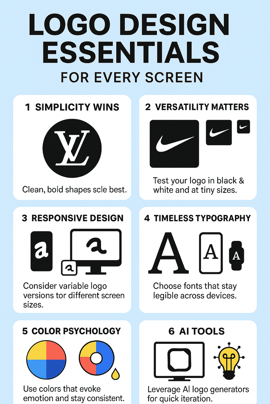
- Define your brand’s core. Write three words that describe it, such as “bold, inventive, trustworthy,” and use them as your brief.
- Keep it simple. Aim for a design that is legible at 16×16 pixels. Try negative space and bold shapes, as FedEx does with its arrow.
- Choose colors carefully. Stick to two or three high-contrast, web-safe colors, and record their HEX codes.
- Test the type. Sans-serifs usually scale better. Avoid scripts that blur at small sizes.
- Prototype quickly. Use an AI tool to try many designs, and mock each one up on a phone, a billboard and a favicon.
- Make it responsive. Create modular versions: full logo, icon only and monochrome.
- Get feedback. Show the logo to a range of people and ask whether it tells your brand’s story.
- Protect it. Register the trademark and write a style guide so it stays consistent.
Design comes down to making choices and sticking with them. Choose with conviction, test thoroughly, and a logo built this way will hold up on screens that have not been invented yet.