The Pepsi Logo: From Brad’s Drink to the 2023 Globe
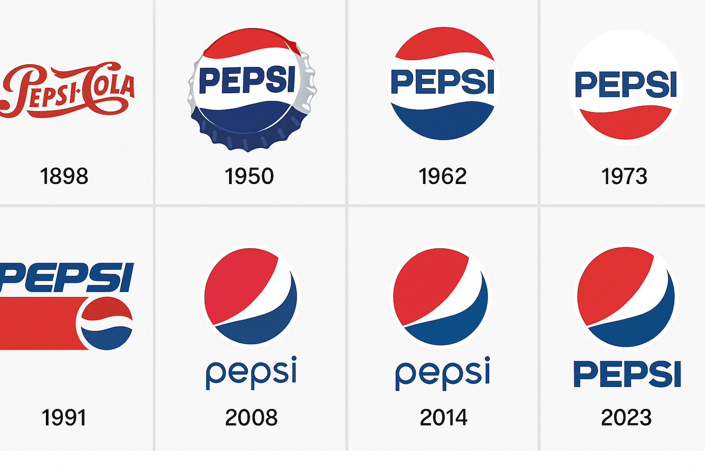
Pepsi began in 1898 as “Brad’s Drink,” a digestive aid mixed by Caleb Bradham in a North Carolina pharmacy, and its first logo looked like something from the apothecary shelf. Over the next century the name went from spidery script to a bottle cap, a globe and a much-mocked “smile,” and in 2023 it came back to bold capitals in the middle of the globe. Few brands have redesigned as often, and few have had as many hits and misses. That makes Pepsi’s logo history one of the most useful in branding, because you can see what worked and what did not.
An Apothecary Label
By 1903 Bradham’s drink had been renamed Pepsi-Cola, and the first proper logo was a swirling, hand-drawn script with plenty of Victorian charm. It was less a logo than a fancy pharmacy label, but it started more than a century of reinvention. A logo’s first job is to identify, and Pepsi’s early marks identified a feisty newcomer that wanted to take on Coca-Cola.
In the 1940s the logo got a patriotic makeover: a bottle cap in red, white and blue. That was strategy as much as style. With the Second World War under way, Pepsi tied itself to American optimism. The best logos tell a story that fits their moment, and the bottle cap did exactly that.
Red, White and Blue
The colors carry much of the brand’s personality. The red, white and blue palette nods to the Stars and Stripes, but it also works on a basic psychological level. Red suggests excitement and appetite, the vending-machine impulse. Blue reads as trustworthy and cool, like a cold can on a hot day. White is the clean background that holds the other two together.
Color is usually the first thing people notice about a logo and one of the last things they forget. The 2023 redesign leaned into that with bolder blues and a punchier red to signal youthful energy. The lesson is to pick colors that do more than stand out. They should make people feel something specific.
Type and the Globe
Pepsi’s lettering has changed with the culture. The ornate script of the 1900s gave way in the 1960s to a minimal all-caps “PEPSI” that suited the clean, modernist style of the time. By the 2000s the logo had moved toward curves and gradients, in step with the fluid look of early digital design. Today it uses a sleek sans-serif.
The globe, with its red, white and blue bands, is the most valuable part of the identity. It is simple but lively, a visual metaphor for a world joined by a cold drink. The lesson is to balance simplicity with personality. Software can help you try fonts and shapes quickly, but the idea still has to come from you.
What the Swirl Means
For Pepsi, the swirl is everything. The globe was introduced in the 1950s and refined over the decades, and it stands for universality: Pepsi is everywhere, from Times Square to Timbuktu. The 2023 version reshapes the swirl so it feels more like a pulse, electric and alive and suited to Gen Z’s TikTok feeds.
A logo can work as a flag, a signature and a coat of arms all at once, and Pepsi’s swirl manages all three as shorthand for fun and freedom. When you design your own, think about what it means. Is it a shield, a spark or a story?
That globe now has to cover a lot of products. PepsiCo sells a wide range of drinks beyond classic Pepsi, including Pepsi Wild Cherry, Pepsi Mango and Nitro Pepsi, along with Diet Pepsi and Pepsi Zero Sugar. The portfolio stretches to Mountain Dew, Gatorade, Tropicana juices and Aquafina water, which gives a sense of how far the company’s reach extends across the drinks market.
Changing Without Losing Itself
Pepsi’s logo changes with each decade and still looks like Pepsi. The 2023 redesign, with bold, retro-style type and an energized globe, manages to feel nostalgic and futuristic at once. It is modernism with a wink, and it shows that a logo can evolve a long way without losing its character.
The lesson is to anchor every version in one core idea. You can iterate endlessly now, but iteration only helps if the thing being iterated is clear. Whether it is a soda or a startup, your logo should feel like it could last a century.
The Logo in Pop Culture
Pepsi has always sold attitude along with soda. From Michael Jackson’s ads in the 1980s to the cans at Beyoncé’s halftime show, the logo has been a pop culture fixture and a badge of cool across generations. Its history runs through moments that defined their eras, from Woodstock to the Super Bowl.
For logo designers, the point is that a logo carries a mood as well as a name. Think about how your brand will live in the world. Will it appear in Instagram Reels? Will people make fan art of it? Pepsi’s logo has done both.
The $1 Million Redesign
Pepsi has also had its embarrassments. In 2008 it reportedly spent $1 million on a redesign that critics mocked as a cross between a smiley face and a yin-yang. A 27-page “brand manifesto” made things worse, with grand claims about gravitational fields and Renaissance proportions. Twitter, now X, piled on, and the logo became a standard warning about overthinking design.
Pepsi recovered, which shows that a logo can survive a misstep when the brand behind it is strong. The lesson is to keep things simple. If a clean design will do the job, you do not need a cosmic theory to justify it.
Branding and the Bottom Line
PepsiCo’s growth is partly a branding story. Since the 1980s, when the logo became a global icon, the company’s market value has risen enormously. The logo is a business asset that drives recognition and loyalty, and in 2023 PepsiCo’s revenue reached $91 billion, helped by decades of consistent branding.
For anyone starting a business, that is a reminder that a logo is an investment. A professional design can cost very little now, but what it does for the business over the years can be worth far more.
The competition is fierce. Coca-Cola’s lineup includes Sprite, Fanta and Powerade, and energy drinks such as Red Bull and Monster have taken market share from Pepsi. Dr Pepper, with its distinctive flavors, and health-focused options like Nestlé’s Pure Life water compete with Pepsi in other parts of the market.
Consistency Through Redesigns
For all its redesigns, Pepsi has kept the essentials: red, white and blue and the globe. That continuity builds trust and makes the brand instantly recognizable. A brand is a promise that has to be kept, and Pepsi keeps it on every can, billboard and post.
Consistency should come first for anyone designing a logo. It has to hold together across business cards and websites, so settle on a few templates and use them every time.
Lessons From Pepsi
Pepsi has three clear lessons. Let your logo grow with your brand. Choose colors and shapes for how they feel, not just how they look. And keep it versatile, because Pepsi’s logo has to work on cans, jerseys and stadium screens.
Keep adjusting a design until it is right, and keep the tools simple. Study Pepsi’s best versions and its worst, and you will learn a good deal about what makes a logo stick.
A Logo That Speaks
The logo communicates without words. The bold colors say fun, the swirl says global and the type says now. That language is deliberate and built to work across cultures. Think beyond looks and ask what your own logo says.
Different brands need different vocabularies. A tech startup might lean on sharp angles and a bakery on soft curves. Pepsi’s visual language is universal, but yours should belong to you.
Pepsi on Social Media
Pepsi’s logo does well online. #PepsiChallenge, #PepsiHalftime and #NewPepsiLogo all pushed it further, and the 2023 redesign set off a wave of posts on X from fans who liked its retro feel. The lesson is to design with sharing in mind.
If you want to create a logo that works online, check it at social media sizes before anything else. Tools such as Hatchful prepare designs for social platforms so they stay crisp everywhere.
Technology and AI
Pepsi’s logo history tracks changes in technology. The 2008 redesign used digital gradients, and the 2023 logo leans on 3D effects. AI is the next step, and AI logo generators such as Looka, Canva and Semplr have made professional-looking design available to anyone, suggesting layouts, colors and fonts in seconds.
For small businesses this saves time and can spark ideas, though it does not replace knowing what you want. As a thought experiment, imagine Pepsi’s own team trying one: they might type in “bold, global, youthful” and get back swirly red, white and blue concepts, perhaps a globe that pulses like a heartbeat or a neon-style font aimed at Gen Z. A tool like that could help a big brand test ideas faster before committing, and it can do the same for anyone with a clear vision.
How to Make a Logo With AI
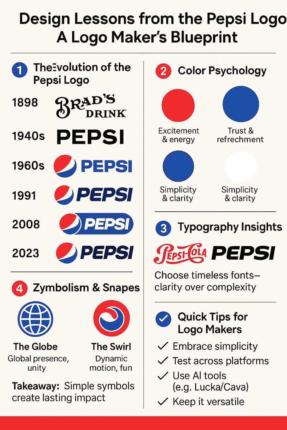
If you want to try it, these are the basic steps:
- Choose a tool. Pick one that is easy to use and gives you watermark-free files.
- Define your brand. Are you playful like Pepsi or sleek like Apple? Give the tool those traits.
- Experiment with color. Use Pepsi’s red, white and blue as a model of colors chosen for feeling, and test palettes that fit your brand.
- Keep it simple. Pepsi’s globe works because it is clean, so avoid clutter.
- Test versatility. Make sure the logo works on business cards, websites and social media.
- Iterate. Try different fonts, shapes and layouts until it feels right.
What Pepsi’s Logo Teaches
Pepsi’s logo history is a long run of experiments. The bottle cap and the 1960s capitals were strong. The 2008 “smile” was weak, and the company spent more than a decade living it down before the 2023 version went back to bold lettering inside the globe. The parts that survived every redesign, the three colors and the round globe, are the ones that matter. Find the equivalent parts of your own brand early and protect them, and you can afford to experiment with everything else.


