Benelli Simplifies Its Lion Emblem for a New Identity
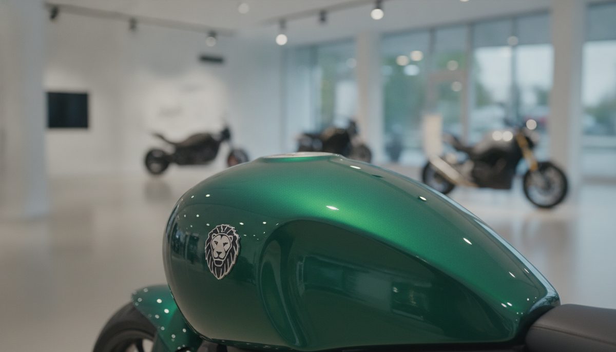
At EICMA in Milan, the Italian motorcycle maker showed a cleaner, one-colour version of its laurel, stars and lion emblem, and a lion that can now stand on its own.
Category
New logos and rebrands as they happen, what changed and what designers can learn from them, each checked against the brand’s announcement or the design press.
At EICMA in Milan, the Italian motorcycle maker showed a cleaner, one-colour version of its laurel, stars and lion emblem, and a lion that can now stand on its own.
The WNBA’s first champions are coming back in 2027, with logos that keep the old navy, red and silver but had to be new: league rules don’t allow an old primary logo to return.
Apple’s first redesign of Apple Music since 2015 drops the red, sets the name in lowercase, and gets its ripples from notes played into a pool of oil.
McLaren’s road cars and F1 team share one identity for the first time, with a wordmark based on the sign over Bruce McLaren’s family service station in Auckland.
Instagram changed its wordmark for the first time in a decade, mixing script and sans-serif letters. The app icon stayed the same, and the internet read it as “Instagzam”.