Instagram’s New Wordmark: Script Meets Sans After Ten Years
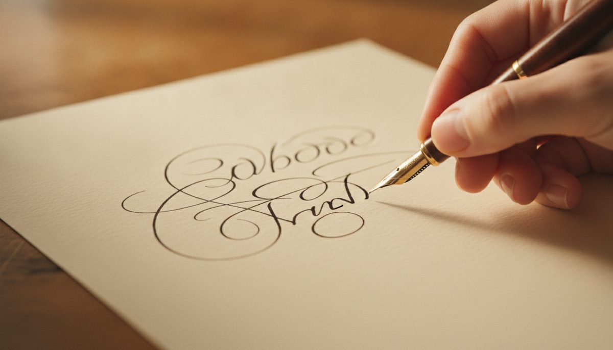
On 13 August 2026, Instagram head Adam Mosseri announced a new wordmark, the first change to the text logo at the top of the app in about ten years. “The wordmark at the top of the app hasn’t changed in 10 years, so it was time for a refresh,” he wrote, calling the new one “sharper and more modern”.
What changed
The old wordmark was fully cursive. The new one mixes the two: some letters keep script strokes and connections, such as the joined “n” and “s” and swooshes on the “r” and “g”, while the rest sit closer to a sans-serif. That brings Instagram nearer to the wordmarks of Facebook and Threads.
It was designed in-house. “Script reflects individuality, so referencing that felt right,” Instagram’s director of product design, Jasmine Probst, told TechCrunch. The brand system also adds new typefaces, a handwriting face called Instagram Pen and Instagram Mono, alongside the existing Instagram Sans.
The camera icon and app icon did not change, and the rainbow gradient stays, used more sparingly.
The “Instagzam” problem
Within hours many people read the new “r” against the “g” as a “z”, and other brands joined in the jokes. It is a reminder that a wordmark has to be read before it can be admired: script letters that touch can form shapes nobody intended. Test a wordmark at small sizes and on people who have never seen it.