The Michelin Logo: How a Stack of Tyres Became Bibendum
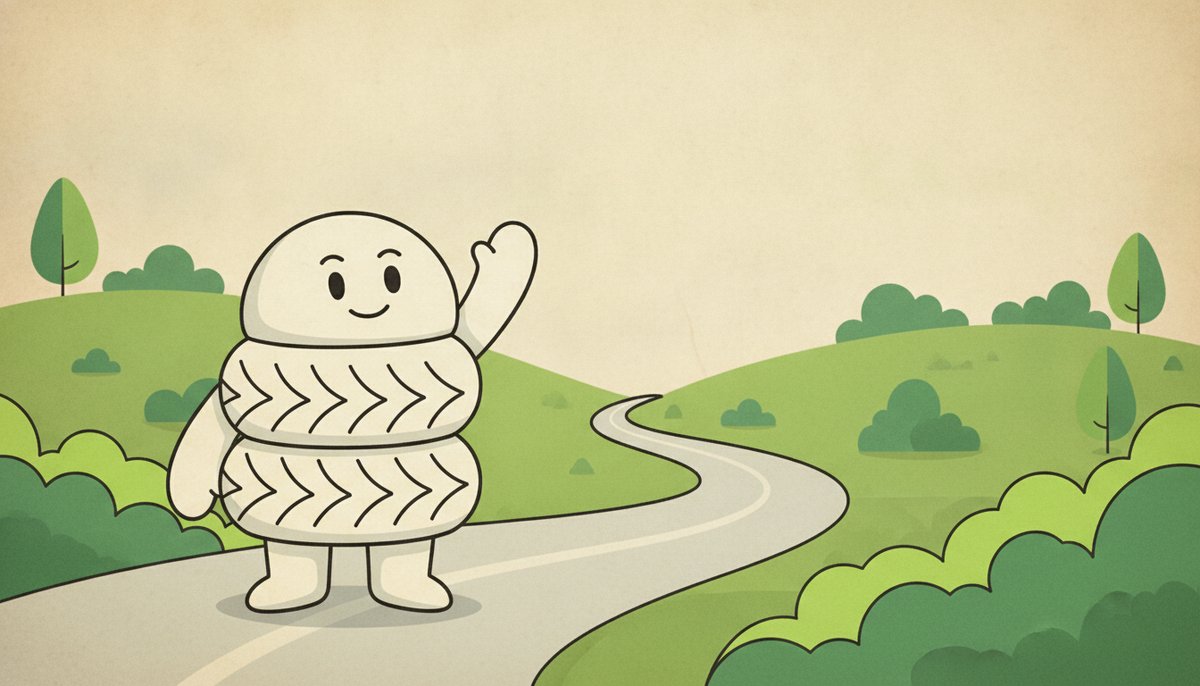
Few logos have a face, and fewer still have a name. Michelin’s has both: Bibendum, the round white figure built from tyres, who has stood for the company since 1898.
He is one of the oldest brand mascots still in use, and his story shows how a character can do work that a wordmark alone cannot.
Two Brothers and a Pile of Tyres
André and Édouard Michelin took over a family rubber business in Clermont-Ferrand, France, and founded Michelin in 1889. They made bicycle tyres first, then tyres for the new motor cars.
At a trade fair in Lyon in 1894, Édouard looked at a stack of tyres of different sizes on the company’s stand and remarked that, with arms, it would make a man. The idea stayed with the brothers.
Nunc Est Bibendum, 1898
A few years later the poster artist Marius Rossillon, who signed his work O’Galop, showed André a design he had drawn for a brewery: a large figure raising a glass under the Latin line “Nunc est bibendum”, “now is the time to drink”, from the poet Horace.
The brewery had turned it down. André saw the tyre man in it. In O’Galop’s 1898 poster for Michelin, the figure made of tyres raises a glass full of nails and broken glass, with the message that a Michelin tyre “drinks up obstacles”. People started calling the character Bibendum after the slogan, and the name stuck.
Why He Is White
Early tyres were a pale grey-white colour, because the black of modern tyres comes from carbon black, which manufacturers only began adding in the 1910s to make rubber last longer. Bibendum kept his white body even after tyres turned black.
That choice is a quiet lesson in itself. A mascot does not have to stay a literal picture of the product. Once people know the character, his colour and shape belong to the brand, not to the tyre.
A Mascot That Kept Changing Shape
The first Bibendum wore a pince-nez and smoked a cigar, a portrait of a well-off motorist of the 1890s. Over the decades he lost the cigar and the glasses, became rounder and friendlier, and was redrawn with fewer, simpler rings so he would read well on small labels and screens.
More recent drawings show him in motion, waving, running or giving a thumbs up, rather than standing stiffly. He also travels far beyond tyres: the Michelin Guide, started in 1900 to encourage drivers to make longer journeys, carries his name to restaurants around the world.
Michelin’s wordmark, in bold italic capitals on a blue background, usually sits beside him, but it is Bibendum people remember. You can see the current mark on our Michelin logo page.
What to Take From Michelin
Bibendum shows that a mascot can turn a technical product into something people feel warmly about, that a character built from your own product is easy to remember, and that he can be simplified many times without losing who he is. KFC took a similar route with the Colonel’s face. If you are designing your own mark, try sketching a simple character in our free logo maker and see whether it says more than the name on its own.