The Burger King Logo: Why the Bun Came Back
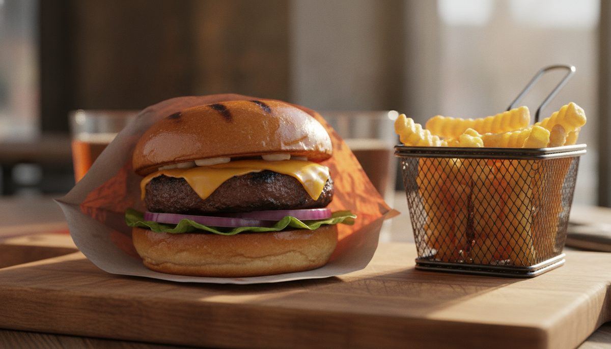
Burger King spent more than twenty years with a shiny blue swoosh wrapped around its burger, then threw it away for a flat logo it had first used in 1969. It turned out to be one of the most praised rebrands of its time.
Its history is a good reminder that the newest-looking logo is not always the best one, and that a brand’s old marks can be worth more than a fresh start.
Insta-Burger King and the Sitting King
The chain began in Jacksonville, Florida, in 1953 as Insta-Burger King, named after its Insta-Broiler oven. In 1954 franchisees James McLamore and David Edgerton took it over in Miami and shortened the name to Burger King.
Early signs used a cartoon king, often shown sitting on a burger with a drink in his hand. He was friendly and fun, but too detailed to work well on a cup or a small sign, and he said “king” more clearly than he said “burger”.
The Bun Halves, 1969
In 1969 Burger King introduced the logo most people remember: the name in thick, rounded red letters sandwiched between two orange bun halves. The wordmark was literally the filling of the burger.
This is the real design lesson. The logo was the product. It used two simple shapes and two warm colours, it needed no explanation, and it looked as good on a paper bag as on a roadside sign. The design was tidied up in 1994 but kept the same idea.
The Blue Swoosh, 1999
In 1999 Burger King added a blue crescent swoosh around the burger, tilted the whole thing and gave it a glossy, three-dimensional finish. It matched the fashion of the time for shine, movement and gradients.
Blue is a strange colour for food, and the swoosh made the logo busier without adding meaning. As the years passed it looked more and more like a relic of its era rather than a timeless mark.
Back to the Bun, 2021
In 2021 Burger King launched a new identity designed by Jones Knowles Ritchie. It dropped the swoosh and went back to a flat version of the 1969 bun halves, with a custom chunky typeface called Flame and a palette of reds, oranges and browns inspired by flame grilling. Packaging, uniforms and restaurants were redesigned to match.
It worked because the brand already owned that shape. People remembered the bun, and bringing it back felt confident and warm rather than old-fashioned. Rivals have done similar things: McDonald’s kept its arches simple for decades, and Wendy’s also chose a flatter, friendlier look.
What to Take From the Bun
Burger King shows that a logo built from the product itself is hard to beat, that effects which look modern today can date quickly, and that your own archive may already hold your best logo. You can sketch ideas quickly in our free logo maker and try a mark made from one or two simple shapes that echo what you sell.