The Nintendo Logo: From Playing Cards to the Red Pill
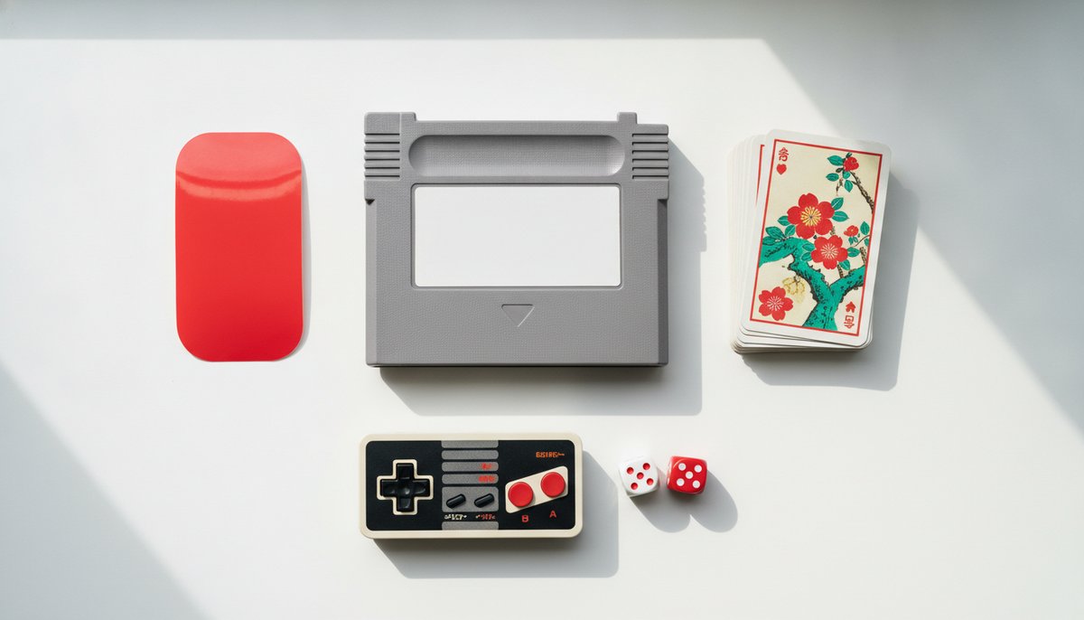
Nintendo was making playing cards in Kyoto for almost eighty years before it made a video game. Its logo, a word inside a red rounded outline, is simple enough to sit on everything the company has made since, from toys to consoles to theme parks.
It is also a lesson in colour. For a few years Nintendo turned its logo grey, then brought the red back, and the change says a lot about what a brand colour is for.
Cards in Kyoto
Fusajiro Yamauchi founded the company in 1889 to make hanafuda, Japanese flower cards with bright painted designs for each month of the year. The name is usually translated as something like “leave luck to heaven”, a fair motto for a card company, though historians still argue about the exact meaning.
For decades the company’s marks were the kind found on card boxes: traditional seals and lettering, often with the founder’s family name. They were there to show who made the cards, not to be remembered on their own.
Toys, Then Games
In the 1960s Nintendo tried all kinds of businesses, from taxis to instant rice, before toys took off. Engineer Gunpei Yokoi’s extending grabber, the Ultra Hand, was a hit in 1966, and electronic toys and arcade machines followed. A company now selling to children around the world needed a mark that worked in any language.
The answer was the logo still used today: the word Nintendo in a bold, rounded typeface, set inside a rounded outline often described as a racetrack or a pill. It appeared through the 1970s and became famous on the Famicom in Japan and the NES in America and Europe in the 1980s, usually printed in red.
Why the Outline Works
The rounded border does a lot. It gives a long word a solid shape, so the logo reads as one object rather than eight letters. It can be printed in one colour, cut out of white or embossed into grey plastic, and it still looks the same. On a game cartridge it fit neatly on a label edge; on a console it could be moulded straight into the case.
Rounded corners also feel friendly, which matters for a brand selling play. Compare it with the sharp, technical marks of the PlayStation and Xbox: both are aimed at a slightly older, cooler audience, and their shapes say so.
Grey, Then Red Again
In the mid-2000s, around the launch of the Wii, Nintendo’s logo turned silver-grey to match the clean white hardware of the time. It looked modern but it lost the warmth of the old red, and on a crowded shelf grey is easy to miss.
In 2016, ahead of the Switch, Nintendo brought back red as its main brand colour, with the logo in a solid red shape and white letters. The Switch itself launched with bright red and blue controllers. The colour came back because it was doing a job: red is how many people recognised Nintendo at a glance, from the box art of the 1980s onwards.
A Logo That Lets Characters Speak
Nintendo’s logo is plain on purpose. The company’s real faces are its characters, Mario, Link, Pikachu and the rest, and the logo stays out of their way. It signs the work rather than competing with it, much like the Disney logo does for its films.
What to Take From Nintendo
Nintendo shows that a simple outline can turn a long name into one memorable shape, that a brand colour earns its place by being recognised and should not be dropped for fashion, and that a logo can stay quiet when the products are the stars. If your business has strong products or characters, give it a plain mark that signs them. You can try ideas in our free logo maker and check how they look in one colour on a small label.