The Lacoste Logo: How a Tennis Nickname Became a Crocodile
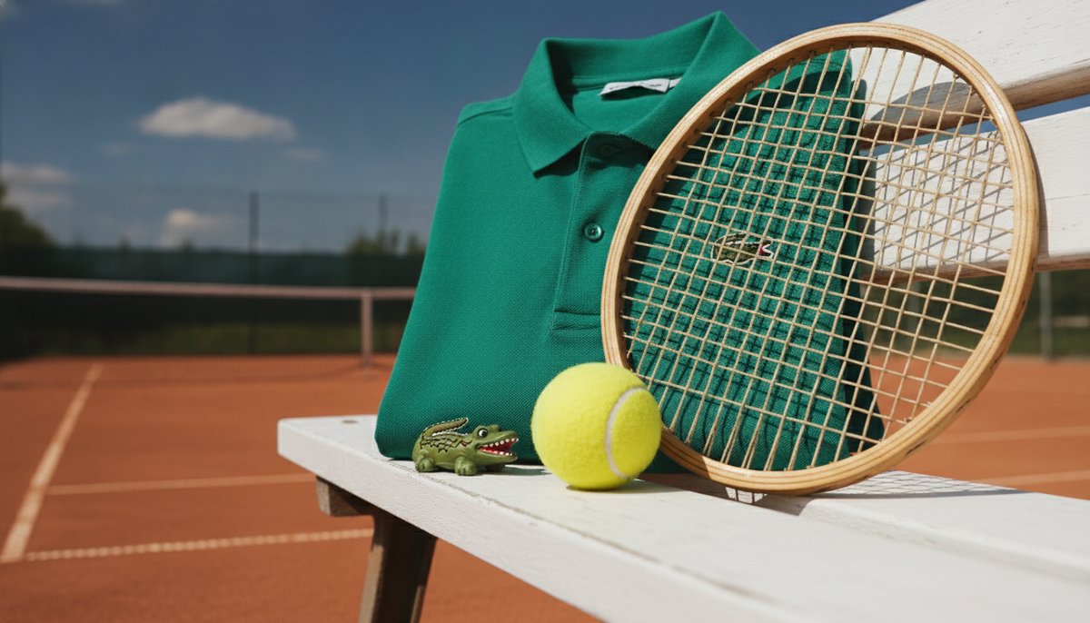
The green crocodile on a Lacoste shirt started as a joke about a suitcase. It ended up as one of the first logos anyone wore on the outside of their clothes, long before a chest badge was the normal thing for a brand to have.
It is also a good example of a logo that came from a person rather than a product. The crocodile was a nickname first and a brand second, and that is why it has always felt like it belongs on the shirt.
A Bet and a Nickname
René Lacoste was one of the French “Four Musketeers” who dominated tennis in the late 1920s. The story goes that in the mid-1920s, while travelling with the French Davis Cup team, he admired a crocodile-skin suitcase in a shop window, and the team captain promised it to him if he won an important match. The press picked up the story, and the nickname stuck: “the Alligator” in America, “le Crocodile” at home.
It suited him. Lacoste was known for being patient and hard to shake off on court, which made a reptile that waits and then bites a fair description of his game.
A Badge on a Blazer
His friend Robert George drew a crocodile for him, and Lacoste had it embroidered on the blazer he wore to matches. At this point it was a personal emblem, closer to a sports nickname on a team jacket than a trademark.
At the same time Lacoste was designing a better shirt. Tennis was then played in long-sleeved woven shirts; he wanted something short-sleeved, with a soft collar and a loose knit cotton that breathed. That shirt, in a cotton piqué, became the polo shirt we know today.
The Shirt, 1933
After retiring from tennis, Lacoste went into business with André Gillier, the owner of a large knitwear company, in 1933. They put his shirt into production and stitched the crocodile on the chest. A logo on the outside of a garment was unusual then. Most clothing labels were sewn inside the collar where nobody saw them.
This is the real design lesson. Putting the mark where everyone can see it turned each shirt into an advertisement, and turned wearing the shirt into a statement. Almost every sportswear brand since, from the Nike swoosh to the Puma cat, follows the same idea.
Drawing a Small Animal
A logo stitched in thread, a few centimetres wide, cannot carry much detail. Over the decades the crocodile has been redrawn many times: sometimes more cartoon-like, sometimes more realistic, with the scales, teeth and tail curl simplified or added back. Through all of it the basics stayed: green body, red open mouth, facing to the left, side on.
Those four things are the logo. Change the drawing style and people still see the Lacoste crocodile; change the colour or turn it round and it starts to look like a copy. If you are designing a mascot mark, work out which features are fixed and let the rest move.
Taking the Crocodile Off
In 2018 Lacoste ran a limited “Save Our Species” edition, swapping the crocodile on a run of polos for ten endangered animals, with the number of shirts for each species matching how many were thought to be left in the wild. The shirts sold out quickly.
Only a very well-known logo can do this. The campaign worked because everyone already knew what should be in that spot on the chest, so the missing crocodile was the message.
What to Take From the Crocodile
Lacoste shows that a logo with a real story behind it is easier to love, that where a mark appears can matter as much as how it looks, and that a simple animal side-on in one or two colours survives every redraw. If your brand has a nickname or a founder’s story, see if it can become a symbol. You can sketch ideas quickly in our free logo maker and check they still read when shrunk to the size of a stitched badge.