The Porsche Logo: A Crest Sketched for America
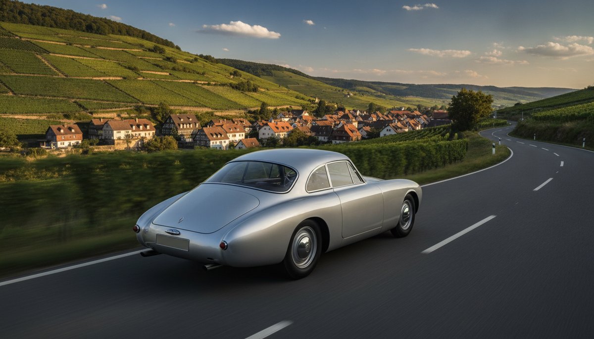
The first Porsche sports cars had no badge, only the name in metal letters on the bonnet. The crest arrived a few years later, because an importer in New York asked for one.
What came back is one of the busiest logos on any car: a shield with a horse, antlers, stripes and two words. It breaks most of the rules about keeping a logo simple, and it works anyway.
Name First
Ferdinand Porsche opened his design office in Stuttgart in 1931 and worked on many cars for other companies, including the Volkswagen Beetle. The first car sold under the Porsche name, the 356, followed in 1948, built by his son Ferry. It carried the word PORSCHE across the front and nothing more.
For a small maker that was enough. A name says who built the car. What it does not do is give owners something to collect, display or feel proud of, and that gap is what the crest filled.
A Request From New York
Max Hoffman, who imported European cars into the United States, told Ferry Porsche in the early 1950s that American buyers wanted a proper badge, the kind of coat of arms that made a car look like it came from somewhere. Porsche drew the first ideas, and the final design was worked up by the company’s engineers, with Franz Xaver Reimspiess often credited. It went onto the 356 from 1952, first on the steering wheel horn button and soon after on the bonnet.
So the crest was a marketing answer to a real market. It was designed for the customer it was meant to impress, and it did that job well.
Reading the Shield
Every part of the crest comes from home. The black rearing horse in the middle is from the coat of arms of Stuttgart, a city whose name is thought to come from a medieval horse stud farm. Around it, the red and black stripes and the deer antlers come from the arms of the old state of Württemberg. The word STUTTGART sits above the horse and PORSCHE runs across the top.
Porsche’s horse is often confused with the black horse on yellow used by Ferrari, but the two have separate origins: Ferrari’s comes from a First World War Italian pilot, Porsche’s from a German city seal. It is a reminder that common symbols are hard to own. A horse means speed and strength to everyone, which is useful, but you need the rest of the design to make it yours.
Small Changes, Many Times
The crest has been refined again and again since 1952, with the colours, the lettering and the shape of the horse tidied each time. The most recent update came in 2023, for 75 years of Porsche sports cars: brushed metal instead of polished gold, a cleaner horse, and a fine honeycomb texture in the red stripes. Set two versions side by side and you can see the changes; on a car going past, no one notices.
That is the way to update a famous logo. Owners of old cars and new ones can both point at the bonnet and see the same badge. Like the Volkswagen roundel and the Audi rings, its sister brands in the VW Group, it changes slowly enough to stay familiar.
Detail That Pays Its Way
A logo this detailed would be hard to use on a phone screen, and Porsche knows it. On small digital spaces it usually leans on the PORSCHE wordmark alone, and keeps the crest for the cars, the keys and the wheel caps, where it is seen up close and in metal. The detail rewards a close look, which suits a product that people spend a lot of time looking at.
What to Take From the Crest
Porsche shows that a logo can be built from the place a company comes from, that a name alone is fine until the customer asks for more, and that a detailed mark needs a simpler partner for small sizes. If your brand is proud of its home town, look at its coat of arms, colours and history for ideas. You can try them out in our free logo maker and check a simple version still works in one colour.