The Ferrari Logo: How a War Ace’s Horse Became a Badge
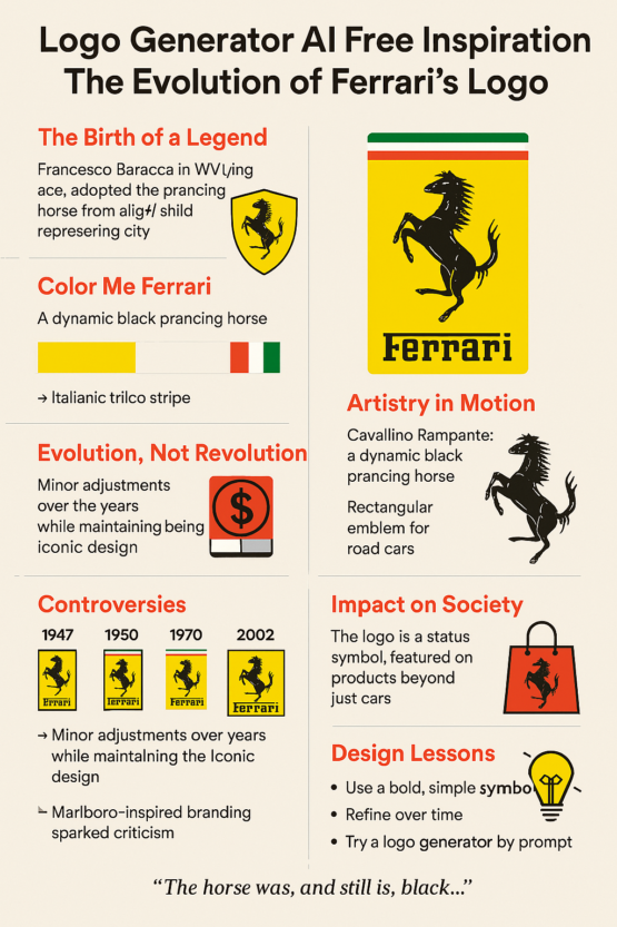
How a warplane emblem became a billion-dollar symbol, and what it can teach anyone designing a logo now.
A Horse From the Sky
Ferrari’s prancing horse was first painted on a fighter plane. It belonged to Francesco Baracca, Italy’s leading flying ace of World War I, and it reached Enzo Ferrari’s cars because Baracca’s mother suggested he use it for luck. A century later the black horse on its yellow shield is one of the most recognized badges in the world, standing for luxury, speed and Italy in roughly equal parts.
What makes it worth studying is how little it has changed. The horse has been redrawn and sharpened over the decades, but it has never been replaced, and Ferrari has never needed a rebrand.
From Fighter Plane to Racing Car
In 1923 Enzo Ferrari, then a young racing driver, met Countess Paolina Baracca, the mother of Francesco Baracca. Her son’s plane had carried a black prancing horse, the Cavallino Rampante, painted on its fuselage. The Countess urged Enzo to put it on his cars as a good luck charm.
Ferrari took her up on it and added his own touches: a canary yellow background for his hometown of Modena, and the Italian tricolor across the top. In 1929 the horse made its debut on the racing cars of Scuderia Ferrari. It was a tribute, and it was also a very smart piece of branding.
“The horse was, and still is, black, and I added the canary yellow background which is the color of Modena,” Enzo recalled.
There was no design software and no brief. The mark came from a story and a sense of what looked right, which is still the best starting point.

Yellow, Black and the Tricolor
The Ferrari palette is a neat case study in color psychology. The black horse reads as strength and control. The yellow is bold and cheerful and impossible to miss, which suits a brand that never wants to blend in. The green, white and red stripe roots it firmly in Italy.
- Black: power, mystery, elegance
- Yellow: optimism, energy, prestige
- Green, white and red: national identity, authenticity, pride
Interestingly, Ferrari red, the color most people associate with the cars, is not the main color of the badge at all. The logo gets its punch from yellow and black, a combination that works on a red car and on almost anything else.
Inside the Design
At the center is a rearing horse, front legs raised and tail high, a pose taken from heraldry, where it signals nobility and victory. It is a simple silhouette with a lot of energy in it. The main versions developed like this:
- 1929: Scuderia Ferrari uses a rounded badge with “SF” for Scuderia Ferrari.
- 1947: The first Ferrari road car carries a rectangular badge with the full “Ferrari” wordmark.
- 1994: The black outlines are sharpened and the horse refined for digital use.
- 2002: The horse is thickened for high-resolution printing and merchandise.
The pattern is refinement rather than reinvention. Ferrari kept the core and polished it. That is still the best model for anyone who already has a mark that people recognize.
Small, Deliberate Changes
Unlike brands that have gone through full rebrands (Pepsi being the usual example), Ferrari has never overhauled its logo. Changes have been slow and calculated, more like fine-tuning a car’s aerodynamics than designing a new one.
- 1970s: Occasional use of a black background for a darker, more mysterious look.
- 1981: Colors intensified to stand out on television and in print.
- 2002: A brighter yellow and a sleeker horse.
- 2020s: Flatter digital versions for apps and the web.
Call it a micro-upgrade approach. Each change solved a specific problem, such as how the badge looked on TV or on a phone screen, and nothing changed without a reason. Brands that want to modernize without losing their equity could do much worse than copy it.
Debates and a Tobacco Scandal
The horse has caused its share of arguments. Some claim it was inspired not by Baracca but by the coat of arms of Stuttgart, which also features a horse, and which inevitably invites comparison with the Porsche crest.
Then there was tobacco. In the 2000s Ferrari’s racing cars carried a subtle, barcode-like design that critics saw as hidden Marlboro branding, a way of getting around advertising bans. Ferrari eventually dropped it, but the episode became part of the story around the badge.
A Billion-Dollar Badge
When Ferrari went public in 2015 under the ticker RACE, its brand value rose sharply. In 2019 and 2020 Brand Finance named Ferrari the world’s strongest brand, in large part because of how widely the logo is recognized.
- Market capitalization: about $35–40 billion
- Brand recognition: 94% in luxury markets
- Logo equity: trusted worldwide as a symbol of luxury and performance
The point for any business is that a logo is not decoration. Over time it becomes equity, and in Ferrari’s case it is worth a great deal.
The Horse in Popular Culture
The prancing horse long ago escaped the car world:
- Films: Ferris Bueller’s Day Off, Ford v Ferrari
- Music: Frank Ocean’s “White Ferrari,” Kanye West’s “Famous”
- Fashion: everything from counterfeit T-shirts to official Ferrari streetwear
- Theme parks: Ferrari World in Abu Dhabi puts the logo everywhere, roller coasters included
That is what great logos do. They outgrow the product. Plenty of people who will never drive a Ferrari wear the horse on a cap.
Lessons From the Prancing Horse
- Start with emotion. The horse is not just an animal; it stands for speed, defiance and a war hero’s memory.
- Stay consistent. Ferrari does not reinvent the wheel; it polishes it.
- Let type support the symbol. The bold “Ferrari” wordmark balances the elegant horse.
- Know your colors. Yellow, black and the tricolor add up to instant recognition.
If you are briefing a designer, or a piece of software, words like “heritage,” “speed” and “elegance” describe what Ferrari’s badge does. The hard part is backing them with a real story, as Ferrari could.
What a Rearing Horse Means
In heraldry a rearing horse stands for victory, freedom, speed and courage. Ferrari did not invent any of those meanings. It borrowed them, along with the story of the pilot who flew under the horse, and it has spent a century reinforcing them on the track. Symbols that draw on an existing tradition start with a head start, which is part of why heraldic animals turn up in so many car badges.
From Hand-Painted to AI
Ferrari’s original badge was painted by hand. Now AI logo generators produce finished-looking marks in seconds, which gives startups and small businesses access to professional-looking branding they could not otherwise afford. A prompt like “strong animal symbol, Italian theme, luxury typography” or “black horse, yellow background, heritage styling” will get you something that looks the part.
What it will not get you is Baracca. The reason Ferrari’s badge carries weight is the history behind it, and that has to come from the brand, not the tool.
Hashtags, Memes and Merchandise
Social media has only spread the horse further. #FerrariLogo trends around car launches, #PrancingHorse collects fan art and tattoo tributes, and memes put the horse on everything from crypto to couture. AI image tools now churn out Ferrari-inspired mashups that the company’s own marketing department could never have anticipated.
From Modena to the Metaverse
From its beginnings in Modena, Ferrari has grown to more than 60 showrooms worldwide and a digital showroom in the metaverse. The horse now has to work glowing in a virtual garage as well as on an enamel badge, and logos in general increasingly have to move, animate and respond. Ferrari’s simple silhouette handles that well, because there is so little in it to break.
What the Horse Teaches
Ferrari’s logo started with a story, was refined with care, and has lasted through consistency. No tool can stand in for that history, but the method is open to anyone. A good logo should:
- tell a story,
- carry an emotion,
- stay true to the core identity.
Ferrari did not get there overnight. It took decades of small adjustments to a badge that was right from the start.
To start on your own, try Semplr’s AI logo generator at semplr.com.
For more on how color shapes branding, see our guide to logo psychology.


