Louis Vuitton Logo Evolution: From Trunks to Icon
The Louis Vuitton monogram was invented to stop people copying the company’s trunks. In 1896, four years after Louis Vuitton died, his son Georges covered the canvas in his father’s initials and a scattering of flowers so that fakes would be easy to spot. It is now the most counterfeited pattern in fashion, which is about as complete a reversal as a logo can go through, and the brand has grown richer through every stage of it.
How the Monogram Began
Louis Vuitton set up as a trunk maker in Paris in 1854, and his flat-topped, waterproof trunks quickly became popular with wealthy travelers. They also became popular with copyists. When he died in 1892, his son Georges took over the business and with it the problem of knockoffs.
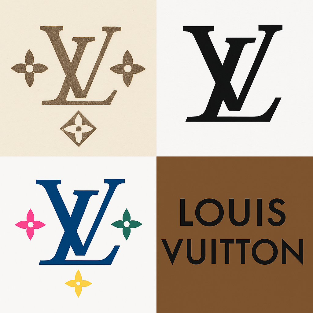
His answer, in 1896, was the monogram: an interlocking “L” and “V” surrounded by floral motifs, printed across the canvas. It was a practical defense against counterfeiters and a tribute to his father at the same time, and the design was intricate enough that copying it well took real effort. It is still the backbone of the brand.
Georges drew on the fashion of the time for Japanese art, which was very strong in late 19th-century Europe. That gave the monogram an elegance that has outlived the trend that inspired it, and it marked the company as one that intended to last.
The Colors
The original logo was black and white, about as plain as a mark can be. The Monogram Canvas introduced the beige-and-brown combination that most people now picture when they hear the name: earthy, rich and unmistakably expensive-looking. Brown is not an obvious color for luxury, and that is part of why it works. Nobody else owns it.
Under Marc Jacobs, from the late 1990s, the monogram started appearing in pink, blue, purple and yellow, an explosion of candy colors on handbags that cost thousands of dollars. The point was to reach a younger, bolder customer. More recently the pattern has gone metallic under Nicolas Ghesquière and turned a sticky, gummy yellow under Virgil Abloh. Luxury, it turns out, can be funny. In each case the color told people which Louis Vuitton era they were looking at.
The Details and the Collaborations
The monogram rewards close looking. The floral motifs, a quatrefoil, a four-pointed star and a four-petal flower, were not chosen at random. They suggest decoration and pleasure and a bit of the romance of travel. Georges also understood, from hard experience as fakes flooded the market, that intricate patterns are harder to copy. The complexity was functional.
Then came the artists. Stephen Sprouse scrawled graffiti across the monogram in 2001. Takashi Murakami turned it into a rainbow pop-art print in 2003. Yayoi Kusama covered it in polka dots in 2012. None of them just tweaked the logo. They remixed it, and because the underlying structure was so strong, the result still read as Louis Vuitton. The monogram has proved to be an excellent canvas for other people’s ideas.
A Pattern That Keeps Going
The Monogram Canvas is the brand’s signature. The beige-on-brown repeat of “LV” and flowers has been used on everything from trunks to trench coats. Louis Vuitton has other patterns, the Damier checkerboard and the textured Epi leather among them, but the monogram is still the main one. It is flexible enough for a sneaker, a phone case or a hard-sided suitcase.
The trick is consistency with variation. The core design has not changed since 1896; what changes is where it goes and how it is colored. Build a strong base, then experiment on top of it. That lesson applies to any logo, however it is made.
Controversies
The logo has had its scandals. In 2021 Louis Vuitton released a Monogram Keffieh scarf, a $700 reworking of a Palestinian symbol in colors critics said resembled the Israeli flag. Twitter accused the brand of cultural appropriation, and memes mocked it with the line “If I don’t steal it, someone else will,” borrowed from a viral clip about a separate repatriation dispute. Louis Vuitton pulled the scarf quickly.
There is also the Second World War. During the German occupation, the Vuitton family collaborated with the Vichy regime and profited from it. Decades later the company played this down as old history, but it has left a mark on the logo’s otherwise polished image. And then there is counterfeiting, which deserves its own section below.
What the Logo Is Worth
Louis Vuitton belongs to LVMH, the largest luxury group in the world, and the logo is a big reason for that size. In 2017 Forbes valued the brand at $28.8 billion. By 2023 Interbrand put it at $124 billion, a 17% rise in a year. LVMH’s 2023 revenue was €79.2 billion, with Louis Vuitton contributing about 20%.
The monogram is valuable because it signals exclusivity. Investors and customers both respond to that. Whatever your budget, it is worth remembering that a strong mark is something a business can build on for generations.
A Different Look for Each Era
The logo has moved with the times. In the Victorian period it was tied to the beginnings of luxury travel. After the Second World War it carried the company’s expansion into leather goods. The Marc Jacobs years, 1997 to 2013, made it part of pop culture, with Murakami’s cherry blossoms among the best-known designs. Virgil Abloh’s run as men’s artistic director from 2018 to 2021 brought streetwear into the house.
Each change reflected the mood of its moment. It matters less which version of the monogram you know than the fact that you know one. It adapts, and it stays recognizable.
Lessons From Louis Vuitton
The first lesson is that simple marks scale. The “LV” is basic and bold, and it reads just as well on a billboard as on a belt buckle. The second is that consistency builds trust. In more than 125 years the core logo has hardly moved. The third is to innovate carefully. Collaborations keep the brand fresh without discarding its history.
Lasting is not the same as standing still. It means changing with a clear purpose, and Louis Vuitton has done that better than almost anyone. A logo does not need to be elaborate. It needs to belong unmistakably to one company.
What the Monogram Means
The logo is full of meaning. The “L” and “V” honor a father and son, Louis and Georges. The flowers suggest pleasure and decoration and the golden age of travel. Gold details on hardware signal wealth, and the geometric shapes signal precision. Every part has a reason to be there.
For many people it works as a status symbol. Carrying the monogram says you have made it, or would like people to think so. That is a large part of what the brand sells: power, prestige and the feeling of belonging to an exclusive club.
The Monogram in Culture
Louis Vuitton trunks were once made for empresses and explorers. Now the monogram appears in Instagram posts and on red carpets. The logo has, in a sense, become more democratic. The goods are still expensive, but fakes and second-hand pieces have spread the “LV” much further. Celebrities such as Kim Kardashian and the Japanese group JO1 wear it, and influencers tag it constantly.
It divides opinion. Some people see it as aspirational, others as showing off. The monogram sits in the middle of arguments about wealth, consumerism and identity, which shows how much a logo can carry.
Anatomy of the Mark
Look closely and the construction is clever. The “L” leans like an italic and tucks under an upright “V,” so the pair is asymmetrical and still balanced. When the full name is used, it is set in Futura, which is sleek and modern and has aged well. The floral motifs sit around the initials like satellites, adding depth without clutter, and the negative space between them is handled with real care.
The strength of the design is restraint. Nothing is there for decoration alone, which is why it still looks clean after more than a century.
What the Logo Says
The monogram’s pitch is simple: buy this and you are somebody. It promises exclusivity, craftsmanship and a history you can wear. Through the artist collaborations it adds a second message, that the brand has a sense of fun. Over time the message has shifted from “travel in style” to “live in style,” which mirrors a wider change from exploration to self-expression.
It works quietly. The logo rarely has to raise its voice to be noticed.
On Social Media
Social media has given the logo a second life. #LouisVuitton has millions of posts, mostly bags, shoes and people showing them off, and #LVMonogram picks up with every collaboration. Posts on X from 2019 promoted “The Art of Craftsmanship: trademarked since 1896,” linking to the brand’s YouTube series.
Hashtags extend the logo’s reach far beyond the shops. No amount of design software can buy that kind of visibility; it comes from more than a century of reputation.
From Paris to the World
Louis Vuitton has grown from a single Paris workshop to 445 boutiques in 62 countries. The logo holds together a business that now includes trunks, ready-to-wear, perfume and much more. The 1987 merger that created LVMH accelerated that growth, but the monogram is what customers actually recognize. It has scaled without losing its character, which few brands manage.
Counterfeiting is the cost of that fame. By some estimates 20% of fakes seized in the EU carry the “LV,” and the brand fights back with around 60 full-time staff working on counterfeits and, reportedly, half of its communications budget. Growth is messy, but the logo has survived it.
Technology
Technology has changed how the logo reaches people. After the pandemic, online boutiques made it possible to buy a monogram bag without leaving the sofa. There are digital tools in the mix too, from blockchain systems for tracking fakes to digital art collaborations. Could software recreate the monogram? Possibly, but it would not reproduce the history behind it.
Virgil Abloh’s augmented-reality shows and Ghesquière’s futuristic designs suggest that technology is a partner to the brand rather than a replacement for its craft. The monogram is an analog design that has adapted well to a digital world.
The Counterfeit Problem
The irony is hard to miss. A pattern created to stop fakes is now the most copied in fashion. Factories in China turn out “LV” goods in huge volumes. Louis Vuitton’s response is a combination of lawyers, technology and the canvas itself, which is still harder to copy well than most people realize.
It is a backhanded compliment. Nobody fakes a logo that nobody wants.
The Legacy
From Georges Vuitton’s 1896 idea to today’s collaborations, the monogram has come through wars, changes in taste and more than one scandal, and it is still the most recognizable pattern in fashion. It is hard to find a better example of a logo that has done its job for so long.
The next time you see the monogram, it is worth remembering that it began as a practical answer to a very ordinary problem: people copying your product.
If you are working on a logo of your own, Semplr’s AI logo generator and free logo maker can help you get a first version that says something about your brand, whether you are launching a startup or rebranding.
For more on how logos change over time, read our piece on how famous brands transformed over time.


