The PlayStation Logo: History, Design and Influence
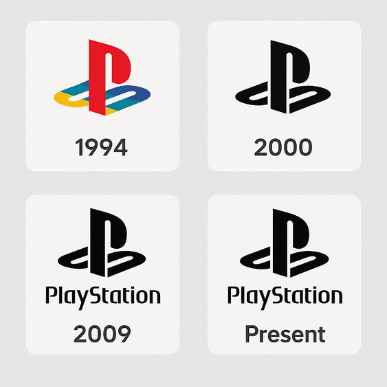
The PlayStation logo was drawn in 1994 by Manabu Sakamoto, for a company that made televisions and Walkmans and had never sold a games console. His answer was two letters, a P and an S, arranged so they seem to stand in three-dimensional space, which was exactly what the console was promising to do with games. Thirty years and five main consoles later, the same mark is still on every box, and it has barely been touched.
That kind of staying power is rare in an industry that redesigns everything else every few years. Some of the credit goes to Sakamoto’s drawing. Most of the rest goes to Sony, which has mostly had the sense to leave it alone.
How Sakamoto Built the Mark
In 1994 Sony was an electronics giant but a newcomer to gaming, and the PlayStation was a big bet. Sakamoto’s job was to give that bet a face. He took the letters P and S and set them at angles to each other so that the P appears to stand upright while the S lies flat in front of it, like an object sitting on a floor. The two forms interlock, and the eye reads depth where there is really only flat color.
The trick matters because the console’s big selling point was 3D graphics. The logo did not say “3D” anywhere. It simply looked three-dimensional, which is a more confident way to make the point. It also has a sense of movement: the S seems to have just slid into place under the P, and the whole thing looks like it could rotate if you nudged it.
This was careful, hand-built work from an era long before tools like Looka or Canva made logo design something anyone could try in an afternoon. What makes it worth studying now is how little there is. Two letters, one illusion, and a palette. The question in 1994 was whether a logo could carry a whole technological shift. This one did.
The Colors, Then and Now
The original 1994 logo was multicolored: red, yellow, green and blue, closer to a box of crayons or a Super Nintendo cartridge. That was deliberate. The colors said fun and energy, and they told parents and teenagers alike that this machine was for playing, not a piece of serious technology. It placed PlayStation as an entertainer for everyone rather than a gadget.
By 2009, with the PS3, the logo had moved to a black-and-white scheme with a blue accent, matching the console’s glossy black body. Black reads as power and polish. Blue suggests reliability and technology. Put together, the change said that PlayStation had grown up along with its audience, and that the people who had played the first console as kids were now adults with jobs and bigger televisions.
The shape did not change at all, only the paint. That is the useful lesson. Color is the cheapest part of a logo to update and the one that dates fastest, so it is the right place to make a brand look current. Sony refreshed the mood and left the structure alone.
Letterforms and Geometry
The letters in the PlayStation symbol are bold, clean and geometric, built from thick strokes and simple curves with no serifs or ornament. They carry the tech optimism of the mid-1990s, the same period that produced chrome fonts and swooshes, but they have aged much better than most of that work because they never leaned on effects. The geometry does the job. The mark stays legible on a console lid, a game case, a controller button and a tiny icon in a digital store.
Compare it with the ornate serifs of luxury brands or the bouncy scripts that toy companies use. PlayStation went the other way, toward minimalism, at a time when games marketing was famously loud. The interlocking P and S still give it personality; it looks like a game character ducking out of the way of something. But the personality comes from how two plain shapes are arranged, not from decoration added on top. Plenty of logo templates aim for that balance of clarity and character. Few get there with so little.
What the Symbol Suggests
The 3D effect also works as a metaphor. A flat surface that opens into space is a fair description of what a game does: you look at a screen and end up somewhere else. The logo hints at that without spelling it out, which is the best way for a symbol to work. Later versions have refined the P and S slightly, but they keep the same arrangement, because the arrangement is the idea.
That idea fits the games the logo has sat on top of, from the jungles of Crash Bandicoot to the ruined cities of The Last of Us. Very different worlds, the same promise on the box: something to step into. The practical point for anyone designing a mark is that the logo should come out of what the product actually does, not out of a list of adjectives.
Why It Has Not Dated
The logo is modernist in the plain sense of the word. It has clean lines, a functional design and nothing that is there for decoration. That is why it has lasted. Many brands chase trends with frequent redesigns and end up looking like whatever year they last panicked in. PlayStation has needed only small adjustments, the 2009 color change being the main one.
The result is a mark that feels slightly retro and slightly futuristic at once, and it gets more valuable the longer it stays the same. If you are designing for a young brand, this is the hard lesson: aim for something you will still be happy to use in ten years, even if that means it looks a little plain on launch day.
One Logo Across Five Consoles
Each PlayStation console marked a different moment in gaming. The PS1 brought 3D games to the living room. The PS2 doubled as a DVD player. The PS3 pushed online play. The PS4 made streaming and sharing gameplay part of the console itself. The PS5 pushed graphical detail further again. The hardware changed shape, color and size each time, and the logo was the constant on all of it.
That continuity is the main reason the brand feels like one long story rather than five separate products. The console names change by a number; the symbol does not. For a growing brand, this is the clearest argument for picking one mark and protecting it: every new product then adds to the same pile of recognition instead of starting its own.
Knockoffs and Criticism
A famous logo attracts imitators, and famous gaming logos get picked apart along with everything else. Knockoff consoles in emerging markets have copied the PlayStation look to borrow its credibility, which waters down what the real mark stands for. One Chinese clone, the “PolyStation,” became a long-running joke online in 2010 for how close it came to the original.
There has also been more serious criticism. Debates about how different cultures are represented in PlayStation games have at times spread to the brand as a whole, with critics arguing that Sony’s branding needs to reflect its global audience. A logo ends up standing for whatever the company behind it does, good or bad, and that is something no amount of design can fix. On the design side, the knockoff problem has one useful lesson: generic marks are easy to copy and hard to defend, and a distinctive shape is the best protection a small brand has.
The Business Behind the Badge
Sony’s stock (SONY on the NYSE) has gone up and down since the PlayStation launched in 1994, but the games business has grown into one of the company’s biggest. By 2025 Sony’s market capitalization was around $100 billion, and PlayStation contributes a large share through console sales, PlayStation Plus subscriptions and its digital store. The logo is on every controller and every game case, so it is fair to call it a working part of that business rather than decoration.
The PS5 launch in 2020 is a good example. According to Bloomberg data, Sony’s stock rose 15% within months, and the logo on the new white hardware helped signal that this was a fresh generation. A logo cannot sell a console on its own. What it can do is make thirty years of good experiences easy to recall in a fraction of a second, which is what customers and investors are both responding to when they see it.
How It Communicates
The logo says very little and gets a lot across. Clean lines, bold forms and a hint of depth suggest innovation, accessibility and excitement, which fits Sony’s line that PlayStation is for everyone, from casual players to people who put hundreds of hours into a single game. It scales from billboards down to the small PS button on a DualSense controller and keeps the same message at every size.
It has also shown that a visual language can shift without losing its identity. On the PS5 the logo appears in a minimal blue glow, very different in mood from the 1994 crayon colors, yet nobody mistakes it for anything else. That flexibility is the real test of a mark: can it change its clothes and still be recognized?
The Logo on Social Media
Today a logo lives on screens as much as on boxes, and PlayStation’s does well there. Hashtags like #PlayStation and #PS5 have millions of posts on X, from fan art to unboxing videos, and the logo shows up clearly against colorful game screenshots. Its simplicity makes it easy to share, easy to remember and easy to remix, which is why fans redraw it in every style imaginable.
Some go further and tattoo the logo on their arms, a trend people have posted about on X. When fans want a brand mark on their skin, it has stopped being a corporate asset and become something personal. Any logo designed today should be checked at social sizes, from a profile picture to a full-screen post, because that is where most people will see it first.
Technology and AI in Logo Design
The PlayStation logo came from an analog design process, but logo design itself has gone digital. AI logo generators such as Looka, Canva, Kittl and Semplr can produce a set of options in seconds and let people adjust fonts and colors without hiring a studio. For a company like Sony, tools like these could help explore future variations, testing a new color or a sharper letterform against the next console’s look.
It is a fun idea to imagine Sony’s team typing “innovation, gaming, futuristic” into one of these tools ahead of a PS6, a console that so far exists only in speculation on X. The tool might offer a sleeker P and S, a blue-black palette or subtle gradients. But the reason the real logo works is that Sakamoto had one specific idea, an object standing in 3D space, and built everything around it. Generators are good at fast drafts and iteration. They still need someone who knows what the idea is.
Products, Services and Recent News
The logo now sits on a large ecosystem: consoles, controllers, VR headsets, and services like PlayStation Plus and PlayStation Now. The PS5, launched in 2020, is still the flagship, alongside its disc-less Digital Edition and the PS5 Pro, which posts on X said was coming in 2026. In 2025 The Verge reported on Sony’s focus on AI-driven game development, and recent PS5 branding has added subtle blue accents to the mark.
Sony bought Bungie in 2022 and continues to work with studios like Naughty Dog, which keeps the logo on big releases such as God of War: Ragnarök. The PlayStation Portal, a remote-play device, carries the mark onto yet another kind of hardware. Every new product is another place for the same symbol to appear, which is how a brand stays coherent through cloud streaming and whatever comes next.
For the 30th anniversary, Sony Interactive Entertainment has been pushing hard into merchandise, turning the logo into a lifestyle brand. Beyond consoles, it has partnered with retailers like Zara and H&M on apparel and collectibles, and even on food and drink. The oddest example is the award-nominated PlayStation-shaped potato snacks it made with McCain in Brazil in 2024. A logo you can fry is a logo people know.
PlayStation Against Xbox and Nintendo
Microsoft’s Xbox logo, with its neon-green sphere, goes for science fiction, but it lacks the typographic elegance of the PlayStation mark. Nintendo’s Switch logo is clean and minimal, and also a little flat; it does not have the sense of depth and motion that PlayStation’s has. In our view, PlayStation’s logo looks alive, Xbox’s looks static and Nintendo’s plays it safe.
The comparison shows what PlayStation got right: a mark bold enough to stand out and simple enough to work anywhere, from hardware to film titles to merchandise. It manages to feel premium and playful at once, which is hard. Most logos manage one or the other.
Lessons for Logo Designers
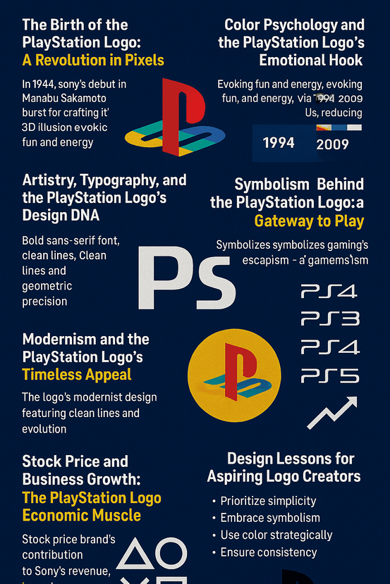
Keep it simple, because simple shapes survive every new format. Let the symbol come from what the product does; the PlayStation mark looks three-dimensional because the console was about 3D. Treat color as the part you are allowed to update, as Sony did in 2009. And once the mark works, stop changing it. Each of these sounds obvious. Very few brands manage all four.
The best way to learn them is to study logos like this one closely, then sketch your own and compare. Generators can help at the drafting stage, but the judgment about what to keep and what to cut is still yours.
Thirty Years In
Plenty of people who played Final Fantasy VII on the original console now buy games for their own children, and the logo on the box is the same one they grew up with. That is what three decades of restraint buys a brand. If you are working on a mark of your own, try a few directions in a tool like Semplr, then pick the one simple idea you would be happy to keep for thirty years.


