The Mitsubishi Logo: Three Diamonds From Two Family Crests
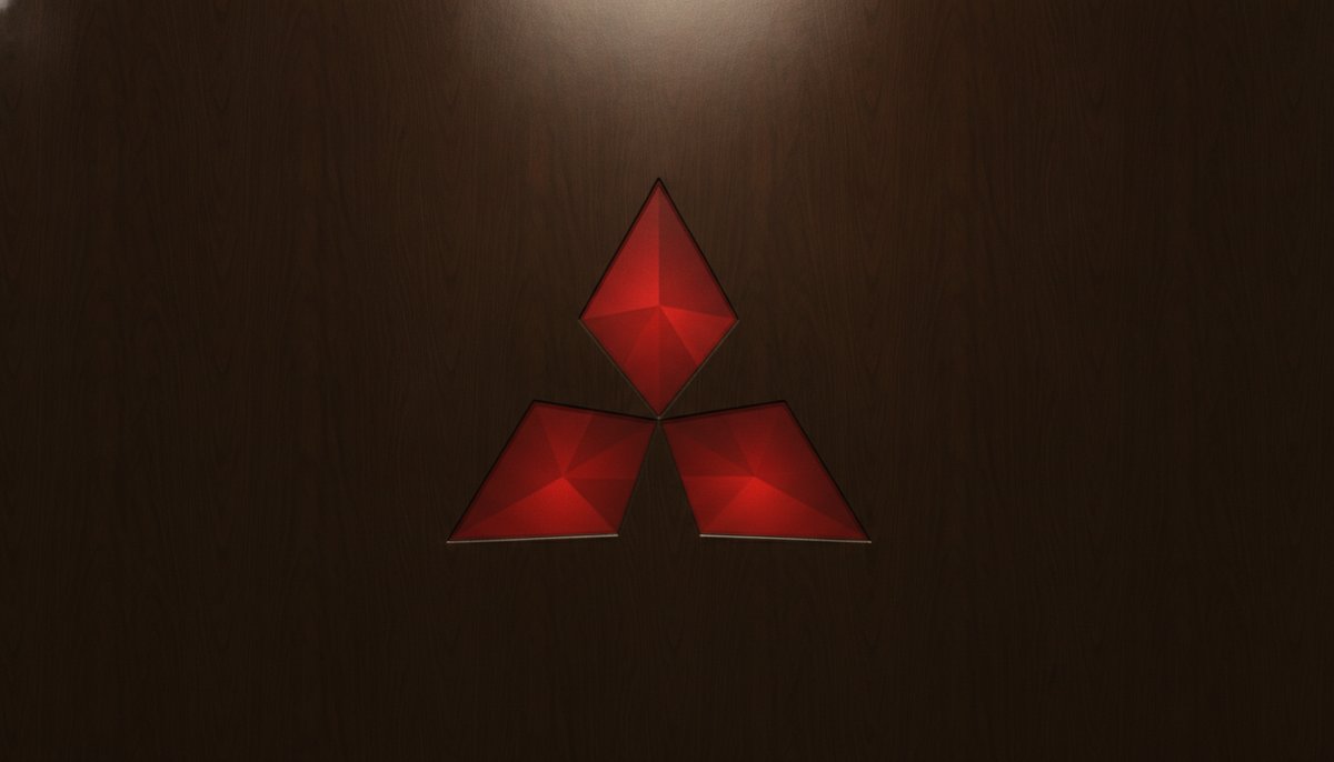
Mitsubishi’s three red diamonds are one of the simplest logos in business: three identical shapes meeting at a point. Behind them is a story about two families, a samurai clan and a shipping firm that grew into one of Japan’s largest groups.
A Shipping Company in the 1870s
Iwasaki Yatarō came from the Tosa domain on the island of Shikoku, where the Yamauchi family ruled. In 1870 he took charge of a shipping business that had worked for the Tosa clan, and over the next few years it became the company that took the name Mitsubishi.
Two Crests Become One
The mark joins two family crests. The Yamauchi family’s crest was three oak leaves radiating from the centre. The Iwasaki family’s crest was three rhombuses stacked on top of each other. The three diamonds take the radiating layout of the first and the rhombus shape of the second.
The name says the same thing. “Mitsu” means three, and “hishi”, which becomes “bishi” in the compound, means water chestnut, a word Japanese also uses for the diamond or rhombus shape. Mitsubishi is, quite literally, “three diamonds”.
This is why the logo has lasted. The name, the shape and the history all point to the same simple idea, so there was never much reason to change it.
One Mark, Many Companies
Mitsubishi grew into a large group of businesses, from shipbuilding and mining to banking. After the Second World War the group was broken up, and its companies went on as separate businesses. Many of them kept the name and the three diamonds.
Today you can find the mark on cars, air conditioners, banks and heavy machinery, made by companies that are independent but share a heritage. Our Mitsubishi Motors, Mitsubishi Electric and MUFG logo pages show how each one uses it.
Red, Flat and Easy to Draw
The diamonds are almost always red, a colour that stands out and has strong meaning in Japan, with the name in plain capitals beside or below. There are no gradients and no fine details, so the mark works the same on a car grille, a factory wall or a tiny phone icon.
It also follows a habit of Japanese family crests, the kamon: a few flat shapes in a strict arrangement, meant to be recognised at a distance. Brands like Toyota have taken a different, more modern route to a simple badge.
What to Take From Mitsubishi
Mitsubishi shows that a logo can carry real history without looking old, that a name and a symbol which mean the same thing reinforce each other, and that a few bold shapes can outlast every trend. If you are working on a symbol for your own brand, try a simple arrangement of repeated shapes in our free logo maker.