The Toyota Logo: Three Ovals, a Hidden T and a Hybrid RAV4
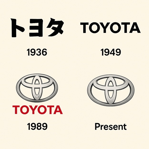
Toyota’s three-oval emblem took five years to design and did not appear until 1989, more than half a century after the company built its first car. Before that, the brand was identified by a plain line of Japanese katakana. The ovals have since become one of the most recognized badges on the road, and the newest place to see them is the 2026 RAV4, America’s bestselling compact SUV, which Toyota is turning into a hybrid-only model.
That decision follows the Camry’s switch to an all-hybrid lineup in 2024, and it arrives with new trims such as the sporty GR-Sport and the rugged Woodland. The car news and the logo history turn out to be connected. Both are about a company that changes slowly, on purpose, and keeps its core visual identity steady while the product underneath it moves on.
From Looms to Cars to Ovals
Toyota started as a loom maker. In the 1920s the company founded by Sakichi Toyoda built automatic weaving machines, and it only turned to automobiles in 1933. A car company needed a visual identity, and the first one, introduced in 1936, was simply the name set in Japanese katakana. At the time, the brand name was still spelled “Toyoda.”
The three-oval logo came much later, in 1989, after five years of work. That is a long time to spend on three ellipses, and it shows. The finished mark is restrained to the point of being plain, and that plainness is the reason it works. It was never meant to excite anyone. It was built to identify a car maker in any country, on any grille, without explanation, and to become shorthand for reliability, which it did.
Silver, Black and Red
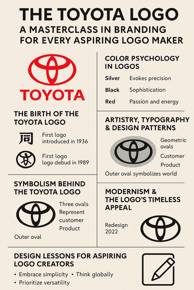
The emblem itself is minimal, and it is usually rendered in one of three colors: silver, black or red. Silver is the color most drivers know, because it is what the chrome badge looks like on a car. It reads as precise and modern, which suits a company that sells itself on engineering. Black reads as sophisticated. Red carries a nod to Toyota’s Japanese heritage. It is the most energetic of the three, and Toyota uses it sparingly, which is why it still feels like an accent rather than wallpaper.
The restraint is the useful part. Toyota could have built a multi-color identity and chose not to. A palette of one or two colors that each mean something is easier to apply, easier to remember and harder to get wrong. If a logo needs four colors to make its point, the drawing usually has a problem that color is papering over.
Geometry and Type
The mark is three ovals. The two inner ones form a subtle “T,” and a larger outer oval wraps around them, which Toyota says represents the world embracing the brand. The geometry is tight enough that the badge looks deliberate at any size, and there is no lettering inside it to fight with the shapes.
When type does appear next to the emblem, Toyota keeps it clean: a sans-serif in the vein of Helvetica, or a custom typeface, chosen so that the name reads as clearly on a billboard as on a bumper. Set the ovals beside the cluttered car badges of earlier decades, full of crests and script, and the advantage is obvious. Every line in the Toyota mark has a job. Nothing is there for decoration.
What the Three Ovals Mean
According to Toyota, the three ovals stand for the heart of the customer, the heart of the product and the heart of progress. The outer oval is the world wrapping around them, a reference to the company’s global reach. You can read that as corporate copywriting, and partly it is. But the meaning is unusually specific for a car badge, and it lines up with the shapes: the two inner ovals literally interlock, and the outer one literally contains them.
That is the bit worth copying. A logo whose story you can point to in the drawing itself holds up better than one whose meaning lives only in a brand book. Before you start drawing, it helps to decide what the brand actually stands for, whether that is trust, invention or something rougher, and then to look for a shape that shows it.
The Flat Redesign
Toyota’s 2022 redesign of the logo was a refresh, not an overhaul. The company dropped the shaded, three-dimensional effect and moved to a flat version of the ovals that works better on screens. It is the same drawing with the chrome taken off, and it looks as crisp on a phone as it does on a showroom sign.
Plenty of brands did the same thing in the same period, and some lost character in the process. Toyota did not, mostly because the ovals never depended on the shading. The 3D version was a rendering of a good shape. Strip the rendering and the shape is still there. A logo that only works with gradients and bevels is likely to feel dated within a few years.
One Badge Across Several Eras
The emblem has been on Toyota cars from the gas-heavy 1980s through the hybrid shift that the Prius started. It has sat on a boxy Land Cruiser and on the hydrogen-powered Mirai, and it has looked right on both. That continuity ties decades of engineering to a single symbol, so that a new model inherits the reputation of the old ones the moment the badge goes on.
That is what a logo is really for. It is a promise that the next product will be like the last one in the ways that matter. Any mark, whether drawn by a designer or roughed out with software, should be able to carry a company through changes in what it sells.
Knockoffs and the Recall Crisis
The logo has had its troubles. Counterfeit Toyota parts carrying fake badges have been a long-running problem in the aftermarket, and each one chips away at the trust the real emblem stands for. In 2010 Toyota went through a damaging recall crisis, and the logo became a lightning rod for criticism. The brand recovered, and its strong visual identity helped it get through.
Cultural appropriation debates have largely passed Toyota by, because abstract ovals do not borrow anyone’s imagery. That is a point in favor of abstraction for brands that sell in many countries. A literal symbol can mean something very different to someone in another culture, so it is worth showing a draft mark to people outside your own market before you commit to it.
Brand Value and the Balance Sheet
Toyota’s stock has climbed in recent years, and the company’s market capitalization was around $250 billion as of June 2025. Interbrand’s 2023 report put Toyota’s brand value among the top 10 in the world, helped by how consistently the company presents itself.
It would be silly to credit three ovals with a quarter of a trillion dollars. But a recognizable, well-kept logo does raise perceived value. It signals that a company is organized and that it will be around next year, and that kind of trust eventually shows up in sales. No startup is going to become Toyota because of its logo; a sloppy one can still cost it customers.
Consistency, the Toyota Way
Toyota applies its identity with real discipline. The emblem shows up the same way on vehicles, in advertising and even on employee uniforms, and that consistency is why nobody mistakes a Toyota ad for a Honda one. Every placement reinforces the others.
Small brands can do the same thing on a smaller scale. Make sure the logo works on a business card, a website and a social profile, and use it the same way on each. Templates help here, but the main thing is deciding on the rules once and sticking to them.
What Designers Can Take From It
Three lessons come out of the Toyota mark. First, simplicity: three ovals are enough to build a world-famous badge, so a design does not need a crowd of shapes to make an impact. Second, think globally: the emblem has no words in it, so it crosses language barriers without translation. Third, versatility: the flat version works on screens and on stamped metal alike.
When briefing a designer or a logo tool, be clear about the brand name, the industry and the tone you want, playful or sleek. Then spend most of your time adjusting the fonts, colors and layout of whatever comes back. The first draft is rarely the one worth keeping.
How the Badge Communicates
Without any words, the badge still says a lot. The curves suggest motion, the symmetry suggests balance, and the bareness of the design suggests something you can rely on. That fits Toyota’s tagline, “Let’s Go Places,” which offers adventure while promising you will get home safely.
Shape and color do most of this work in any logo. Rounded letterforms and bright colors make a brand feel playful. Sharp angles and muted tones make it feel corporate. Toyota sits deliberately between the two, which is part of why the same badge suits a family hybrid and an off-road truck.
The Logo on Social Media
On Instagram and X, the logo turns up constantly. Hashtags like #ToyotaLife and #ToyotaPride have gathered millions of posts, with owners photographing their cars everywhere from Tokyo to Texas. The flat emblem is easy to read in those photos, and it holds up as a small icon.
That is a test every logo now has to pass. If it cannot be read on a two-inch phone screen, it will struggle. Mock it up as an app icon, a profile picture and a business card before deciding it is finished.
The Hybrid-Only RAV4
The 2026 RAV4 drops gas-only engines entirely. As USA Today reported, it will be sold only with hybrid (HEV) and plug-in hybrid (PHEV) powertrains, part of Toyota’s wider electrification push. That push comes as U.S. tariffs threaten to raise prices. Mark Templin, Toyota North America’s COO, put it bluntly: “A 25% tariff is not sustainable long term without significant price increases.” Through that uncertainty, the badge still stands for what it always has, affordability and trust.
For anyone designing a logo, the RAV4 is a good example of a brand changing its product without changing its face. The car underneath is new. The ovals on the nose are the same ones that were there in 1989, and that is exactly how it should be.
GR-Sport and PHEV Power
The plug-in models make 320 horsepower, up 18 from the 2025 model’s 302, which makes the RAV4 PHEV one of the quicker compact SUVs. The GR-Sport, offered only as a PHEV, borrows from Toyota’s GAZOO Racing division with tuned suspension and sportier styling, and it is the first RAV4 of its kind in the U.S. MotorTrend expects it to be “destined to be the most expensive RAV4,” but with “fun handling” for enthusiasts.
The logo history runs parallel here. The ovals are supposed to stand for customer, product and progress, and a car that balances power and efficiency is a fair expression of that. The general principle is that a logo should match what the company really does, not what it would like to be known for.
The Woodland Trim
For buyers who want to get dirty, the Woodland grade adds all-terrain tires, a raised ride height and standard all-wheel drive. It comes as both an HEV and a PHEV, and according to iDriveSoCal it gets new paint colors such as Urban Rock, plus Mineral accents.
The same badge goes on the Woodland and on the GR-Sport, two cars with very different personalities, and it fits both. That range is the practical payoff of a neutral, clean design. A mark with a strong mood of its own would suit one of them and look wrong on the other.
Screens, Sound and Safety
Inside, the RAV4 gets either a 10.5- or a 12.9-inch touchscreen, with digital climate controls set into its base. A 12.3-inch digital instrument cluster replaces the old 7-inch gauges and supports customizable displays and navigation. Wireless Apple CarPlay and Android Auto are standard, and higher trims add a nine-speaker JBL audio system and a head-up display, per USA Today.
Toyota’s Arene software platform runs all of this, along with Toyota Safety Sense 4.0. On the steering wheel, the silver ovals tie the technology back to the brand, and silver is a sensible choice for that job. It is the color we associate with machined parts and precision, while red is kept for moments when Toyota wants to signal passion.
The Hammerhead Grille
Outside, the RAV4 picks up Toyota’s hammerhead front end, a shark-like face with C-shaped headlights and bold LED taillights. The body is also stiffer, which cuts noise and improves the ride, while the overall dimensions stay the same.
The flat 2022 version of the logo suits this sharper styling. A shaded chrome badge would fight the hard lines of the new face. The flat ovals sit on it cleanly. A small identity change, made years earlier, quietly made later product design easier.
Tariffs and Prices
Toyota’s electrification push comes amid U.S. tariffs that could raise vehicle prices, which Templin warned could put new cars out of reach for some buyers. The hybrid-only RAV4 is meant to balance efficiency with broad appeal and keep America’s top-selling SUV selling.
The logo is not going to solve a tariff problem. What it does provide is continuity: whatever happens to prices, buyers know what the badge stands for, and that recognition is one of the most durable assets the company has.
Range and Charging
The RAV4 PHEV’s electric range rises to 50 miles, up from 42, and the XSE and Woodland trims get DC fast charging through a CCS port, going from 10% to 80% in about 30 minutes. The SE and GR-Sport stick with J1772 AC charging, according to CarsDirect.
It is a practical, incremental upgrade, which is very Toyota. The logo has evolved the same way, by small steps that never lose the core. Any logo should be judged the same practical way, by whether it works on a billboard and on an app icon.
The RAV4 and Its Rivals
Against the Honda CR-V and the Mitsubishi Outlander, the RAV4’s hybrid-only lineup and 320-horsepower PHEV give it an edge. The CR-V offers hybrids but nothing like the GR-Sport, and the Outlander’s PHEV does not match the RAV4’s technology.
On the badge front, Toyota’s simple ovals have more universal appeal than Honda’s busier “H.” Looking at what competitors use is a good habit for any designer, because the goal is a mark that stands out in its category without shouting.
Technology, AI and Logo Design
AI logo generators such as Looka, Semplr and Canva now let anyone produce a draft logo in minutes from a short description, and tools like Hatchful and DesignEvo offer free, high-quality downloads. For a small business without a design budget, that is a real help. Toyota’s 2022 redesign probably relied on digital tools too, if only to get the flat ovals pixel-perfect.
The catch is that generated logos tend to look alike. Treat the output as a starting point and customize it heavily. A generic mark costs almost nothing to make and is just as easy to forget.
More Than Cars
The emblem covers a big range of products: sedans like the Camry, hybrids like the Prius and the hydrogen-powered Mirai. Toyota also sells services under it, including Safety Connect, which uses AI to detect collisions, and Destination Assist for navigation.
The company has announced plans for 30 EV models by 2030. They will almost certainly wear the same ovals, which is a good sign of how much trust Toyota places in a design that is now more than 35 years old.
Toyota Against Honda, Ford, BMW and Mercedes
Honda’s winged “H” is bold but carries less meaning than Toyota’s layered ovals. Ford’s script feels nostalgic and less global. BMW’s roundel, long associated with a propeller, says luxury, while Toyota’s ovals say accessibility. Each badge fits its company, but Toyota’s is the one that seems to belong everywhere.
That is a good reason to study the logos in your own niche before designing one. Toyota sits at the minimalist end of the scale and Mercedes, with its star and its history, sits closer to the ornate end. Both work. The aim is to be different from your neighbors without becoming strange.
If Toyota Had Used an AI Tool
As a thought experiment, imagine Toyota’s designers in 1989 with a modern AI tool. They might type “global, reliable, innovative” and ask for something minimal, then get back a dozen oval-based sketches to adjust for symmetry and cultural fit. Today the same kind of tool could just as easily turn out clean, watermark-free versions of the flat logo for screens.
It would have saved time, but the five years Toyota actually spent were about judgment, not drawing. Fast iteration is useful for any company, large or small. Deciding which oval is right is still the hard part.
Recent Toyota News
Toyota has been busy in 2025. It unveiled a next-generation Prius with a 220-mile range, and it is working with BMW on hydrogen fuel cells. The badge stays front and center through all of it.
On X, fans have been talking about the new Corolla Cross, with the ovals prominent in the promotional photos. The car changes and the logo does not, and that is the arrangement working as designed.
Borrowing From Toyota
The Toyota logo is a lesson in clarity: three shapes, a specific meaning and a willingness to change only what needs changing. You do not need a car company’s budget to apply that. Pick one or two colors that mean something, keep the drawing simple enough to survive a flat redesign, and look at plenty of examples, playful ones included, before settling.


