The BMW Logo: A Century of the Blue-and-White Roundel
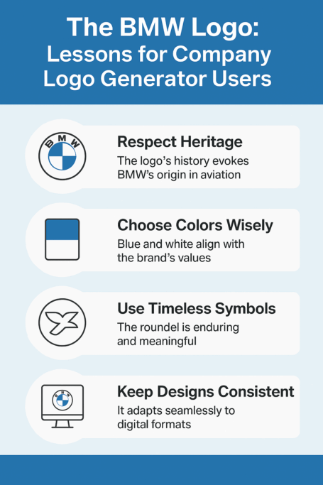
The most famous story about the BMW roundel, that it shows a spinning propeller, is one BMW itself has debunked. It persists anyway, because it is a better story than the truth, and because the badge has barely changed since 1917. A black ring, the three letters and four blue-and-white quarters have been enough to sell cars for more than a hundred years, and the mark is a good lesson in how far a simple design can go if you leave it alone.
Where the Roundel Came From
Bayerische Motoren Werke grew out of an aircraft-engine maker, and the roundel dates from 1917. Its origins are wrapped in myth. One version says the blue-and-white quarters show a propeller turning against the sky, a nod to the company’s aviation roots. The other, and the one BMW points to, is that they come from the colors of the Bavarian flag. The real answer probably involves both, plus some clever marketing in later decades that happily let the propeller story run.
Either way, the roundel did what good logos do. It started a conversation, and it tied the company’s heritage to its ambitions. If you are designing a mark for a business, that is a reasonable goal: hint at where you come from, and leave room for where you are going.
Why Blue and White
The colors are not an accident. Blue suggests trust, precision and sophistication, all qualities people already associate with German engineering. White adds clarity and keeps the blue from feeling heavy. Together they make a combination that is recognizable from across a car park, and the colors do some of the selling before anyone has looked at the car.
The lesson is to choose colors that match your brand’s personality. A restrained, two-color scheme like BMW’s reads as premium. A younger, more energetic brand might want brighter hues. Whatever you choose, use fewer colors than you think you need.
Shape, Type and Restraint
The roundel is minimal. A circle is divided into quarters and surrounded by a ring carrying the letters in a crisp sans-serif. There is nothing decorative in it, which is why it works on a grille, a key fob, a steering wheel or a banner ad. Good design often goes unnoticed while it does its job, and the BMW badge is a fine example.
For a new logo the typography lesson is restraint. Resist the urge to overcomplicate it. Pick a clean typeface that holds up on a billboard and a business card. One useful test: look at your design in a single color. If it still works without the colors, it will work almost anywhere.
Propeller, Flag or Just Good Design?
BMW has said plainly that the propeller story is a myth, but it survives because it is such a good image, all daring pilots and roaring engines, and that suits a brand built on performance. The circle itself adds something too. It suggests motion, unity and permanence, which fits the “Ultimate Driving Machine” promise neatly.
Shapes carry meaning whether you intend them to or not. Circles tend to suggest community and completeness, while sharp angles suggest strength and speed. Think about which you want before you start drawing, and make sure the shape supports the story rather than fighting it.
Modernist Roots and the 2020 Update
The roundel has changed little since 1917. Its clean lines and balanced proportions fit the modernist idea, associated with the Bauhaus, that form should follow function. In 2020 BMW did make a notable change for digital use: the badge became flat, and the black outer ring became transparent so the background shows through. It was a small adjustment that showed how to stay current without losing the mark.
Timelessness is what every logo designer is after, and it mostly comes from simplicity and scalability. A logo that looks as good in a TikTok video as on a shop front will last. Preview your design in as many contexts as you can before you commit, and make sure it will still look right in twenty years, not just next month.
One Badge, Many Eras of Cars
The roundel has stayed constant through decades of automotive change, from the sharp-edged 3 Series of the 1980s to the electric i4. The cars look very different from one decade to the next, but the logo on the bonnet has told every buyer the same thing. It is the anchor that ties a very varied lineup together.
That is why it pays to think long term. Fashionable designs are easy to produce, but very few of them will still look good in 2030. Aim for a mark that sits above trends, and let the products carry the fashion.
Knockoffs and Debate
Any famous logo gets copied, and the roundel has turned up on cheap car parts, counterfeit merchandise and countless parodies. In some circles it is a status symbol, in others a cliché. The logo has also been part of debates about culture and identity, with critics asking whether BMW’s global reach waters down its Bavarian roots.
For anyone making a new logo, the practical point is originality. A design that looks too much like someone else’s can bring legal trouble, and a mark that feels like a knockoff damages a brand faster than almost anything else. Check before you launch.
The Badge as a Business Asset
Interbrand valued the BMW brand at $40 billion in 2024. The logo plays a central part in that value, signaling the quality and prestige that let BMW charge premium prices. When the company’s shares rose 15% in 2023 during its push into electric vehicles, analysts credited the strength of the brand with keeping investors confident.
For a small business the stakes are lower but the principle is the same. A well-made logo raises how customers and investors perceive you, and it can help a startup look like it belongs next to established names. It is a strategic decision, not decoration.
Consistency
From dealerships to Super Bowl ads, BMW uses the same roundel, and that repetition builds trust. A logo works like a promise, and changing it carelessly breaks the promise. BMW has been careful, so every place the badge appears feels unmistakably like BMW.
Small brands can copy this with a simple style guide: a short document setting out colors, fonts, sizes and spacing. It sounds like bureaucracy. In practice it is what stops a logo slowly turning into five slightly different logos.
What the Roundel Teaches
Simplicity comes first. Every element, color, shape and type, should serve the brand’s story. Evolve the design if you must, but rarely and in small steps. And test it everywhere: if it doesn’t work as a tiny browser favicon, it isn’t finished.
If you want BMW-style elegance, start minimal and add only what earns its place. It is much easier to add a detail later than to take one away from a logo people already know.
What the Badge Says
The roundel communicates luxury, performance and engineering without a tagline. Its visual language is strong enough that it doesn’t need words to make its point, which is what a well-made logo should do: speak before the company does.
Before designing, write down what you want your logo to say, in a few plain words such as “bold” or “trustworthy.” Every choice afterward can be checked against that list.
Hashtags and Fan Culture
Search #BMWLogo on Instagram and you will find millions of posts: car selfies, fan art, even tattoos. The badge has become a lifestyle marker as well as a corporate emblem, and BMW has encouraged that with well-judged social campaigns.
Digital use is now unavoidable for any brand. Make sure your logo stays sharp and legible in a crowded social feed, at the size of a profile picture as well as full screen.
Technology and Logo Design
BMW’s roundel was drawn by hand. Today software can suggest layouts, colors and fonts in minutes, and a small business can get a polished result without a design team. That raises the bar rather than lowering it: when anyone can produce a tidy logo, the ones that stand out are the ones with a clear idea behind them. Technology can amplify creativity, but it doesn’t supply it.
How BMW Might Use an AI Logo Generator
Imagine BMW’s designers in 2025 being asked for a sub-brand logo for a new electric hypercar. They type “futuristic,” “sleek” and “eco-conscious” into an AI logo maker such as Semplr. Out comes a minimal badge with angular lines and a green-blue palette, a gesture toward sustainability that still feels like BMW. They adjust it, download a high-resolution file, and have a starting point for the reveal.
It is only a thought experiment, and BMW would certainly refine the result by hand. But it shows how such tools can help even large companies explore ideas quickly, and how they put the same speed in the hands of anyone starting a business.
Making Your Own Logo in Five Steps
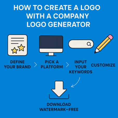
If you want to design a logo of your own, here is a simple process using a company logo generator:
- Define your brand. Write down three words that describe the business, such as “bold,” “trustworthy” or “playful.”
- Choose a tool. Looka, Turbologo and Semplr all have free options.
- Enter your brand name and keywords, and experiment with colors and shapes.
- Refine and test. Adjust the design and preview it on mockups such as business cards and web pages.
- Download clean, watermark-free files in the formats you need.
Keep it simple, the way BMW has. A cluttered logo is a forgotten logo.
A Badge That Has Lasted a Century
The BMW roundel sits in the same company as other luxury marks that have barely changed in a century. It is simple, it has been used consistently, and it carries a story people still enjoy repeating, even the one that isn’t true. Most of its strength comes from what BMW has chosen not to do with it.
That is the part worth copying. Draw something plain, give it a meaning, and then resist the temptation to keep redrawing it. A century from now, nobody will remember the trendy logos of 2025. They will probably still recognize the roundel.


