The Twitter Bird Logo: From a $15 Stock Image to an Icon
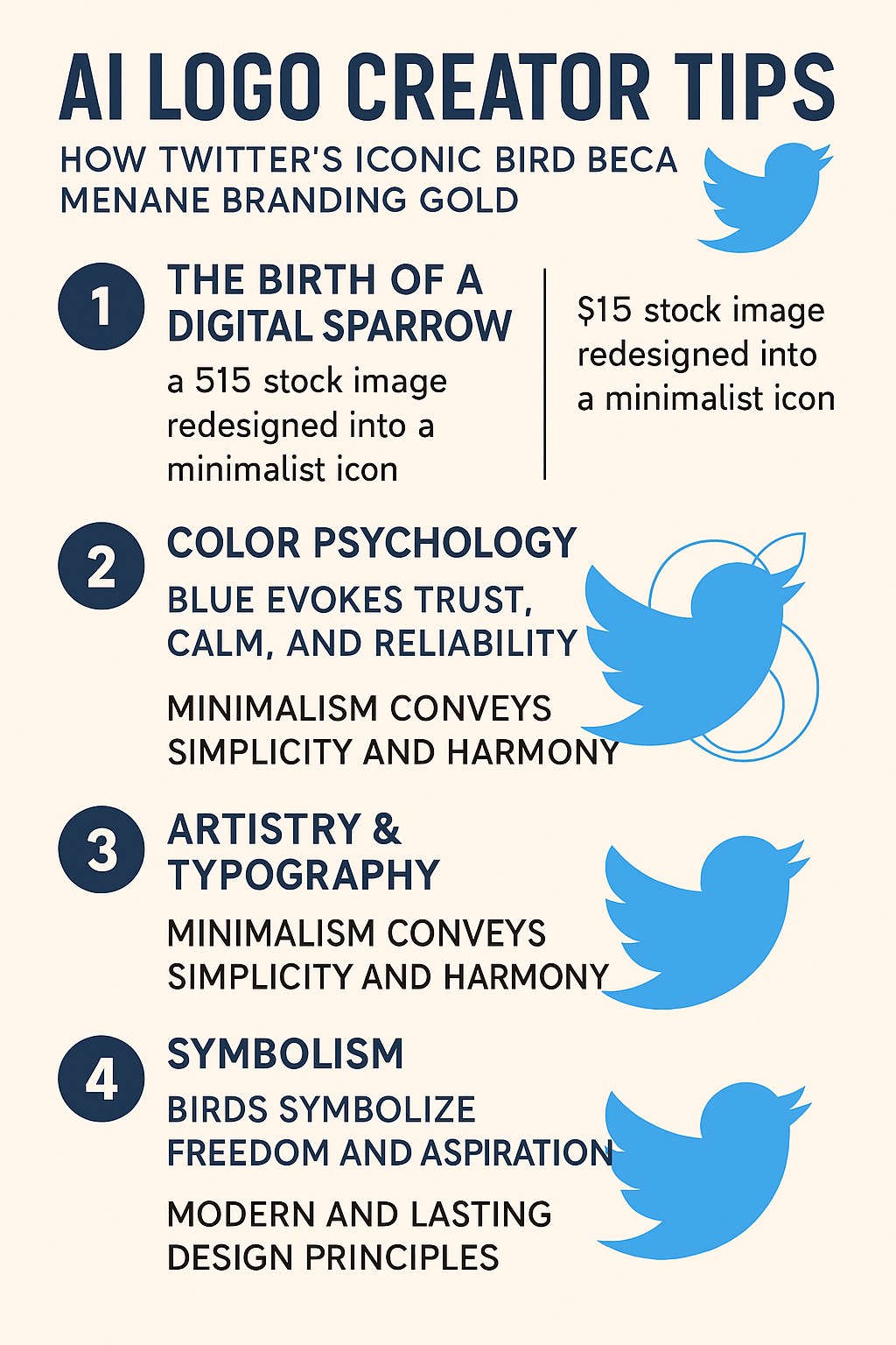
Twitter’s first bird cost about $15. It was a stock illustration by the designer Simon Oxley, bought from iStock, and within a few years it had been redrawn into one of the most recognized symbols on the internet. The blue bird is small enough to fit on a postage stamp and was familiar to billions of people. Its story, from clip art to a carefully built silhouette, is one of the better examples of how a logo can grow up with a company, and of how little a strong mark actually needs.
From Stock Art to Larry the Bird
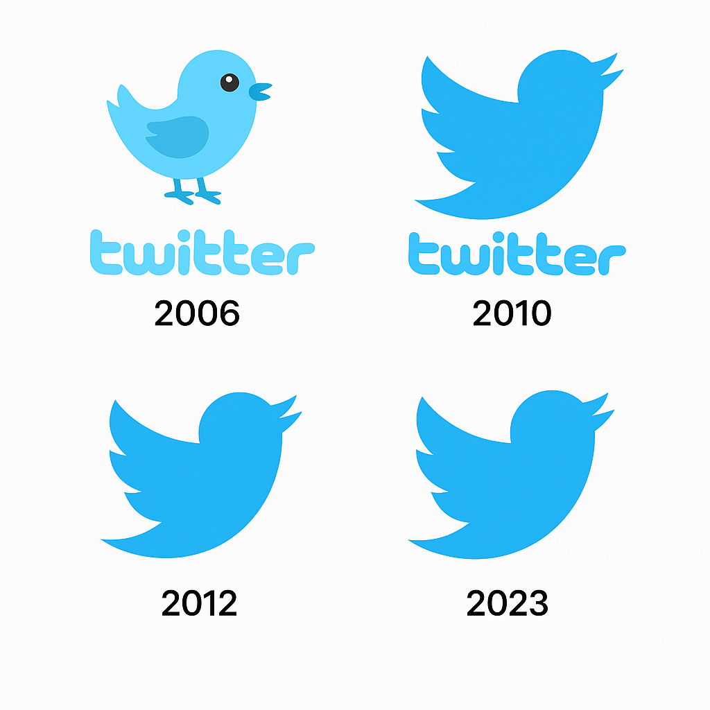
The origin is now Silicon Valley legend: co-founder Jack Dorsey’s young company took a $15 stock image by Simon Oxley and made it the face of the brand. The early bird, nicknamed “Larry the Bird” after the basketball player Larry Bird, looked nothing like the later silhouette. It was cartoonish and a little childish, a fledgling in every sense.
By 2010 Twitter had outgrown the clip art. Douglas Bowman, the company’s creative director, simplified Larry into a much cleaner shape, a single swooping silhouette that suggested connection without any words. The idea was the same one behind a good tweet: short, clear and easy to remember. The lesson for anyone designing a logo is just as short. Simplicity takes work, and it is worth the work.
Why Blue
Twitter’s blue was easy on the eyes, and it was also a smart choice. Blue suggests trust, calm and reliability, and it is closely associated with communication, which suits a platform built on conversation. Compare it with Coca-Cola’s red, which suggests energy and passion, or Starbucks’ green, which suggests growth. Twitter’s blue was a quiet fit for a talkative audience.
Color is the first thing your audience notices. Logo tools make it easy to try palettes, but Twitter’s single shade of blue is a reminder to choose a color that matches what the brand stands for. One or two colors are usually enough. More than that and the logo starts to look like a fruit salad.
Circles and No Words
Twitter dropped the lowercase “twitter” wordmark by 2012 and let the bird stand alone. It was a confident move, similar to Apple’s wordless apple or Nike’s swoosh, marks strong enough to need no caption. The bird itself was built from 13 circles, a geometric construction meant to give it harmony and balance. Every curve in it came from the same system, which is why it looked so settled.
That approach is worth copying. Templates from tools such as Semplr can help balance fonts and icons, but the Twitter bird is a reminder to strip away anything extra. A good test is to ask whether your logo could work without its name. If it could not, keep refining.
What the Bird Meant
Birds stand for freedom, perspective and lifting off, which suited a platform that amplified voices around the world. Twitter’s silhouette tilted upward, suggesting aspiration, and it made sense whether you were posting from Tokyo or Timbuktu. It was Icarus without the melting wax.
Symbolism matters in any logo. Software can produce icons by the hundred, but it cannot decide what they mean for your brand. A lion suggests strength, a tree growth, a star inspiration. The Twitter bird shows that a logo works best when its picture and its story are the same thing.
A Modernist Mark
The bird was a modernist design in the Bauhaus tradition of form following function. Its clean lines and lack of decoration kept it looking current long after 2010. That kind of timelessness is what keeps marks like Louis Vuitton’s and Chanel’s going, and it is the main thing to aim for. Trends like gradients or neon effects are tempting, but a logo that looks very 2025 will look dated by 2030.
The best logos are specific enough to remember and general enough to last. The Twitter bird had that balance, and whatever tools you use, longevity should come before flash.
A Logo in the Middle of History
The bird was a backdrop to some of the biggest moments of the social media era, from the Arab Spring to #MeToo. It appeared on protest signs and in Super Bowl ads, and it became the symbol of a digital town square. The best logos do more than sell. They end up taking part in the culture around them, and Twitter’s did that more than most.
Controversies and Copies
The bird had its own controversies. In 2018 the designer Martin Grasser, who helped refine the logo, revealed how it was built from circles, and some purists complained that it was “just circles.” Then there were the knockoffs: countless apps imitated the bird’s silhouette, which is flattering until the lawyers get involved.
Some critics also argued that the bird’s universal appeal smoothed over more specific cultural symbols. Any logo can run into these problems. Whatever tool produced a design, check it for originality and for unintended meanings before launch, because a logo that turns out to be a copy, or offensive somewhere, is much more expensive to fix later.
The Bird as an Asset
Twitter’s brand, anchored by the bird, was a large part of its value. When Elon Musk bought the company in 2022 for $44 billion, analysts pointed to the logo’s worldwide recognition as a key asset, and in the months after the acquisition the bird stayed as it was, a measure of how much equity it carried.
For any business, that shows what is at stake. A strong logo supports brand value and customer loyalty, and it can even affect how investors see a company. You do not need a large budget to make a good one, but you do need to take it seriously.
Consistency
Twitter’s logo was a model of consistency. On a billboard or as a favicon, the bird looked the same. That uniformity builds trust, and it is a principle worth writing on the first page of any sketchbook. Use one version of your logo across every platform, on Instagram and on a coffee mug alike, so the brand always feels like itself.
How the Bird Spoke
The logo said “join the conversation” without a word. Its upward tilt and open shape invited people in, which fit the platform’s purpose. Every logo carries a message of this kind, intended or not. Does yours suggest luxury or fun? Adjust shapes and type until the answer is the one you want.
The Bird Everywhere
The bird spread across the internet, inspiring trends like #TwitterLogo and #BrandInspiration and turning up in memes, avatars and emoji. It is a good example of how logos can travel far beyond where they started. Design with sharing in mind, so the logo works as a small icon on social media, but make sure it still holds up in print.
AI and Logo Design
AI has changed who can make a logo. Platforms like Looka generate logos in seconds, and no design degree is required. The Twitter bird came before all this, but a similar mark today might well start as an AI draft, with software refining its curves and colors. The tool does the drawing; people still decide what is good.
The main risk with these tools is generic output. The Twitter bird feels made for its brand because it was refined with intent over several years. If you start with a generated logo, customize it until it could only belong to you, and make sure you can download it without a watermark.
If Twitter Had Used an AI Generator
Imagine Twitter’s design team planning a refresh with an AI generator such as Turbologo. They type “bird, blue, minimalist” and get variations back: one with a bolder wing, another with a subtle gradient. The team picks a watermark-free option, refines it in-house, and has a candidate for X’s next chapter.
It is a speculative exercise, but it shows where AI is genuinely useful: it lets you try many directions without committing to any of them. Just make sure the tool gives you high-resolution files suitable for professional use.
Making a Logo With AI in Five Steps
If you want to try it yourself, here is a simple process:
- Choose a tool. Free options such as Looka and Turbologo are easy to use, and several offer watermark-free downloads (check the terms).
- Define the brand. Use words that describe its character, such as “trustworthy” if you are leaning toward blue or “bold” if you are leaning toward red. The Twitter bird said “connection.” Decide what yours should say.
- Customize carefully. Change fonts, colors and icons so the result does not look like a template. Twitter’s minimalism is a good model.
- Test it everywhere. Check the logo on business cards, in apps and on social media, and make sure you get scalable formats such as PNG and SVG.
- Download a clean file. Use a platform that gives you a watermark-free version so the logo looks professional.
What the Bird Teaches
The Twitter bird went from a $15 stock image to one of the best-known symbols of the internet age, and it got there through steady simplification rather than a single stroke of genius. Its color, its meaning and its staying power all came from a willingness to remove things until only the essential shape was left.
If you want to start on your own logo, Semplr’s free AI logo creator is one place to begin. Aim for something that could stand on its own, the way the bird did.


