The Mercedes Logo: How the Three-Pointed Star Evolved
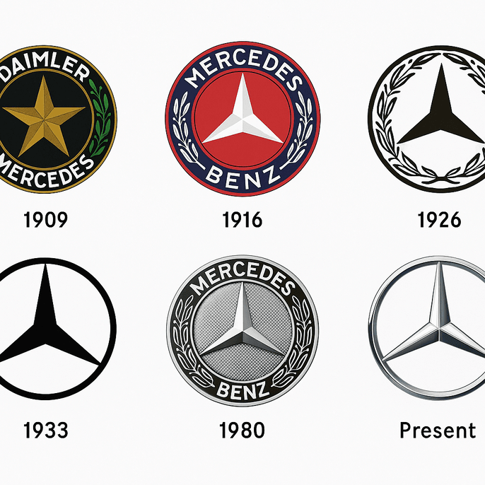
The Mercedes star started as a mark on a postcard. Gottlieb Daimler is said to have drawn a three-pointed star on a card to his wife in the 1870s, predicting it would one day shine over his factories, and by 1909 his company had adopted it. More than a century later the star is still there, thinner and flatter, inside a plain ring. Few car badges have changed so little, and few say so much with three lines.
From a Postcard to a Trademark
The star is older than the Mercedes-Benz name. Daimler, co-founder of Daimler Motors, sketched it on that postcard long before the company built a car anyone would recognize, and according to company lore he told his wife it would one day rise over triumphant factories. The three points stood for an ambition to power transport on land, at sea and in the air, which was a bold claim when most people were still getting used to horseless carriages. The company adopted the star officially in 1909. After Daimler and Benz merged in 1926, it was surrounded by a laurel wreath taken from the Benz emblem, and the wreath was later simplified into the thin ring used today.
The origin is part of the appeal. A logo that grew out of a founder’s ambition has a story that a mark drawn to a brief will never quite match, and the best logos carry an idea bigger than the product they sit on.
Silver and Black
The star is almost always silver, a color associated with sophistication and advanced engineering. Silver suggests precision and reliability, which is exactly the reputation Mercedes-Benz wants. It makes the brand look both futuristic and dependable. Black versions of the logo, such as the minimalist 1933 version, add a quieter kind of power and work well in print and in high-contrast settings.
Color is one of the first decisions in any logo, and Mercedes shows why it should follow the brand’s character. A trustworthy business might choose blue and a loud one red. Mercedes chose the color of polished metal, which is what it sells.
Geometry and Restraint
The logo is a study in minimalism. The three-pointed star is precise geometry, balanced inside a circle that suggests unity and permanence. There are no fussy details, just shape. The accompanying lettering, usually a bold sans-serif, keeps the same modern simplicity. The logo is brief in the best sense, closer to a haiku than a novel.
The lesson is not to overcomplicate. Clean lines and balanced proportions are the reason the star still works, and they are the first things to protect in any design.
Land, Sea and Air
The star is a statement of intent. Its three points represent land, sea and air, a reference to Daimler’s early engines for cars, boats and aircraft. That gives the logo weight. It is a philosophy as much as a badge, and it is a good example of a symbol coming first and a trademark second. The star works across borders as easily as the brand does.
Thinking symbolically is the useful habit. Decide what a brand stands for, whether strength, innovation or something else, and find a shape that carries it without needing explanation.
How the Star Has Avoided Trends
The logo has evolved without losing its identity. It went from the ornate laurel wreath of 1926 to the plain ring of today, keeping up with design fashions while staying recognizable. Recent versions, such as the digital-friendly 2020 update, use flat design for screens, which shows how adaptable the star is. It has aged well because it never relied on effects.
That is the lesson. Trendy effects look dated within a decade. Simplicity lasts.
The Star Through Automotive History
The star has marked each era of the company. In the 1930s it was on the Silver Arrows race cars that made Mercedes a performance giant. In the 1980s it became shorthand for yuppie luxury on the hood of the S-Class. Today it sits on the electric EQS, a signal of where the company says it is going. In each period the logo has been a cultural reference as well as a trademark, something like a classic riff that never gets old.
That adaptability is worth copying. A logo has to be versatile enough to move with a brand through changes nobody can predict at the start.
Knockoffs and Criticism
Every famous logo gets copied, and the Mercedes star is no exception. Counterfeit stars turn up on cheap car badges and dubious “tribute” merchandise, and each one wears down the brand’s prestige a little. Mercedes-Benz polices its trademark aggressively, but it is a battle without end. A more pointed criticism is that the logo’s prominence on luxury cars reinforces class divides, a shiny symbol of excess in an unequal world.
These arguments are a reminder that logos carry social weight. Before settling on a design, it is worth thinking about how it will look in its cultural context, and whether it will attract admiration or criticism you did not intend.
A Valuable Star
The logo is also a financial asset. Mercedes-Benz Group AG’s stock has climbed steadily, and branding has played a part. A 2021 Interbrand report valued the Mercedes brand at $50 billion, driven in part by the instant recognizability of the star. Using the same logo across every model, from the A-Class to the Maybach, reinforces that value, much as a blue-chip stock compounds over time.
For a startup, a memorable logo can do a smaller version of the same thing, adding credibility with customers and investors.
Consistency
Whether it is on a grille or a billboard, the star is unmistakable. That uniformity builds trust, because customers know exactly what they are getting. Consistency holds a brand identity together, and Mercedes extends it to its showrooms and digital advertising, so the whole brand feels like one place.
Any logo needs to scale across platforms. Preview it on business cards, websites and anything else it will appear on before deciding.
Design Lessons
The Mercedes logo teaches simplicity, symbolism and scalability, and each one is concrete. The minimal star is instantly recognizable. Its three points tell a story. And it looks as good on a keychain as on a hood. For anyone starting a logo, the process follows from that: begin with a clear concept, refine it ruthlessly and test it in every medium. A logo is closer to architecture than to decoration.
A Visual Vocabulary
The logo communicates without words. The star says excellence, the circle says permanence and the silver says trust. That visual language extends to Mercedes’ polished ads and futuristic showrooms and builds a story of aspiration. Every brand benefits from defining a visual vocabulary of colors, shapes and fonts that tells its story the same way every time.
The Star Online
Hashtags like #MercedesBenz and #ThreePointedStar have millions of posts, from car enthusiasts to lifestyle influencers. The logo’s clean design reads well on screens and suits digital campaigns. Recent posts on X about its 1933 simplification show that even fairly niche logo history can get attention online.
A logo should be ready for social media, which in practice means high-resolution files that look sharp on X, TikTok and LinkedIn and a shape that still reads at avatar size.
Mercedes Against BMW, Audi and Lexus
The star competes with the badges of BMW, Audi and Lexus. BMW’s propeller-inspired roundel, in Bavarian blue and white, leans on heritage and performance. It is sporty and dynamic but lacks the broader symbolism of the Mercedes star, which suggests ambition beyond cars. Audi’s four interlocking rings, which mark the 1932 merger of four companies, are sleek and modern but can feel clinical, without the emotional warmth of a star. Lexus’ stylized “L” in an oval is elegant but narrower, closely tied to its parent company Toyota, which dilutes its luxury appeal.
On design alone, Mercedes has the most minimal badge of the group, and its star-and-circle combination is more versatile than BMW’s color blocks or Audi’s row of rings. The rivals’ logos need context to land. The star does not, which is why it is the one to study if you want to combine simplicity and meaning.
Technology and AI
Technology has changed logo design, and Mercedes has adapted with it. The 2020 tweak optimized the logo for digital displays, in line with wider trends. AI logo generators such as Looka, Canva and Semplr have made design widely available, letting almost anyone create a professional-looking logo. Mercedes’ design chief, Gorden Wagener, has reportedly suggested AI could replace designers within a decade, though he also insists human creativity still leads.
For now, AI tools help rather than replace. They can analyze trends, suggest palettes and speed up routine work. It is easy to imagine Mercedes’ team using one to explore a holographic star for augmented-reality dashboards or a neon version for ads aimed at Gen Z. They would never replace the logo that way, but such tools could feed ideas for sub-brands and campaign graphics.
Beyond Cars
The star appears across a large range of products. The electric EQS and the high-performance AMG line both carry it. Mercedes also offers financial services and mobility services such as car-sharing, and it has been testing humanoid robots in manufacturing through its 2025 partnership with Apptronik. The logo ties all of it together, from luxury sedans to automated production lines.
A logo should hold together a whole product range, not just the first product, so design it with the portfolio you might have in ten years in mind.
Making a Logo of Your Own
The star suggests a short process that works with software or a pencil:
- Define the brand. Know the name, the industry and the mood (modern, playful, serious) before designing. Mercedes’ mark is clear, aspirational and built to last.
- Customize carefully. Adjust colors, fonts and icons, and cut anything cluttered.
- Test scalability. Preview the logo on business cards and websites, and make sure it is legible at every size.
- Get clean files. Make sure you end up with high-resolution, unwatermarked files you are free to use professionally.
Mercedes’ own recent work, such as the AI-powered MBUX Virtual Assistant, shows that even a very traditional luxury brand is willing to use new technology. The star itself is the reminder of what should not change.
Why the Star Lasts
The Mercedes logo has outlived wreaths, chrome, flat design and the move to electric cars because it was never more than three lines and a circle. Every redesign has made it thinner or plainer, never busier, and that is the clearest lesson it offers. Simplicity, a real meaning and the discipline to keep both have kept the star recognizable for more than a century.


