Logoluv

LogoLuv

Where Logos Tell Stories page 6

The stories behind the world’s most famous logos: their history, design choices and meaning, plus ideas for designing your own.

Iconic Logos

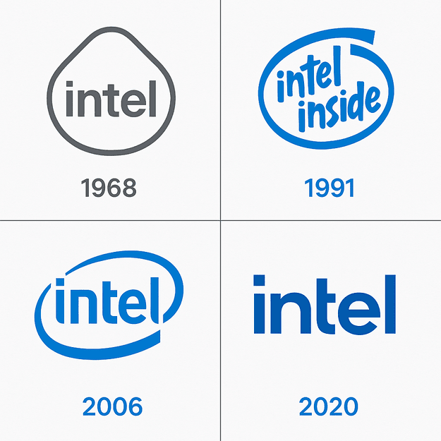
Intel Logo Evolution, From 1968 to the 2022 Redesign

Intel’s logo has spent more than fifty years selling something almost nobody sees. The chips sit sealed inside other companies’ computers, so the blue wordmark and the “Intel Inside” sticker had to do the job of making a component feel like a brand.
· 9 min read

Iconic Logos

The Marvel Logo, From Timely Comics to the Red Block

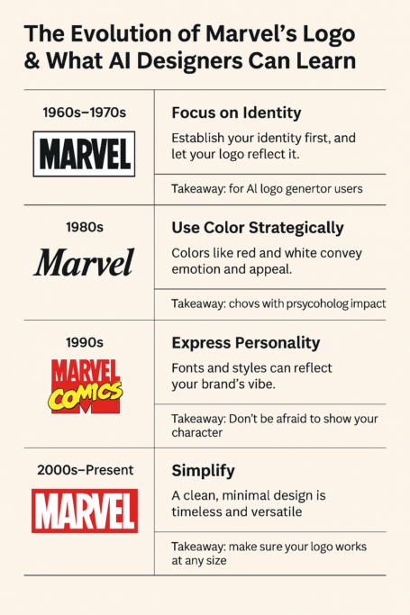
The Marvel logo most people know is a red rectangle with MARVEL knocked out in white, and it only dates from 2002. Before that, the company went through a shield, a corner box, slanted italics and a red-and-yellow 1990s mess, and its history is a good map of what works in a logo and what doesn’t.

· 7 min read

Sports Logos

The Minnesota Timberwolves Logo, From 1989 to Today

The Minnesota Timberwolves have redesigned their logo three times since joining the NBA in 1989, and every version has been a wolf. The animal stayed; the drawing got simpler, the blues got bolder, and by 2017 the fur and detail of the early years had been cut back to a clean, flat mark.

· 9 min read

Iconic Logos

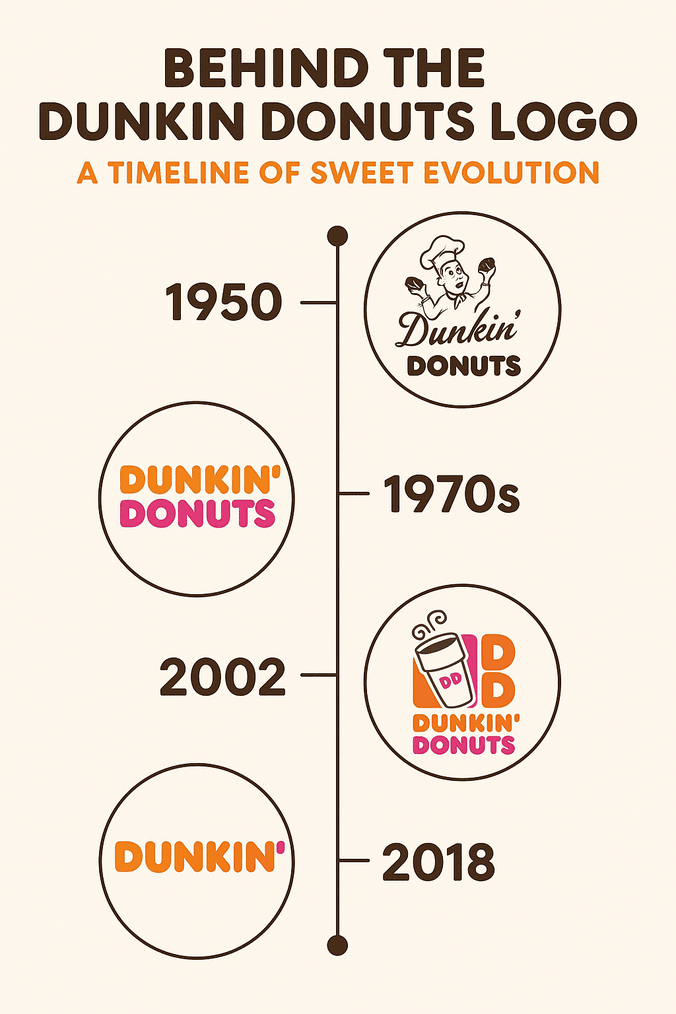
The Dunkin’ Donuts Logo: Orange, Pink and Nostalgic

In 2018 Dunkin’ Donuts took the word “Donuts” out of its own name, which is a strange thing for a donut chain to do. The logo barely flinched: the same orange and pink, the same chunky, friendly lettering, now spelling only “Dunkin’.”

· 8 min read

Iconic Logos

Baskin-Robbins Logo Evolution and the Hidden 31

Look at the pink parts of the Baskin-Robbins “BR” and you will find a 31, the number of flavors the chain built its name on. It is one of the better-known hidden details in fast-food branding, and it is the reason this logo is more interesting than its cheerful colors suggest.

· 7 min read

Iconic Logos

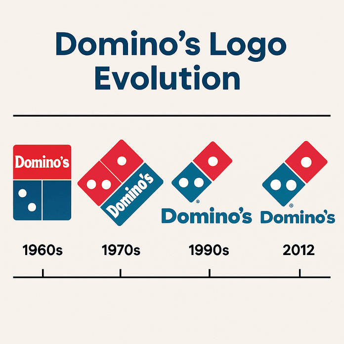
The Domino’s Logo: Three Dots and How It Evolved

The three dots on the Domino’s logo were meant to be a running total. Each one stood for a store, and the plan was to add a new dot every time the chain opened another location. With more than 20,000 stores today, that idea did not last long, but the three dots did.

· 8 min read

Iconic Logos

The Mercedes Logo: How the Three-Pointed Star Evolved

The Mercedes star started as a mark on a postcard. Gottlieb Daimler is said to have drawn a three-pointed star on a card to his wife in the 1870s, predicting it would one day shine over his factories, and by 1909 his company had adopted it.

· 8 min read

Iconic Logos

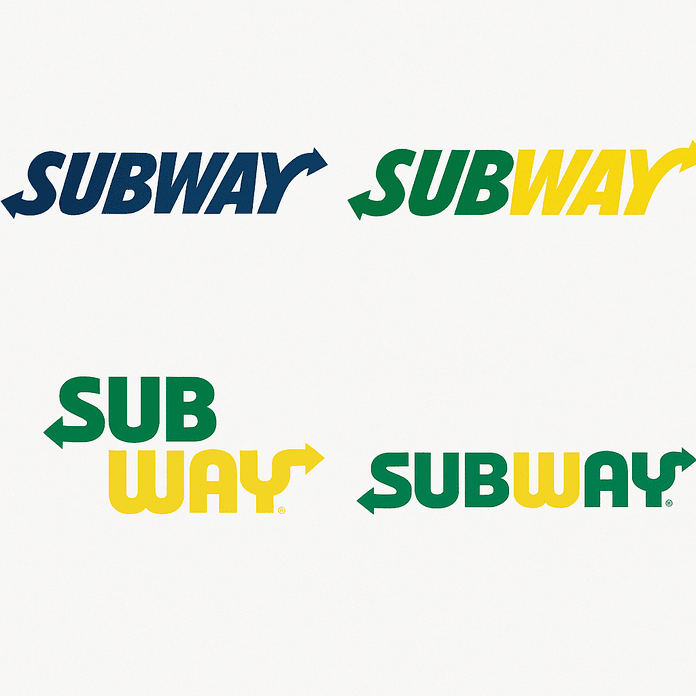
The Subway Logo: How It Evolved and Why It Works

Subway started in 1965 as Pete’s Super Submarines, a single shop in Bridgeport, Connecticut, paid for with a $1,000 loan. The logo that grew out of it, green and yellow with an arrow at each end, is now one of the most familiar marks in fast food.

· 9 min read