Baskin-Robbins Logo Evolution and the Hidden 31

The Number in the Letters
Look at the pink parts of the Baskin-Robbins “BR” and you will find a 31, the number of flavors the chain built its name on. It is one of the better-known hidden details in fast-food branding, and it is the reason this logo is more interesting than its cheerful colors suggest. The pink and blue get your attention. The 31 is what people remember and point out to each other, and a logo that people explain to their friends is doing its job very well.
How the Logo Came Together
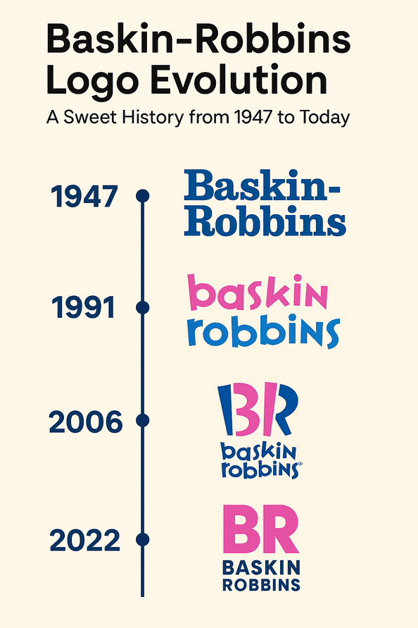
Burt Baskin and Irv Robbins joined forces in 1945, and from early on the brand was built around fun rather than refinement. The first logo was simple. The pink-and-blue design most people know took shape by the 1990s: a bold “BR” monogram with the “31” worked into it as a nod to the 31 flavors. It combined a plain shape with a small story, which is a hard pairing to beat.
A good logo tells you something about the brand at a glance, and this one says “variety” and “treat” before you have read a word. That is the first lesson for anyone designing a logo: it should work as a visual elevator pitch.
Pink and Blue
The colors were chosen with care. Pink is playful, warm and inviting, the color of cotton candy and strawberry ice cream. Blue brings trust and reliability, and it keeps the pink from tipping into pure candy. Together they tell you the place is fun and that you can count on it.
That balance is the useful bit. Colors are shorthand for emotion, and the trick is to pick ones that match your brand’s personality rather than ones you happen to like. Try several palettes side by side before you commit. The right one is usually obvious once you can compare them.
Type and the Monogram
The lettering is rounded and sans-serif, and it feels approachable, the typographic equivalent of a friendly wave from the counter. The “BR” monogram with its hidden “31” is a piece of sleight of hand that rewards a second look, a bit like finding an extra scoop at the bottom of the cone.
The new Baskin-Robbins logo introduced in 2022 pushed further in the same direction, with a softer typeface and brighter colors. It shows that a classic can be updated without being thrown out. If you are making your own logo with AI software such as Semplr, aim for the same balance of clarity and invention, and keep adjusting the type and shapes until the result feels right rather than merely acceptable.
What the 31 Means
The hidden number is more than a gimmick. It stands for choice and abundance, a flavor for every day of the month. That kind of quiet storytelling is what separates good logos from great ones. A logo can be a small puzzle, as long as it is one people solve in a second.
If you are designing your own mark, think about whether it could use a hook like this, a small detail that makes people smile when they notice it. Not every logo needs one, and a forced hidden message is worse than none. When it fits, though, it makes a logo feel personal.
The 2022 Refresh
The Baskin-Robbins logo manages to look modern and nostalgic at once. The 2022 refresh, noted in posts on X as a slow rollout, kept the core elements and updated the feel for screens. That approach is similar to what Mercedes has done in simplifying its three-pointed star for a cleaner, more digital look: modernize the surface, keep the heritage.
The aim for any designer is a logo that feels current without being tied to the current year. If your design looks very “2025,” it will look very dated by 2030.
From Neon to Instagram
The logo has been a constant in American dessert culture through a lot of change, from the neon-lit 1980s to the Instagram aesthetic of today. It is the sign people remember from birthday parties and late-night trips for ice cream, and plenty of kids doodled it on their notebooks. Few dessert brands are so tied to particular memories.
That staying power comes from consistency. A logo is a promise, and this one has kept promising the same thing for decades. The challenge for anyone designing a logo is to make something that can last for decades, not one that peaks with this year’s trend.
Knockoffs and Criticism
The logo has had its share of trouble. Local ice cream parlors have copied the pink-and-blue palette, and there have been debates about whether the branding feels too American in global markets. None of it has done much damage. The brand has stayed cheerful and kept going.
Mercedes offers a comparison: its logo has been drawn into debates about luxury and environmental impact in recent news cycles. In both cases a strong logo has survived criticism by staying true to what it was. The practical point is to expect pushback and to make sure your design is honest about your brand, because that is the version that holds up.
The Business Side
Baskin-Robbins is privately held under Dunkin’ Brands, and the parent company’s performance reflects the value of its brands. A strong logo drives recognition, and recognition drives sales. The 2022 refresh arrived alongside a push into digital ordering and global expansion, which made it a signal that the brand was ready for new markets.
For small businesses the stakes are the same at a smaller scale. A good logo is a business asset, and it can help a startup look like a serious competitor long before it is one.
A Consistent System
Whether it is on a storefront in Tokyo or a pint in your freezer, the logo is instantly recognizable. That sameness builds trust, and it makes every store feel familiar. Consistency is what holds a brand together.
Consistency starts with a simple design system: a fixed set of colors and fonts, used the same way across every touchpoint. It does not have to be elaborate. It has to be followed.
Three Lessons From Baskin-Robbins
First, simplicity wins: clean lines and bold shapes. Second, a story helps, and the “31” is a good example of meaning built right into the letters. Third, change carefully. The 2022 refresh modernized the look without losing what made the logo recognizable.
None of this requires a design degree. You can try minimal designs, playful type and hidden symbols in any decent logo tool and see which ideas survive.
What the Logo Says
The message is simple: joy. Rounded edges and bright colors suggest that life is short and you might as well have dessert. That clarity is what makes the logo memorable. For any designer, the hard part is condensing a brand’s message into one image, and the easiest way to fail is to try to say too much.
On Social Media
In the age of #FoodPics the logo does well online, turning up in Instagram posts and TikTok hauls. The 2022 version, with its brighter palette, was designed with phone screens in mind and stands out there as clearly as on a storefront.
The reminder for anyone making a logo now is to design for screens from the start. Check how it looks on X, Instagram and as a small profile picture.
AI and Logo Design
AI has changed how logos get made, and a refresh like Baskin-Robbins’ 2022 update is the kind of project these tools could help with. They use machine learning to suggest designs based on a brand’s values, colors and industry trends, and they have made decent design available to almost anyone.
They are not magic. Technology can speed up creative work but it does not replace the judgment behind it. Use AI as a starting point and then add what only you know about your brand.
More Than Ice Cream
Baskin-Robbins also sells cakes, sundaes and drinks, all under the same logo. From custom ice cream birthday cakes to seasonal flavors like Pumpkin Cheesecake, the range is broad, and the logo is general enough to cover all of it. Dairy Queen leans into Americana and Ben & Jerry’s into quirky activism. Baskin-Robbins sits between them, fun and accessible.
Against Dairy Queen and Ben & Jerry’s
Dairy Queen’s red-lipped logo feels retro but has no story comparable to the “31.” Ben & Jerry’s hand-drawn look is full of personality, but it can look messy next to Baskin-Robbins’ clean design. Baskin-Robbins wins on balance: playful and professional at once, which is what most small brands should be aiming for.
If Baskin-Robbins Had Used an AI Logo Generator
Imagine the Baskin-Robbins team starting its 2022 refresh by typing “playful,” “ice cream” and “pink and blue” into an AI logo generator. It would return plenty of options. The designers might adjust the “BR” monogram and try a few new typefaces until something felt fresh but familiar.
This is a hypothetical, but it is how these tools are most useful: for fast exploration. For small businesses they offer professional-looking results at a fraction of the usual cost.
Making a Logo With AI, Step by Step
- Pick a tool. Choose one with a clear interface that lets you download your logo without a watermark.
- Define your brand. Use keywords that describe it: “fun” for a bakery, “sleek” for a tech startup.
- Experiment with color. Choose colors for the feeling they create, the way Baskin-Robbins does.
- Keep it simple. A clean design is easier to remember. Cut clutter even if the software suggests it.
- Test and adjust. Download the logo and check it on a website, a business card and social media.
What Baskin-Robbins Gets Right
The Baskin-Robbins logo is a cheerful pair of colors and two letters, and on its own that would be forgettable. The 31 hidden inside makes it a logo people talk about. That is a small, specific piece of design thinking, and it is worth more than any amount of polish. If you can find one detail like that for your own brand, something true that rewards a second look, put it in and leave everything else simple.


