The Instagram Logo, From Polaroid Camera to Gradient
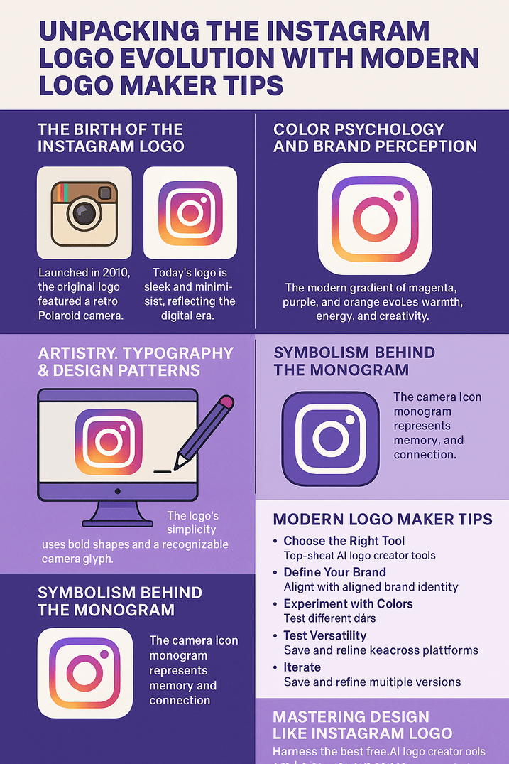
Instagram’s first icon was a little brown Polaroid-style camera with a rainbow stripe, drawn in 2010 when the app was a photo-filter toy. In 2016 the company threw out the camera’s textures and shading and kept only its outline, filled with a magenta-to-orange gradient. Plenty of users hated it at first. Now it is one of the most familiar shapes on any phone, and the change is a good case study in when a brand should let go of the thing everyone thinks they love.
The story is short, because Instagram is young, but it covers most of what matters in logo design: nostalgia, simplification, color, backlash and scale.
A Polaroid in Your Pocket
When Instagram launched in 2010, its logo was a nostalgic Polaroid-style camera with a rainbow stripe across the front, a tribute to instant photography. Co-founder Kevin Systrom made the first design himself, and it was retro on purpose. It played on a longing for physical photos at a moment when pictures were becoming disposable, and it described the app’s job literally: take a picture of a moment and share it.
As the app took off, the chunky camera began to look dated. By 2011 a refined version appeared. It was still a camera, but sleeker and more polished, a sign that the brand was growing up. A logo has to grow with its audience, and Instagram’s was moving from quirky to iconic. That early refinement set up the much bigger change to come.
The Gradient and What It Says
The current logo uses a gradient of magenta, purple and orange, and the colors are doing real work. Warm, bright hues suggest creativity, passion and energy, which fits a platform built on visual storytelling. When the new logo arrived in 2016, it dropped the retro browns for this sunset palette. It was a risky move, and it paid off by making the brand feel current. Studies suggest warm gradients carry an emotional charge and help create a sense of community, which is exactly what a social app wants from its icon.
For young designers the lesson is that color changes how a brand is perceived before anyone reads a word. Instagram swapped the colors and kept the shape, and the brand felt completely different. If you are working on your own mark, try the same shape in three or four palettes. The difference is usually bigger than you expect.
No Type, Just a Glyph
Unlike many tech companies, Instagram does not lean on lettering in its icon. The camera glyph, which lost any text in later versions, carries the whole identity. The 2016 redesign used negative space well: the camera became a rounded square, a circle for the lens and a dot for the viewfinder. It is about as simple as a camera can be drawn and still read as one.
This pattern puts recognition ahead of detail, and it is easy to copy in principle. The logo’s history shows a clear move toward flat design, in step with the rest of the industry at the time. For aspiring logo creators it is a lesson in clean lines and bold shapes. A good logo works like a short poem: strip out the extra words, let the form carry the meaning, and make sure people can recall it instantly.
A Symbol of Memory
At heart the Instagram logo is a symbol of memory. A camera icon needs no translation; it means captured moments in any language. That universality was not accidental. The original Polaroid shape pointed at personal history, and the modern glyph boils that down to a general symbol for photography. Over time the meaning has deepened, from taking pictures to curating a life in public.
For new entrepreneurs, symbolic depth is worth aiming for. A logo works like a flag or a signature, standing in for the whole organization. Instagram’s glyph does that, and it is a reminder that a simple symbol, refined enough, can say more than words in a crowded market.
The 2016 Break
The 2016 overhaul went all in on modernism. The skeuomorphic camera, with its fake textures and shading, was replaced by a flat icon flooded with gradient color. This was more than a facelift. It was a shift in philosophy toward something that would last, closer to the Bauhaus idea of form meeting function. The new logo gave up nostalgia for forward-looking minimalism and looked at home in app stores and on billboards alike.
That adaptability is the lesson. Lasting design beats trendy design, and the redesign was a rejection of gimmicks in favor of clarity. Instagram showed that going modern does not have to mean losing your identity. Done well, it means the logo will still look right in ten years.
A Logo in Step With Style
Instagram is a style arbiter as much as an app, and its logo reflects that influence. The original retro camera fit the hipster look of the early 2010s, with its filters and vintage cameras. The bright new logo matches the bold, colorful maximalism of Gen Z fashion. Each redesign has lined up with the visual trends of its moment, which helped keep Instagram in the role of tastemaker.
Branding is tied to its time, and a logo has to feel like it belongs to the present. Style reflects the moment, and the Instagram logo’s history shows a design that both shaped and echoed the culture around it.
Backlash and Knockoffs
Not every chapter went smoothly. The 2016 redesign set off a wave of complaints. Users mourned the retro camera and called the gradient soulless. Knockoff apps copying the icon’s shape have also blurred its exclusivity and raised copyright questions. There is a cultural debate too: does a camera icon really represent storytelling around the world, or is it a Western idea of what sharing looks like?
These arguments are a reminder that logos are lightning rods as well as artwork. A logo has to own its space, and that means originality is not optional. Instagram’s experience is a useful warning: expect a reaction to any big change, protect what is distinctive about your mark, and make sure it speaks to everyone it is meant for.
Branding and the Business
Facebook bought Instagram for $1 billion in 2012, and the brand was a big part of what made it worth that much. The logo became a sign of trust, easy to recognize, which helped bring in users and reassure investors. After 2016 the refreshed logo matched a cleaner app experience, and user numbers kept growing, passing 1 billion by 2018. Perception drives value, and a strong logo helps anchor customer loyalty.
For new entrepreneurs the link is worth taking seriously. A logo that looks professional tells people the business is serious. Instagram’s shows that visual identity is a business asset as well as decoration, tied to growth and market trust.
Consistency Through Change
The logo anchors Instagram’s brand identity, and it looks the same on profile pictures, merchandise and ads. Even through big changes, the core idea, the camera shape, has stayed. That mix of change and continuity is valuable. It let Instagram refresh its look without losing people’s recognition.
For young designers, consistency is the glue that holds an identity together and builds trust. Test variations of your logo by all means, but keep your core motif fixed and use it the same way on every surface, from a profile picture to a billboard.
What Designers Can Learn
Instagram’s logo teaches three things. First, simplicity wins: the glyph cuts through noise. Second, evolution matters, and holding on to an outdated design out of sentiment is a mistake. Third, emotion often beats logic, and the colors are there to make people feel something.
The logo’s history is above all about adaptability. Great logos are rarely right the first time. They are reworked with a purpose, with an audience and the culture around them in mind, and Instagram went through three versions in six years to get there.
How the Logo Speaks
The camera at the center of the logo says “capture and share” in a visual language that needs no translation. The rounded corners and warm gradient make it approachable, which fits the app’s social purpose. That kind of clarity matters for any brand.
If you are designing a logo, think about what it says without words. Adjust shapes and colors until they match what you mean. The Instagram logo shows how a single icon can communicate connection to every viewer at once.
Hashtags and Ubiquity
Instagram and hashtags grew up together, and the logo is part of that. As the platform spread hashtag habits like #ThrowbackThursday, its icon became the doorway to viral trends. It sits on billions of screens and has become a cultural stamp, part of the same shorthand that social media created.
For young designers, digital relevance has to be part of the brief. Digital symbols shape how people interact, and in a world of endless scrolling a logo has to hold attention in the split second it gets.
Technology, AI and the Next Version
Technology has changed how logos are made, and Instagram’s story reflects that. Its early designs began as sketches. Today the same icon could be iterated in minutes, with gradients and shapes tested on screen. AI logo generators have made this kind of rapid prototyping available to beginners, and the speed and access are real gains.
Imagine Instagram’s team revisiting the logo today with one of these tools. They would enter the core traits, camera, creativity and connection, and let the software produce gradient variations or minimal tweaks. Tools like Looka or Canva could polish the results into clean files ready for a global rollout. That would cut design time a great deal. Instagram already has a habit of reinvention, and AI would simply speed it up. The tools can take on the grunt work, but the judgment about which version keeps the brand intact still has to come from people.
Making a Logo With AI
If you want to try this for your own brand, start by picking a platform with an interface you find easy. Enter keywords that describe the brand, such as “vibrant” or “tech,” and look at what comes back. Adjust the colors and shapes until they feel like you, the way Instagram’s palette feels like energy. Iterate without worrying about mistakes: save versions and compare them side by side. Experimenting is where the good ideas come from, whether you are starting a company or just learning design.
Designing Like Instagram
A Few Practical Steps
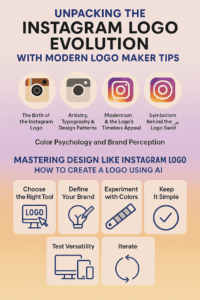
- Choose a tool you trust. Canva and Looka both have simple dashboards and plenty of templates to start from.
- Define the brand first. Decide whether it is fun, sleek or bold before you generate anything, the way Instagram’s logo is built around connection and creativity.
- Experiment with color. Warm tones like Instagram’s gradient carry emotion. Try several palettes and see what your audience responds to before you commit.
- Keep it simple. Complexity hurts recall. The Instagram logo works because there is so little in it, so strip out anything that is not pulling its weight.
- Test it everywhere. Download high-resolution files and check the logo in an app, on a website and in print.
- Iterate. Don’t settle on the first draft. When you create a logo using AI, tweak it, save several versions and get fresh eyes on them. Instagram’s logo took years to reach its current form.
Where It Leaves Us
The Instagram logo went from a literal picture of a camera to a symbol of one in six years, and the second version is far stronger. It lost the charm of the original, and plenty of people were sorry to see it go, but it gained the ability to sit next to any other icon on a phone and still stand out. That trade was worth it. Like other logos that have lasted for decades, it works because it is simple and has a clear idea behind it. For anyone starting out, tools like Semplr make it easy to sketch your first version. The harder part is knowing, as Instagram did, when the version people love has to go.


