The Domino’s Logo: Three Dots and How It Evolved
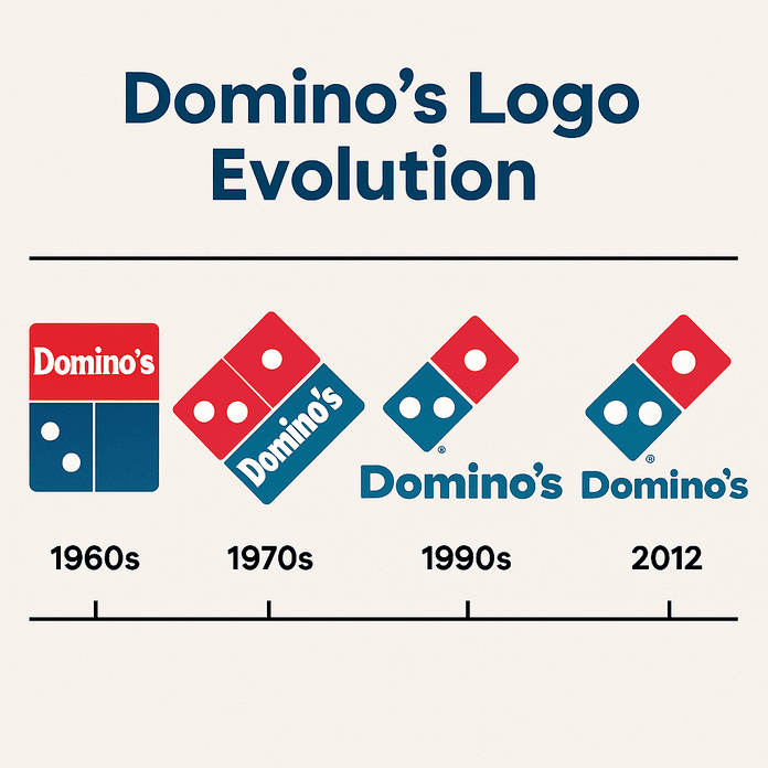
The three dots on the Domino’s logo were meant to be a running total. Each one stood for a store, and the plan was to add a new dot every time the chain opened another location. With more than 20,000 stores today, that idea did not last long, but the three dots did. Since the brand first appeared in the 1960s the logo has been simplified and tilted and has lost a word, and it is still one of the plainest and most effective marks in fast food.
Three Dots, Three Stores
The story starts in Michigan in the 1960s, when a young Tom Monaghan took over a struggling pizzeria called DomiNick’s. A delivery driver suggested renaming it Domino’s, mostly because the name was easy to say and stuck in the head. The first logo was as plain as a cheese pizza: a red-and-blue domino tile with three white dots, one for each of the first three stores. More dots were supposed to follow as the chain grew. That plan was dropped quickly, which, at more than 20,000 locations, was a good call.
A logo does not need to tell a company’s whole story. It just has to stick, and the domino did, settling into popular memory through sheer simplicity.
Red and Blue
The colors do a lot of the work. Red signals urgency and appetite, the visual version of “order now.” Blue suggests trust and reliability, a good fit for a company that built its name on delivering in 30 minutes or less. Together they work as well as pepperoni and mozzarella.
Red tends to grab attention and push people to act, while blue builds loyalty over time, and Domino’s gets both from a single tile. The lesson for anyone choosing colors is that they carry emotion before they carry information. Try a few palettes and watch how each one changes the mood of the same shape.
The Tile and the Type
The logo is very simple. The domino tile is a clean piece of geometry, with crisp lines, strong contrast and an obvious link to the game that gave the company its name. The lettering, especially since the 2012 redesign, uses a sans-serif that feels modern but friendly, like a delivery driver who always has change for a twenty.
Compare Pizza Hut’s swooping red roof or Papa John’s script. Domino’s is the minimalist of the group, the cousin who turns up to the family reunion in a well-cut blazer. That clean approach is also practical, because a simple tile scales from a pizza box to a billboard without losing anything.
What the Domino Stands For
The tile is more than a pun on the name. It is also a metaphor for growth: one store leads to the next, the way one domino knocks over another. The three dots no longer track the store count, but they still suggest ambition and a brand that keeps expanding. That bit of built-in story is part of what makes the logo memorable.
A logo works like a flag or a signature, and Domino’s flies its flag with some pride. Whatever you are designing for, a coffee shop or a tech startup, it helps to find a symbol that carries a small story of its own.
The 2012 Redesign
The 2012 logo was a tidy-up, not a reinvention. It dropped the word “Pizza” from the name, since everyone already knew what Domino’s sold, and moved to a sleeker design built for screens. The new version looks as good on a phone as on the roof of a delivery car. Good logos change without losing their character, and this one is a fine example.
For designers, the balance between fresh and familiar is the whole game. Small, regular updates can keep a brand current for decades, and Domino’s history shows that you rarely need to start again from scratch.
A Constant Through Changing Tastes
Domino’s has ridden every shift in American eating, from the pizza boom of the 1980s to the age of delivery apps. Its logo has stayed fixed through fads like stuffed crust and gluten-free bases, and it has become visual shorthand for comfort food for college students and families alike.
Because it appears on boxes, apps and even Super Bowl ads, the domino has become a pop culture fixture, the pizza world’s answer to Coca-Cola’s script or Nike’s swoosh. The lesson is to aim for a logo that can be everywhere and still feel familiar wherever it shows up.
Knockoffs and Missteps
Domino’s has had its share of trouble. Shady pizza places have used counterfeit versions of the logo, and some of its ads have drawn social media backlash for being tone-deaf. The logo itself has mostly stayed out of it, partly because it is so inoffensive. The company’s global expansion has raised its own questions about cultural sensitivity, with toppings like corn in Japan and tikka masala in India not always translating smoothly from one market to the next.
That is a reminder that a logo has to work across cultures without offending anyone. Before a mark goes international, check how its colors, shapes and words read in the places it is going.
The Logo and the Business
Domino’s stock (DPZ) has climbed a long way over the years, and the company had a market value of $16 billion in 2025. The logo is the face of a brand that people associate with convenience. Every box with the red-and-blue tile on it reinforces trust, which helps sales and franchise growth. In Warren Buffett’s terms, a strong logo is part of a moat, a competitive advantage that rivals find hard to cross.
That is why a well-made logo matters at any scale, from a single pizzeria to a fast-growing tech company. Professional-quality design is far more accessible than it used to be, which levels the field for small businesses.
Consistency From Anchorage to Auckland
Domino’s is very good at consistency. From Anchorage to Auckland, the red-and-blue tile means Domino’s and nothing else. That sameness builds trust, because customers know what they are going to get. It is also why the brand can try new menu items, tacos included, without confusing anyone about who it is.
A brand is a kind of promise, and the logo is how Domino’s keeps reminding people of it. Treat your own logo as a fixed point that every piece of communication refers back to.
What the Logo Says
The logo communicates more than its size suggests. The bold colors say fast and fun, and the domino hints at community and connection. The 2012 redesign gave the tile a playful tilt, making it feel less corporate and more like a friend who brings pizza.
Your logo should speak your brand’s language too. Start by deciding the message, fun, sophisticated or rebellious, and only then start drawing.
The Domino Online
Search #Dominos on Instagram and you get millions of posts: pizza selfies, delivery unboxings and even fan art of the logo. The domino turns up in TikTok dances and memes on X, and its clean design keeps it from looking pixelated or dated at small sizes.
Digital versatility matters more every year. Make sure you have high-resolution files of your logo that hold up everywhere, from Instagram Stories to X banners.
Technology and AI
AI has made logo design faster and more accessible. AI logo generators such as Looka and Canva generate options from a brand’s style, colors and industry, and the domino, with its clean lines and bold shapes, is exactly the kind of mark they handle well. They are useful for creative people as well as for engineers.
Domino’s itself has embraced technology, from AI-powered ordering systems to drone delivery trials. The logo is adaptable enough to fit all of it, whether it appears in an app or on the side of a robot.
Beyond the Pizza
Domino’s sells far more than pizza now. Wings, lava cakes, sandwiches and pasta bowls share the menu, all under the same logo. The company’s services, from online ordering and the order tracker to the loyalty program, lean on the logo’s recognizability to hold everything together.
That is a lesson in versatility. A logo has to work across products and platforms, so try it on mockups of everything from merchandise to app screens before you settle on it.
Domino’s Against the Competition
Next to Pizza Hut’s nostalgic roof or Little Caesars’ toga-wearing mascot, the Domino’s logo looks modern and uncluttered. It is less fussy than Papa John’s script and livelier than Round Table’s medieval look. That simplicity gives Domino’s an edge in a crowded market.
Aim for clarity over complexity. Put your design next to your competitors’ and make sure it stands out without shouting.
If Domino’s Tried an AI Logo Generator
As a thought experiment, imagine the Domino’s design team using a generator for a refresh. They would type in “bold, red, blue, domino-inspired” and get back a range of options, then mock them up on pizza boxes and app screens until something felt right. The result might be unmistakably Domino’s with a 2030s twist, perhaps a holographic domino or an animated tile for VR menus.
It is speculation, but it shows what these tools are good for. For anyone else, watermark-free exports from tools like Semplr, Canva Pro and Looka mean a design can go straight onto real mockups.
How to Make a Logo With AI
If you want to try it yourself, these steps cover the basics:
- Define your brand. Decide whether you are playful like Domino’s or luxurious like Louis Vuitton.
- Choose a tool. Looka is good for polished designs and Canva for flexibility.
- Experiment with color. Red for energy, blue for trust, or a mix.
- Keep it simple. The Domino’s logo works because it is clean, so avoid clutter.
- Test it. Mock up the logo on business cards, apps and social media.
- Get clean files. A premium plan on Canva or Looka removes watermarks from downloads.
Many of these tools have free tiers, so you can work through the whole list before spending anything.
What the Domino Gets Right
The Domino’s logo began as a store counter that could not keep up and ended up as one of the most recognizable marks in food. The original idea failed, and the shape survived because it was simple enough to mean something else. Keep the design simple and bold and tied to a story, and it can outlive the reason you drew it.


