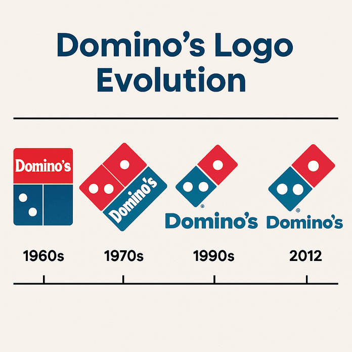
The Domino’s Logo: Three Dots and How It Evolved
The three dots on the Domino’s logo were meant to be a running total. Each one stood for a store, and the plan was to add a new dot every time the chain opened another location. With more than 20,000 stores today, that idea did not last long, but the three dots did.