The Minnesota Timberwolves Logo, From 1989 to Today
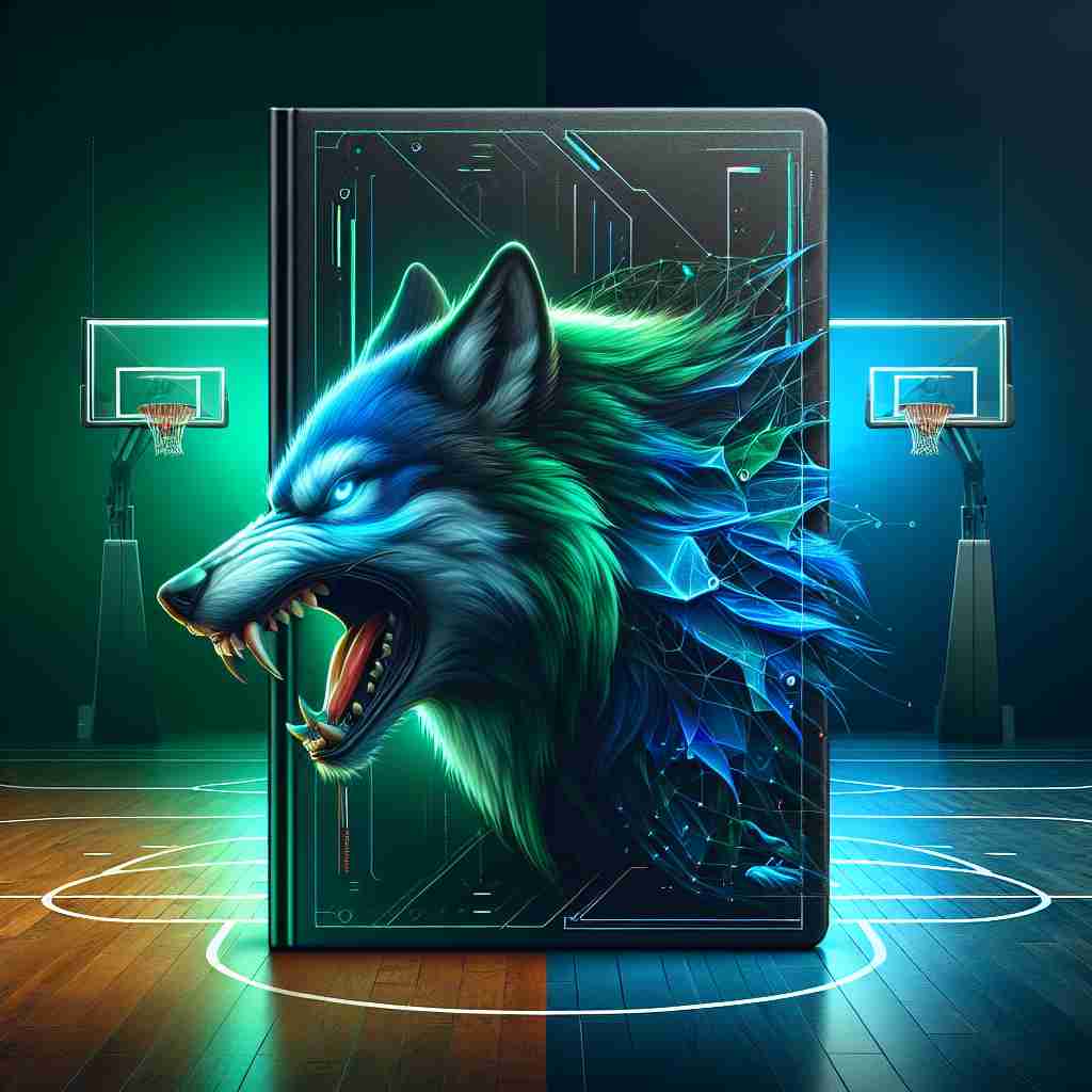
The Minnesota Timberwolves have redesigned their logo three times since joining the NBA in 1989, and every version has been a wolf. The animal stayed; the drawing got simpler, the blues got bolder, and by 2017 the fur and detail of the early years had been cut back to a clean, flat mark. That is a fairly unusual record in professional sports, where teams often throw out their whole identity when a new owner or a new star arrives.
It has also become more than a team badge. The wolf is a streetwear item, a merchandise engine and, for some critics, a source of uncomfortable questions about borrowing Native American symbolism.
1989: A Wolf for a New Team
When the Timberwolves entered the NBA in 1989 they needed a logo that announced a new franchise and also said something about the state. The answer was a snarling wolf with bared teeth against a forest-green background. It was a tribute to the lakes and pine forests that define Minnesota, and to a sense of wildness that a lot of Minnesotans are proud of. The look had a rugged, Paul Bunyan quality to it, unapologetically Midwestern.
The redesigns since then show a steady direction. The 1996 version introduced a fiercer wolf with a basketball, in step with the flashy look of the NBA in that decade. In 2008 the logo slimmed down, with sharper lines and a bolder blue. The 2017 overhaul, unveiled while Karl-Anthony Towns was emerging as the team’s star, reduced the wolf to a minimal shape howling at a basketball moon. Each step kept the animal and changed the drawing, which is the safest way to modernize a logo without losing the fans who grew up with it.
The logo has been busier than ever in 2025. The team’s playoff run, led by Anthony Edwards, put it back on national television night after night, and ESPN reported merchandise sales up 15% year over year. Winning is still the best marketing a team logo can get.
The Colors
The palette does a lot of the emotional work. The deep blues suggest loyalty, which a Timberwolves fan needs after decades that included both playoff runs and a long list of lottery picks. Green ties the team to the state’s forests and lakes, and white adds a clean, crisp edge. Together they come across as tough but not hostile, a team that plays hard and still feels like part of the community.
Set against the rest of the league, the choice looks smart. The Lakers’ purple and gold are pure Hollywood glamour. The Celtics’ green comes from Boston’s Irish heritage. The Timberwolves’ blue and green carve out their own territory, outdoorsy and approachable. The general point holds for any brand: pick colors that tell your story, and make sure they are not already owned by your nearest rival.
Drawing and Lettering
The wolf has always been about motion and menace, with piercing eyes and lines that seem to move. The early versions included a lot of fur texture, which looked good on a poster and muddy on a small screen. The 2017 redesign chose a sleek, simplified wolf that reads clearly on jerseys and phones alike. The lettering followed the same path, from the blocky type of the 1990s to a sharp, angular sans-serif that suits a team that wants to look aggressive.
The move from detail to simplicity is the main design lesson here. Fine texture is the first thing to disappear when a logo is shrunk, embroidered or printed on cheap fabric. Clean lines and a bold silhouette survive all of that, and they still look good when the logo is blown up on an arena floor.
What the Wolf Means
The Timberwolves do not use a monogram in the traditional sense. The wolf is the monogram, standing for ferocity, teamwork and the wilderness. The 2017 logo went further, with the wolf howling at a basketball moon, a small piece of myth-making that blends the sport with older stories.
The wolf also has deep roots in the Native American cultures of Minnesota, where it stands for strength and community. That connection gives the logo some of its weight, and it is also the source of criticism, which comes up below. Either way, the logo shows how a single image can carry a team’s whole identity and mean something to fans from Minneapolis to Manila.
The 2017 Redesign
The 2017 redesign was a clear success. It removed the fussy details of earlier versions and replaced them with a sleek wolf and a basketball moon in a crisp blue-green palette. The result appeals to younger fans who mostly see the logo on TikTok, and it still respects the history that longtime supporters care about. It evolved the logo without erasing the past.
This is the balance most brands get wrong. They either keep a dated mark too long or replace it with something unrecognizable. The Timberwolves kept the subject, simplified the drawing and let the colors carry the continuity. Simplicity and adaptability, more than any particular style, are what make a logo last.
The Wolf as Streetwear
The logo has a life well beyond the court. In the 1990s the bold wolf appeared on the baggy jerseys that were standard in hip-hop fashion. Today’s cleaner design works on fitted caps and hoodies. The 2024 Nike x Timberwolves capsule collection sold out within hours, according to Hypebeast, which says a lot about how far the wolf has traveled from the arena.
It sits comfortably next to other famous NBA marks in the streetwear world. The Bulls’ bull head was a 1990s fashion staple, and the Warriors’ bridge logo has a strong Bay Area identity. The Timberwolves’ wolf holds its own among them, partly because it is playful enough to wear casually and simple enough to print on anything from a T-shirt to a tote bag.
Fakes and Cultural Questions
Counterfeits are a constant problem. Fake jerseys fill online marketplaces and dilute the real thing. In 2025 a post on X went viral for showing a counterfeit Timberwolves cap whose wolf looked more like a puzzled dog, and fans had fun with it, but the underlying issue is serious for the team’s merchandise business.
The bigger debate is about meaning. Some critics argue that the team’s wolf imagery borrows from Native American symbolism, given the animal’s sacred place in Ojibwe culture. The team consulted local tribes during the 2017 redesign, but the debate has not gone away. For any designer, the lesson is plain: originality and cultural awareness both matter. Templates and borrowed motifs can produce a design that looks like a knockoff or, worse, offends the people whose symbols it uses.
The Business of the Wolf
The logo underpins a valuable business. Forbes put the team’s value at $2.5 billion in 2025, driven by playoff success and merchandise sales. The wolf appears on everything from $200 sneakers to $5 coffee mugs, and each redesign has lined up with a business goal. The 2017 refresh, for example, came with a push for younger fans and international markets.
For an entrepreneur, that is the return on a strong logo in its plainest form. A mark that people want to wear becomes a revenue stream as well as an identity.
What Stays the Same
Through all the redesigns, three things have not changed: the wolf, the blue-green palette and bold type. That consistency is what lets the logo feel familiar to a fan who first saw it in the Kevin Garnett years, and it is why the wolf reads instantly on a jersey or a billboard.
It is the most transferable lesson in this story. Decide which elements of your identity are permanent, use the same fonts and colors everywhere, and change the rest only when you have a reason.
Saying It Without Words
The current logo communicates without text. A howling wolf and a basketball moon suggest strength, unity and ambition, and the wolf-pack idea fits a team sport neatly. The message is that this team fights together.
A logo can tell a story in a glance, but only if every part of it points the same way. If you are designing for a startup or a personal project, check each line and color against the one or two ideas the brand needs to carry, and remove whatever does not help.
#WolvesNation
Online, the wolf is everywhere. Hashtags such as #Timberwolves and #WolvesNation have millions of posts, from fans’ selfies in team gear to game-day hype videos. The clean lines of the 2017 design were built for Instagram and hold up under any filter. A TikTok trend in 2025 had fans recreating the wolf’s howl, which spread the logo further still.
Testing a logo on mockups for X, TikTok and Instagram is now a basic step. The Timberwolves’ mark shows what passing that test looks like: it works on an arena floor and in a phone notification.
Technology and AI
The logo’s history tracks the change in design tools. The early wolves were hand-drawn, and today’s design teams work digitally, with precise vector tools and the ability to test ideas with fans before launch. AI logo generators such as Looka, Canva and Semplr go further, producing options in seconds by drawing on huge numbers of existing designs, so anyone can now make a reasonably bold logo without a big budget.
It is easy to imagine the Timberwolves’ own designers using one for a future refresh, typing “wolf, basketball, blue-green, minimalist” and getting back a fiercer wolf, a stylized moon or a “TW” monogram to react to. That would be a fast, cheap way to explore color tweaks and new poses. Deciding which option respects the team’s history, and the cultures its symbol comes from, would still be a human job.
Merchandise and Fan Experiences
The brand extends well beyond the game into merchandise and fan experiences. The wolf appears on jerseys, hats and limited-edition sneakers, including a 2025 Air Jordan collaboration that sold out in minutes. The team’s app carries the logo and offers tickets and exclusive content. In 2025 the team also opened a playoff pop-up shop in Minneapolis, stocked with logo-branded gear.
An app icon, a sneaker tongue and a shop sign are very different places for a logo to live. A design that works in all three has done its job.
Against the Rest of the NBA
The Lakers’ purple-and-gold mark has Hollywood swagger. The Celtics’ leprechaun leans on Irish folklore. The Timberwolves’ wolf is earthier, tied to the Minnesota wilderness in a way that feels genuine. Its 2017 minimalism also looks better than the cluttered logos some teams, such as the Clippers, have used.
Standing apart is the goal. In a league of thirty logos, the ones people remember are the ones that could not belong to any other city.
Lessons for Your Own Logo
The Timberwolves’ wolf suggests a simple process for anyone designing a logo:
- Define the brand’s personality first. Fierce like the Timberwolves or sleek like Apple? Write it down in a few clear words.
- Choose colors deliberately. Blue for trust and green for nature, as the Timberwolves use them, or whatever fits your story.
- Keep it simple. One clean wolf says more than a crowded scene.
- Test it everywhere: on clothing, in an app and on social media.
- Get proper files. Whatever you use to make the logo, make sure you end up with high-resolution versions without watermarks.
- Iterate. Make many versions and refine the best until it feels right.
What the Wolf Gets Right
The Timberwolves logo has lasted because the team never lost sight of the wolf. The drawing has changed with the decades, the blues have deepened and the detail has gone, but the subject and the colors have carried fans through every version. It has not always been perfect, and the questions about its cultural roots deserve to be taken seriously.
As a piece of design, though, it is a good example of patient evolution. Pick a strong subject, simplify it over time, keep the colors steady, and let the team’s fortunes do the rest.