The Manchester United Logo: How the Red Devil Got on the Crest
The devil on Manchester United’s crest is borrowed from a rugby league team. Salford’s players were nicknamed the Red Devils, United took the name, and by the 1970s a pitchfork-carrying imp sat in the middle of the club’s red, gold and black shield. It is an odd choice for a football club when you think about it, a cartoon demon on the chest of one of the most valuable sports brands in the world. It has also turned out to be one of the most recognizable badges in the game, seen from the Stretford End to sports bars in Tokyo.
The crest is a useful study for anyone designing a logo: it is tied to a real history, it uses color with intent, and it has been simplified at the right moments without losing what makes it United.
From Railway Club to Red Devils
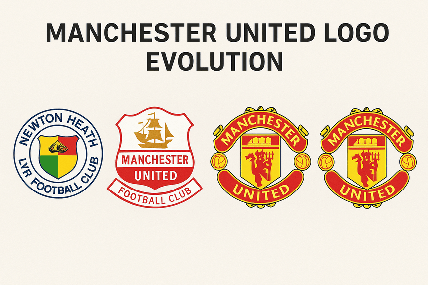
Manchester United did not start with a design studio. It began in 1878 in industrial Manchester as Newton Heath LYR Football Club, founded by railway workers. Its early badge was purely functional, closer to something on a payslip than to a global brand.
The crest’s real story starts after 1958, when the Munich air disaster killed eight of the club’s players. The team that Sir Matt Busby rebuilt needed a symbol that could carry both its grief and its determination. Taking the “Red Devils” nickname from the Salford rugby team, the club put a pitchfork-wielding devil on its badge by the 1970s, set inside a red, gold and black shield.
A logo’s first job is to identify, and this one identifies a story of survival and swagger. That is the first lesson from United’s crest: the best logos carry a narrative. The devil did not just mark a team. It marked a comeback.
Red, Gold and Black
Color is never an afterthought in a logo, and United’s shows why. Red dominates. It suggests passion, danger and urgency: the noise of the Stretford End, the rush of a late winner. Gold accents add prestige, like a trophy under floodlights, and black gives the design weight and authority. Color is one of the fastest routes to emotion, and this crest uses it directly.
For designers the point is that colors carry meaning, so choose them to fit what the brand stands for. United’s red does not just say football. It says fight. If you are building a brand, work out what your equivalent of that red is before you choose anything else.
Shield, Devil and Type
The crest combines form and function well. The bold sans-serif lettering is clear and readable from the top tier of a stadium or on a phone screen. The devil, pitchfork raised like a punk’s salute, mixes menace with mischief, which makes it a good example of a playful mark that still looks tough. It scales well and is hard to forget. The shield shape, taken from heraldry, feels old and modern at once, a link between Manchester’s industrial past and the club’s global present.
Simplicity, done properly, means clarity about what the logo is for, and United’s crest has that. A logo has to work on a scarf, a billboard and a social media avatar without losing its character, so test for scalability and clarity before anything else.
What the Symbols Mean
The devil is more than a mascot. Taken from the “Red Devils” nickname, it stands for defiance in the face of adversity. The ship at the top of the shield, a reference to Manchester’s canal history, roots the crest in local pride. Together they tell a story that is universal and specific at once: resilience, with a Mancunian accent.
Symbolism is central to any good logo. Whether it is a devil or a local landmark, a symbol has to carry meaning, and that meaning has to come from the brand’s real story. United’s crest shows how a well-chosen symbol can turn a badge into something people wear on their chests and wave on flags.
The 1998 Clean-Up
The crest has changed gradually. The 1998 redesign removed clutter to make it cleaner and better suited to screens. Unlike brands that chase trends (Pepsi has changed its logo many times), United has stuck to restraint and consistency. As Paul Rand put it, “A logo is less important than the product it signifies.” The crest lasts because it puts identity before flash, and it works on kits as well as keychains.
Designers should resist overcomplicating things. If United introduced a new logo in 2025, it would most likely be a refinement rather than a reinvention, keeping the devil at its center. Simple logos scale, and yours should too.
A Badge Across Eras
The crest works like a timeline of the club. In the 1960s it was linked with George Best and his flair. In the 1990s, under Sir Alex Ferguson, it became a badge of global success, seen from Tokyo to Timbuktu. The 1999 Treble and Cristiano Ronaldo’s return in 2021 each belong to a different era, and the same red devil marks both. That consistency lets a logo anchor a brand across decades, which is what any designer aiming for longevity should want.
Counterfeits and Cultural Debate
Fame brings problems. Counterfeit United shirts flood markets from Bangkok to Blackpool. There are cultural debates too: the club’s global reach has drawn appropriation claims, and some argue that the devil does not resonate in non-Western markets. For designers the point is to make a mark that is original and easy to defend legally, because knockoffs follow success.
The Crest and the Money
Manchester United’s shares trade on the New York Stock Exchange (MANU), and the crest’s global appeal drives merchandise sales. That has limits. In 2025 Adidas cut £10m from its £90m-a-year deal because the club missed the Champions League. Still, the badge brings in a great deal of money, and a strong brand clearly helps the bottom line.
The crest has also been the one constant through the club’s difficult finances since the Glazer family’s 2005 leveraged buyout, which loaded the club with £604m of debt, up from £50m. According to BBC Verify, £1.2bn has left United over 20 years in interest, repayments, dividends and fees, £815m of it in debt interest alone. Merchandise carrying the red devil helped generate £303m in commercial revenue in 2024, five times the 2006 figure, even as fans protested against the Glazers. Sir Jim Ratcliffe’s 2024 purchase of a 30% stake for £732m, plus £236m for Old Trafford upgrades, is meant to steady the finances without adding debt. The lesson is that a strong visual identity can hold up even when the organization behind it is in turmoil.
Consistency
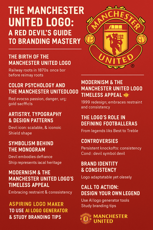
The crest appears on everything from kits to pint glasses and never loses its identity. That is the lesson for designers: make a logo that adapts to different uses but always looks like itself. Write down how it should be used, and keep to it on every platform.
How the Crest Talks
The devil and the shield together say passion and heritage. The devil’s mix of menace and charm gives the crest a voice that could only be United’s. Whatever you design, make sure the visuals and the message say the same thing.
The Crest Online
Hashtags like #MUFC carry the crest across social media, and it stays clear on Instagram and X. A logo now has to work as well on a phone as on a pitch, so design for small screens from the start.
Technology, AI and the Crest
AI tools such as Looka and Semplr now let almost anyone make a professional-looking logo. As a thought experiment, a United redesign in 2025 done with one of these tools might refine the devil’s curves for 4K screens while keeping its heritage. The team would enter “red, devil, shield, heritage,” get back a sleek, screen-ready crest, and then rework the pitchfork for VR broadcasts without losing the character. The basic process is the same for any small business: start from your brand’s values, generate options, and iterate. Software has made it possible for small brands to look polished. It has not made the decisions any easier.
Kits and Recent News
The crest is on the 2025-26 home kit, which is red with patterns inspired by Old Trafford, and on a training kit with no sponsor after a £24m deal with Tezos ended. Recent news includes a £60m bid for Brentford’s Bryan Mbeumo and the appointment of Rúben Amorim as manager, signs of a rebuild. On mugs and in multimillion-pound deals, the crest ties it all back to the club’s history.
Against City, Liverpool, Barcelona and Real Madrid
Next to Manchester City’s round badge or Liverpool’s liver bird, United’s crest is bolder, and the devil gives it more personality than either. City’s badge feels corporate; Liverpool’s feels nostalgic. United’s stands out, and the lesson for designers is simple: make sure your mark looks different from its rivals’.
The contrast with the big Spanish clubs is just as sharp. Barcelona’s elegant crest combines Catalan pride with a St. George’s cross, and Real Madrid’s crowned monogram has an aristocratic confidence. United’s crest says rebellion, Barcelona’s says heritage, and Real Madrid’s says untouchable prestige. Each is a lesson in how a badge can express a club’s particular culture.
Why the Devil Works
United’s crest works because it is built on a real story, the comeback after Munich and the nickname borrowed from Salford, and because the club has mostly been careful when changing it. The 1998 simplification made it stronger, not weaker. That is a good model for anyone with a logo that people already care about.
If you are designing a logo for your own brand, start from the story rather than the shape. Find the one thing about your history that is true and specific to you, put it at the center, and keep everything around it as simple as you can.