The Olympic Rings: History and Design of the Olympics Logo
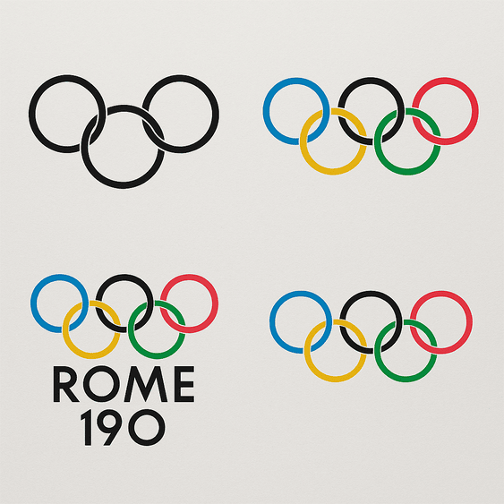
The Olympic rings were drawn in 1913 by Pierre de Coubertin, the French baron who founded the modern Games, and the design has not needed to change since. Five interlocking circles in blue, yellow, black, green and red, on white, stand for the five inhabited continents joined together. Very few symbols are recognized in so many countries, and almost none of them are this simple. Coubertin was not a designer, and the logo did not come out of a studio. It came out of one man’s conviction that sport could work as a common language, and it shows what a logo can do when the idea behind it is clear.
How the Rings Began
In 1913, Coubertin sketched five rings, each in a different color, to represent the five inhabited parts of the world: Africa, the Americas, Asia, Australia and Europe. He explained the idea himself in writing: “These five rings represent the five parts of the world now won over to the cause of Olympism.” It is a strategist’s sentence as much as a poet’s. The rings were not a description of the world as it was. They were a claim about the world he wanted.
The debut was quiet. The rings appeared on letterheads and flags for several years before the 1920 Antwerp Games, where they became the official emblem. Coubertin’s process was slow, analog and deliberate, the opposite of generating dozens of options in seconds. And the design was a rejection of the ornate crests and allegorical figures that sporting events usually favored at the time. The best logos rarely shout. This one barely raised its voice, and the world still noticed.
Five Colors on White
The colors are a large part of why the rings work. Blue tends to read as trust and calm, yellow as optimism, black as strength, green as growth and red as passion. Put together on a white field, they read as a single statement about the whole world rather than five separate ones. Color is fast. It reaches people before words do, and here it lets the logo skip language and go straight to emotion, which is exactly what a symbol for an international event needs.
Five colors sounds like a lot, and in most logos it would be too many. It works here because each color is used once, in the same flat form, with no gradients or effects. The palette looks as current in 2025 as it did in 1913. The lesson for anyone choosing logo colors is to pick ones that carry a story and to apply them with discipline, rather than picking whatever looks good on the day.
Geometry Without Type
The rings are as minimal as a logo gets: five circles of equal size, arranged three over two and linked like a chain. The artistry is in the proportions and the overlaps. Each ring passes over one neighbor and under another, which gives a static drawing a sense of motion and connection. There is no lettering in the core mark at all. When text appears, as in “Paris 2024,” it plays a supporting role, set below the rings and never inside them.
Compare that with more playful identities such as Google’s doodles or Spotify’s wavy lines, which rely on animation or lively typography to stay interesting. The rings need none of that. Their stillness is what lets them sit comfortably on a flag, a medal, a stadium roof or a phone screen. A logo should be easy to scale and quick to recognize, and the rings pass that test at every size.
Why the Interlocking Matters
The continents are the obvious meaning, but the interlocking is the clever part. The rings do not sit politely side by side; they are woven through each other and cannot be pulled apart without breaking the drawing. That is a visual argument for cooperation, and it is made by the structure of the mark rather than by a caption.
That meaning has carried the logo through wars, boycotts and a pandemic, and it has been invoked as a sign of hope in all of them. The general point is that a symbol needs an idea, not just an appearance. Software can generate shapes from keywords, but the meaning has to come from the people who commission the logo, and the rings show how much more a mark can carry when it has one.
Modernist Before Modernism
Next to Apple’s bitten apple or Nike’s swoosh, the rings look both old and new. Their clean lines and strict geometry fit modernist design principles, even though Coubertin drew them years before modernism became the dominant style in graphic design. The simplicity is what keeps them fresh. There is nothing in the drawing that dates it to a particular decade.
That is worth remembering when trends tempt you. 3D effects and neon gradients come and go. A logo built from clear lines and a universal idea lasts. Every so often there is talk of an Olympics logo redesign (more on the 2025 rumors below), and every time the rings stay as they are, because there is nothing to fix.
Host-City Emblems
Each Games gets its own emblem, but the rings are the constant. Tokyo 2020 used a harmonious checkered lattice. Paris 2024 used a flame-inspired mark that doubles as a woman’s face, a reference to Marianne, the French symbol of liberty. These secondary emblems blend local culture with the global brand, and they can afford to be playful or experimental because the rings beside them do the heavy lifting.
This is a smart structure for any brand that has to work in many places. A fixed master mark sets the foundation, and local or seasonal variations build on top of it. The rings are the anchor that keeps every edition of the Games inside the same visual language, however different the host-city emblems look.
Knockoffs and Cultural Criticism
The rings have had their controversies. Knockoffs are everywhere, and plenty of brands have borrowed the interlocked-circle idea. In 2016 the International Olympic Committee (IOC) cracked down on unauthorized uses of the logo, from T-shirts to tattoos. There is also a more serious critique: some argue that the logo’s message of universal unity glosses over colonial history and the power imbalances between the nations it claims to join.
Through all of it, the logo has kept its standing. Any widely used mark will face scrutiny, and the response is not to design something so bland it offends nobody. It is to design something strong enough to survive the argument.
The Rings as a Business
The rings are also a very large business. The IOC’s revenue, driven by broadcasting and sponsorship, reached $7.6 billion for the 2017–2020 cycle, and the logo sits at the center of all of it. Companies such as Coca-Cola and Visa pay millions to put the rings in their advertising, betting that some of the logo’s prestige rubs off on them and on their share prices.
In effect, the rings work as a trust mark that signals quality and status in a crowded market. That is brand equity in its plainest form: a logo that has become an asset worth renting out. Most businesses will never license their logo, but the principle scales down. A mark that people associate with something good becomes worth more every year it is used well.
Strict Rules, Same Rings
Consistency is the rings’ real advantage. On a stadium banner or a social media post, they look the same, because the IOC’s brand guidelines control every use down to the pixel. The logo does not change because it does not need to, and the trust it carries comes partly from that sameness.
Smaller brands can take the same approach. Adjust colors and fonts if you must, but do not drift far from the core design, and use it the same way everywhere. A logo that shifts with every campaign is soon forgotten.
Paris has been trying to hold on to the feeling of 2024. For the first anniversary, the city planned to project the Olympics logo onto the Eiffel Tower and host a giant Olympic karaoke on July 26, 2025, while the cauldron balloon rose again over the Tuileries Garden, with President Macron attending. Not everyone was in a festive mood. Some athletes and sports organizations complained about the lack of a tangible legacy, pointing to halted infrastructure projects and sponsorships that have faded. The rings still say unity and pride. Whether the city has much to show for the Games beyond them is a separate question.
Design Lessons From the Rings
The rings teach a handful of things. Simplicity comes first: five circles are enough to make one of the most recognized symbols on earth. A logo should carry a meaning that can be explained in a sentence. Colors should be chosen for what they say. And the mark has to work everywhere, on a billboard and in an Instagram story.
Logo tools make it easy to try out ideas quickly: type a brand name, pick a style, see what comes back. That is fine as a start. The work is in revising the results until the mark has an idea of its own, the way the rings do.
A Logo Without Words
The rings communicate without a single word. Unity, strength and diversity come across to people who share no language, and that is deliberate: Coubertin wanted a global symbol, free from linguistic barriers. Few logos communicate as instantly.
The test for any logo is the same. It should say something before anyone reads the name or the tagline. If it needs a caption to make sense, the shapes are not doing their job yet.
The Rings Online
On social media the rings are everywhere. Hashtags like #Olympics and #TeamUSA collect millions of posts during each Games, and the clean design works well in profile pictures, filters and memes. In 2024, Paris’s Instagram campaign leaned heavily on the logo and racked up billions of impressions.
Designing for small screens is now part of the job. Shrink your logo to the size of an avatar and see if it still reads. The rings do, because circles and flat color survive compression and tiny pixel counts much better than detail does.
AI and Logo Design
AI logo generators such as Looka, Zoviz and Logo.com have made it possible for anyone to produce a professional-looking logo in minutes. In 2025 these tools are better than ever, using machine learning to read design trends and produce drafts that can pass for human work.
The rings, though drawn by hand, are exactly the kind of design such tools handle well: clean lines, flat colors and a shape that scales. A clear prompt helps. Something like “five interlocking rings, vibrant colors, global unity” would get you a recognizable draft. It would also get you a copy of an existing logo, which is the real limit of these tools: they are good at the familiar and much weaker at the new.
Medals, Merchandise and Licensing
The rings appear on everything from medals to merchandise. Official sponsors such as Nike and Omega use them to sell sneakers, watches and even NFTs. The IOC’s licensing program checks that every product fits the brand’s values, from eco-friendly clothing to high-tech wearables. In 2024, Paris introduced sustainable merchandise, putting the logo on recycled T-shirts and biodegradable water bottles.
Every one of those objects is a different surface, a different material and a different size. A logo that can be printed on cotton, engraved on a watch case and molded into plastic without losing its identity is a well-made logo. Try yours on mockups of real products before deciding it is done.
The Rings Against FIFA and the UN
Set the rings beside other global emblems and their strengths stand out. FIFA’s World Cup logo changes with each tournament, and the UN uses a globe wrapped in laurel branches. Both are well known, but neither matches the rings’ simplicity or universality. FIFA’s logos are often creative, but they lack consistency, and the UN emblem looks bureaucratic by comparison.
Benchmarking against the best in your field is a useful habit. The rings win their comparison because they are recognized instantly, and that is the right goal for nearly any logo.
If the IOC Used an AI Generator
As a thought experiment, imagine the IOC in 2025 wanting a new Olympics logo for the 2028 Los Angeles Games. Someone types “futuristic, inclusive, vibrant” into a watermark-free AI logo generator and gets back variations: rings with a holographic glow, rings turning into stars, rings made of pixels. The team adjusts the colors, perhaps adds a nod to California sunsets, and downloads a high-resolution file.
Tools such as Logo.com and Semplr now offer unlimited generation and customization, so an exercise like that is cheap and quick. The IOC would almost certainly keep the original, and it would be right to. The value of the experiment is in spotting ideas for secondary emblems, not in replacing a symbol that has worked for more than a century.
Recent News
The Olympics remain a global obsession in 2025. Paris 2024 was a success, and the rings were all over social media throughout. Recent news has focused on the IOC’s sustainability push, with the logo appearing on eco-friendly merchandise and digital campaigns. Rumors of an Olympics logo redesign surfaced on X in 2025, and the IOC quickly shut them down. Meanwhile, the 2028 Los Angeles Games are already drawing attention, with early concepts leaning into technology and inclusivity.
Through all of this, the rings stay at the center, a promise of excellence that has been kept consistent for more than a hundred years. Few brands get to plan on that timescale, but every brand benefits from designing as if it might.
What the Rings Get Right
The rings were drawn by an amateur with a strong idea, and they have outlasted almost every professionally designed emblem of their era. You do not need a baron’s vision or a century to make something that lasts, but you do need a clear thought and the discipline to keep the drawing simple. Coubertin had both.
If there is one thing to take from them, it is that the idea comes first and the drawing second. Five circles mean nothing until someone decides they mean the world.