Logoluv

LogoLuv

Where Logos Tell Stories page 7

The stories behind the world’s most famous logos: their history, design choices and meaning, plus ideas for designing your own.

Iconic Logos

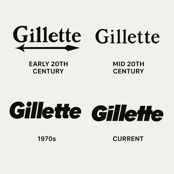
Gillette Logo Evolution, From 1901 to Today

The Gillette logo has spent more than a century doing one job: making a man trust a blade near his throat. King C. Gillette started the company in 1901, and the earliest wordmark carried his name with an arrow piercing the “G,” a plain signal of precision.

· 7 min read

Iconic Logos

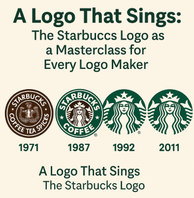
The Starbucks Logo: How the Siren Became an Icon

The Starbucks siren started life as a bare-breasted, twin-tailed figure lifted from a 16th-century Norse woodcut, printed on the bags of a single Seattle coffee-bean shop in 1971. Over four decades the company covered her up, cropped her in and finally took its own name off the logo altogether.

· 7 min read

Iconic Logos

The Instagram Logo, From Polaroid Camera to Gradient

Instagram’s first icon was a little brown Polaroid-style camera with a rainbow stripe, drawn in 2010 when the app was a photo-filter toy. In 2016 the company threw out the camera’s textures and shading and kept only its outline, filled with a magenta-to-orange gradient.

· 9 min read

Sports Logos

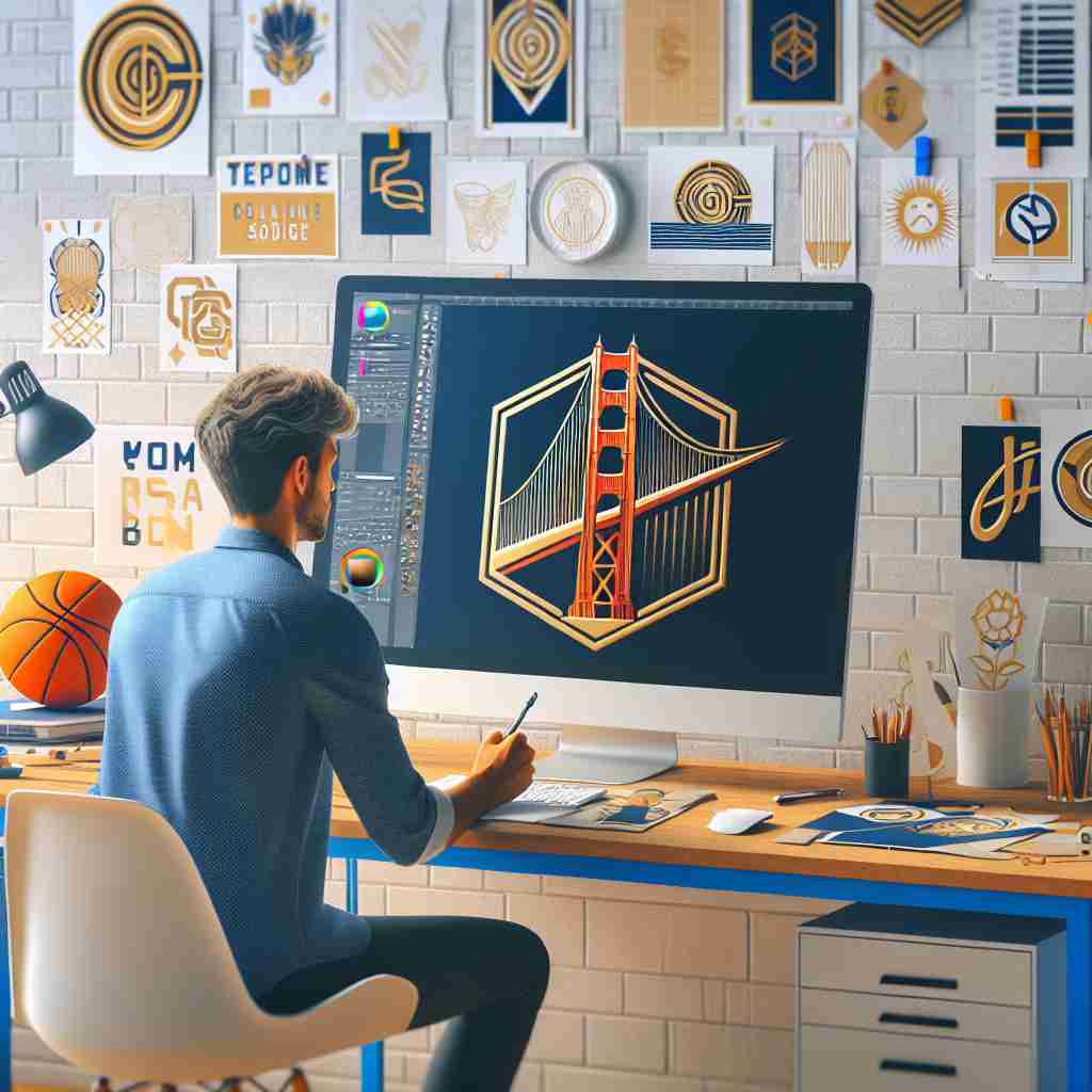
The Golden State Warriors Logo: History and Design

The Golden State Warriors have put a bridge at the center of their logo, which is a neat piece of symbolism for a team that changed its name from one city to a whole state. The mark is now a clean blue-and-gold badge, a long way from the franchise’s Philadelphia beginnings.

· 3 min read

Logo Generation Ideas

Logo Design That Works on Every Screen

Georges Vuitton drew the LV monogram in 1896 to stop people copying his father’s trunks. More than a century later the same pattern works on a luggage tag, a billboard and a 16-pixel browser icon, which is a better result than most logos designed last year can claim.

· 9 min read

Iconic Logos

The Pepsi Logo: From Brad’s Drink to the 2023 Globe

Pepsi began in 1898 as “Brad’s Drink,” a digestive aid mixed by Caleb Bradham in a North Carolina pharmacy, and its first logo looked like something from the apothecary shelf. Over the next century the name went from spidery script to a bottle cap, a globe and a much-mocked “smile,” and in 2023 it came back to bold capitals in the middle of the globe.

· 8 min read

Iconic Logos

The BBC Logo: Three Boxes and a Century of Trust

The BBC logo is three letters in three boxes, and that is all it has been for decades. The version introduced in 1997 set B, B and C in Gill Sans, a typeface Eric Gill drew in the 1920s, and it has become one of the most trusted marks in broadcasting.

· 7 min read