Gillette Logo Evolution, From 1901 to Today
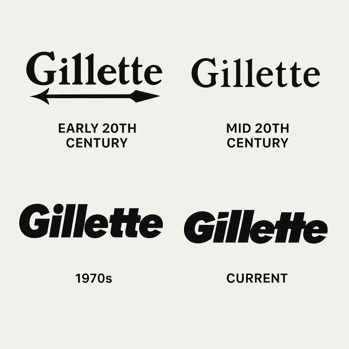
The Gillette logo has spent more than a century doing one job: making a man trust a blade near his throat. King C. Gillette started the company in 1901, and the earliest wordmark carried his name with an arrow piercing the “G,” a plain signal of precision. It had none of the glamour of later advertising, but it worked. A logo is shorthand for trust, and Gillette’s first one told customers the product would do what it promised without drawing blood.
By the 1960s the logo had changed. The arrow was gone, and the name was set in a sleek, bold sans-serif in black, sometimes accented with silver or blue. The change matched the decade’s taste for modernity, the same mood behind Kennedy’s New Frontier and the clean lines of a Le Corbusier chair. The simplicity was the point. The logo looked calm and competent, which is what you want from a razor.
Why So Much Blue
Gillette leans heavily on blue, and not just because it looks crisp on a blister pack. Blue reads as trust, dependability and cool-headed competence, all useful qualities in a product that scrapes across your face every morning. It is also the default color of brands that want to be taken seriously. Gillette pairs its blue with white or metallic silver, which adds an impression of cleanliness and precision, like a freshly shaved jaw.
Compare that with Coca-Cola’s red, all excitement, or Starbucks’ green, with its suggestion of calm and nature. Gillette’s palette is a deliberate fit for its promise of a smooth, no-nonsense shave. For anyone choosing brand colors, the lesson is intention. The colors are part of the promise you make to customers, not just decoration.
The Wordmark
The current lettering is a bold, unadorned sans-serif with a modernist feel, about as close as grooming gets to Helvetica: universal, functional and free of frills. The letter spacing is carefully judged so the name stays legible whether it is molded into a razor handle or spread across a Super Bowl ad.
Around the wordmark, Gillette’s packaging and advertising use sharp angles and metallic finishes to suggest cutting-edge engineering. A good logo, like a good haircut, should be recognizable at once and stay in style. Gillette manages that by keeping the core lettering simple and letting the futuristic touches live in the surrounding design, where they can be updated without touching the name.
Meaning Without a Symbol
Louis Vuitton has its monogram and Nike its swoosh, but Gillette relies on its name. That is a show of confidence rather than a lack of imagination: the brand is old and well known enough that the word alone carries the meaning. The sharp, clean letterforms stand for the precision of the razors, and a diagonal slash that turns up in marketing material nods to the act of shaving itself.
Symbolism doesn’t always need a literal picture. The shape of a letter or the weight of a typeface can tell a story just as clearly, and a wordmark avoids the risk of a symbol that dates.
Modernism That Has Lasted
Gillette’s logo has aged well, the way a well-kept razor does. Its modernist roots keep it in step with today’s taste for minimalism. Newer rivals such as Dollar Shave Club chose playful, millennial-friendly branding. Gillette stuck with clean, professional and universal, and it looks like it intends to stay that way.
Fashions such as Y2K nostalgia and maximalist gradients come and go, and Gillette’s restraint is a relief by comparison. The logo doesn’t shout. It is simply there, confident of its place. Chasing trends is a trap for any designer, and the logos that last are the ones that ignore them.
A Century of Shaving
From the 1920s to the metrosexual 2000s, the Gillette name has been a constant in men’s grooming. It was there for the rise of the safety razor, the electric-shaver craze and the multi-blade wars of the 2000s. Each period brought small changes in presentation, bolder type in the assertive 1980s and sleeker lines in the more technical 1990s, but the identity itself stayed put.
That consistency has helped Gillette shape what being well groomed looks like. The logo turns up everywhere from James Bond’s bathroom shelf to your father’s medicine cabinet. It shows what happens when a brand stays true to itself while the world around it changes.
Controversy and Counterfeits
Gillette has had its share of trouble. In 2019 its “The Best a Man Can Be” campaign, which took on toxic masculinity, drew a fierce backlash, with some accusing the brand of turning on its own customers. The logo, all over the ads, became a lightning rod. Critics said Gillette had strayed from its roots, and supporters praised it for taking a stand.
Then there are the knockoffs. Cheap razors copying Gillette’s packaging and logo are sold all over the world, and they wear away the brand’s premium image. A logo is only as strong as the effort put into protecting it, and Gillette’s lawyers are kept busy. A famous mark is valuable precisely because it is a target.
The Logo and the Bottom Line
Procter & Gamble, which owns Gillette, has seen its share price climb steadily, and its brands are a big part of the reason. The Gillette name anchors a business that commands premium prices in a crowded market. A 2023 Forbes report put Gillette’s global share of the razor market at around 50%, which shows how much pull the identity still has.
A strong logo drives recognition, and recognition drives sales. For a small business, the point is to invest in a design that can grow with the company rather than one that will need replacing in two years.
Consistency
From razor packs to Super Bowl commercials, the Gillette logo appears in the same blue and white and the same bold letters. That uniformity builds trust and makes the brand recognizable in every country it sells in.
Smaller brands can apply the same rule cheaply. Once you have a logo, use it the same way on business cards, websites and social media. Gillette’s playbook is simple: stick to your colors, fonts and tone, with no exceptions.
Design Lessons
Gillette has a few things to teach about logo design. Simplicity comes first: a cluttered logo is like a dull blade, useless and quickly forgotten. Know your audience: Gillette speaks to men, and increasingly women, who value quality and reliability. And evolve carefully. The brand’s small adjustments over the years show a company adapting without losing its character.
Finally, check your logo’s range. Gillette’s mark looks as good on a narrow razor handle as on a billboard. Make sure your design works in black and white, at small sizes and in every medium you plan to use.
What the Logo Says
Gillette’s logo doesn’t need a tagline. The clean lines and bold type say the company is the best at what it does, and the marketing around it, with its sleek product shots and confident copy, says the same thing.
That is worth thinking about beyond the graphic itself. Your logo should match the way your brand talks, whether that is playful, luxurious or practical. Choose fonts and colors that fit that voice, and the rest of the identity will be easier to build.
Gillette Online
Hashtags such as #Gillette and #BestAManCanBe regularly trend, spreading the logo well beyond the shaving aisle. A logo now has to work online, from Instagram grids to Twitter headers, and Gillette’s high-contrast design suits screens well.
Scalability matters more than ever. A logo that turns to mush on a phone screen is an embarrassment, so test your design on every platform you plan to use before you commit.
Technology and the Logo
Gillette’s earliest logos were drawn by hand. Today they are refined with digital tools, and AI logo generators such as Logo.com and Logomaster.ai, which are trained on huge numbers of existing designs, let anyone produce a professional-looking logo in minutes. Gillette’s own designers may well use similar tools to try out ideas while keeping the logo familiar. For small businesses, the change is significant: you no longer need a Madison Avenue budget to get a clean, usable mark.
Imagining a Gillette Logo Made by Software
As a thought experiment, imagine Gillette’s team typing “Gillette,” choosing “grooming industry” and asking for a minimalist style in blue. The software might offer a sleek “G” with a razor-slash accent, a futuristic wordmark with metallic gradients, or a bold sans-serif that looks very 2025.
They would refine the best one, adjusting the kerning and testing it on mock razor packs. The result might honor the brand’s heritage while nodding to younger shoppers. It is only a game, but it shows how such tools can produce useful starting points even for a brand as established as Gillette.
Making Your Own Logo
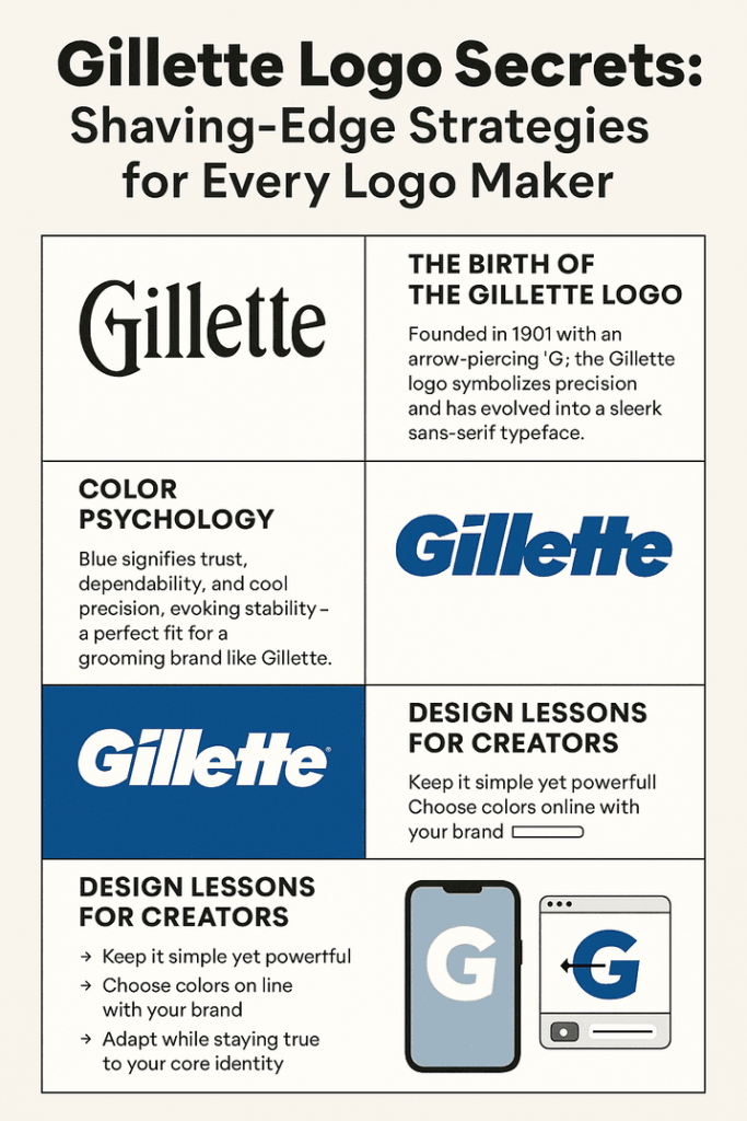
If you want to borrow some of Gillette’s discipline for your own brand, here is a short process:
- Choose a tool that allows real customization and gives you clean downloads without watermarks.
- Be specific about what you want. Enter your name, industry and style. For something Gillette-like, try “minimalist, blue, professional.”
- Customize carefully. Adjust fonts, colors and layout to match your brand, and make sure it works in print and on screen.
- Test it on business cards, websites and social media.
- Download high-quality PNG and SVG files so the logo stays sharp everywhere.
A Sharp, Quiet Logo
The Gillette logo shows what clarity, consistency and confidence can do over a very long time. It dropped its arrow in the 1960s, settled on a plain bold wordmark and has hardly needed to change since. Even a campaign that divided its customers didn’t damage the mark itself.
For a startup or a side business, that is a reasonable model. Keep the design simple, use it the same way everywhere, and let the brand’s reputation build around it. Tools such as Semplr can help you get a first version, and the rest is patience.


