The American Express Logo: Blue Box, Centurion and History

American Express started in 1850 as a freight company, hauling goods across the American West, and its first logo looked like it: a bold, plain “American Express Co.” with nothing to suggest luxury. The blue box and the Roman Centurion came much later, once the business had moved from shipping parcels to traveler’s checks and charge cards. That shift, from a company that moved boxes to one that sells status, is written into the logo, and it is why the Amex mark is a good case study in how an identity can grow up along with the business behind it.
The logo is also unusually conservative for a brand that has been around for more than 170 years. It has changed slowly and rarely, and every change has kept the parts people already trusted.
From Freight Wagons to the Blue Box
In its early decades American Express was not dealing with cafés in Paris. It was moving freight, and the original logo reflected that: a functional sans-serif “American Express Co.” with all the charm of a stagecoach timetable. It was meant to be read, not admired.
By the 1950s the company had moved into traveler’s checks and charge cards, and the logo became sharper to match. It settled into a blue box framing the Centurion, a Roman soldier meant to stand for strength and reliability. The design spoke to mid-century America, offering security at a time of post-war optimism, and it was plainly deliberate. Every piece of it was chosen to make people feel their money was safe. Its route from freight to finance follows the company’s own, which is the first lesson in the logo: a visual identity has to grow with the story it is telling.
Why the Blue
Blue is the obvious color for a financial brand, and Amex leans into it hard. It reads as stable, trustworthy and professional. Studies have found that 34% of the world’s top brands use blue, and Amex’s shade, a rich Pantone 294, manages to feel approachable and authoritative at once. Think of a clear sky or a well-built bank vault.
The contrast with newer financial brands is useful. Fintech upstarts like Revolut lean on playful neon, while Chase uses a more staid palette. Amex’s blue does not shout. It simply sits there with confidence. A logo’s first job is to identify, not to sell, and the blue tells you which company you are dealing with, and what kind of company it wants to be, before you have read a word. That is the point for anyone choosing colors: pick them for the feeling they create, and do it on purpose.
Type, Geometry and the Centurion
The lettering does a lot of quiet work. Amex uses a custom sans-serif, clean but muscular, that sits between friendly and authoritative. The Centurion, introduced in the 1970s, adds some narrative: a soldier standing guard over your money. Where luxury houses such as Louis Vuitton lean on ornate scripts and monograms, Amex keeps things minimal and bold. The mark is legible on a card or a billboard and recognizable at a glance, which is harder to achieve than it looks.
Its geometry is tight: sharp angles, balanced proportions and a Bauhaus-style insistence that form should follow function. The lesson for anyone designing a logo is discipline. Placing an icon on a canvas is easy. Getting the kerning, weight and hierarchy right is what separates a professional mark from a template. Amex shows that less can be more, but only when the “less” is executed with obsessive care.
What the Centurion Means
The Centurion is there for a reason. The Roman soldier stands for protection, loyalty and prestige, values that matter to cardholders booking flights or dining at Michelin-starred restaurants. It is a visual metaphor for the company’s promise to guard your finances. Unlike the abstract marks of Nike or Pepsi, it is figurative and human, and that gives it a story that a generic shape cannot carry.
It also carries the brand’s exclusivity. The Centurion is tied to the elusive Black Card, talked about as a sort of financial Holy Grail. The challenge for logo designers is to make symbols that tell a story without shouting it. The Centurion hints at empire, and people pick up on it without being told.
The 2018 Refresh
In 2018 American Express unveiled a subtle refresh, its first in decades. The Centurion was streamlined and the edges of the blue box sharpened. It was not a reinvention. The new version had cleaner lines, scaled better on screens and had a slightly softer feel aimed at younger cardholders. It’s Nice That described it as the first refresh in 37 years, and the update kept the logo’s character intact while bringing it closer to current taste.
That balance between heritage and change is the most useful part of the story. Trends such as maximalism and retro kitsch come and go, and Amex has outlasted them by evolving without abandoning its roots. The lesson is restraint. Do not chase fads. A logo should feel like it could last a century, not just one TikTok trend cycle.
A Logo Through Financial History
The logo has had a front-row seat to a lot of financial history. In the 1960s it was printed on traveler’s checks, a lifeline for the jet set. By the 1980s it stood for the charge-card culture of the yuppie era. Today it lives mostly on screens, across the mobile app and contactless payments. Each era changed the setting, but the core ideas of trust and prestige did not move.
That ability to adapt is what to aim for. A good logo reflects its present and leaves room for a future nobody can see yet. Ask whether a design will age like wine or curdle like milk. In 2025 the Amex mark still looks crisp.
Counterfeits and the Elitism Question
The logo has had its share of trouble. Counterfeit cards carrying shoddy copies of the Centurion have plagued Amex since the 1980s, costing billions in fraud. There is also a cultural argument about whether Amex’s exclusivity is elitist. Critics point to premium cards like the Platinum, with its $695 annual fee, as a way of fencing off wealth. Fans reply that the prestige is earned rather than exclusionary.
A strong logo invites imitation and scrutiny in equal measure. Make sure your own work is original. Amex’s legal team takes infringement seriously, and a design that borrows too much from someone else ends up looking like a knockoff even when it is not one.
The Logo and the Share Price
American Express stock (AXP) has climbed steadily, reaching $247.69 in July 2025, up 5% for the year, helped by second-quarter earnings of $3.49 per share that beat estimates. The logo is not decoration here. It is a trust signal that encourages people to spend and investors to buy, and posts on X about Amex’s record revenue tend to come with the blue box attached.
That is a reminder that branding shows up on the balance sheet. A logo is a business asset, and it earns its keep when it connects emotionally. Amex’s mark does that well enough to turn cardholders into people who recommend the card to their friends.
Consistency Everywhere
Amex’s identity is built around the logo, and the company applies it with real discipline. The blue box and Centurion appear on billboards and in digital ads alike, and a strict style guide, with fixed color codes and exact proportions, keeps the mark from drifting, whether it is on a Gold Card or a screen in Times Square.
A good logo applied inconsistently is just a nice picture. Lock in your fonts and colors early, in a simple brand kit if nothing else, and stick to them. A scattered brand is forgettable. Amex shows that uniformity is what makes a logo memorable.
Lessons From the Blue Box
There are three clear lessons in the Amex logo. Simplicity scales: the clean lines work on a card or the side of a skyscraper. Every element should carry meaning, as the Centurion does. And it is usually better to evolve than to overhaul. The 2018 update kept the character of the logo intact, which is the right instinct for most established brands.
Modern design tools make logo design accessible to almost anyone, but they are only as good as the person using them. They speed up the work without replacing the thinking. Study the Amex logo for its restraint, its story and its emotional pull, and aim for impact rather than flash, whatever you are working with.
A Logo That Talks Without Words
The blue box says “you can trust us.” The Centurion says “we’ve got your back.” That visual language, built up over decades, matches the company’s most famous line: “Don’t leave home without it.” Where many fintech rivals rely on chatty slogans, Amex lets the logo carry the message of reliability at a glance.
The point for designers is to think beyond looks. Before you draw anything, decide what your brand’s voice is, bold, playful or calm, and make sure the mark says it. Amex’s logo works without explanation, and that is the goal.
The Logo Online
Search #AmericanExpress on X and you find something close to a fan club. Influencers show off their Platinum Cards and memes trade theories about the Black Card. Posts about travel perks and cashback deals keep the logo in circulation. That reach comes partly from design. The mark is simple enough to share and survives being shrunk, cropped and reposted on Instagram and TikTok.
Digital versatility is no longer optional. A logo needs scalable vector files and colors that hold up on a phone screen. Amex does well online because the design is iconic rather than fussy, which is the standard to aim for.
Technology and AI
AI logo generators have made design far more accessible, letting almost anyone produce a logo in minutes. Tools such as Looka, Canva, Kittl, Adobe Express, Zoviz, Fiverr Logo Maker and Semplr offer templates and brand kits, and they are fast and cheap. They are not magic, though. Without a person steering them, they drift toward generic results.
The Amex logo was made long before any of this, and it is a reminder that technology amplifies intent rather than supplying it. Start with a clear brief: your values, your audience, the feeling you want. Then use the tools to get there, adjusting the type and color until the result has some of Amex’s discipline.
Amex Products and Recent News
Amex’s products are nearly as well known as its branding, from the everyday perks of the Green Card to the travel benefits of the Platinum Card. In 2025 the company has expanded its partnership with Delta Air Lines to improve SkyMiles rewards and has kept pushing small-business support through its Shop Small campaign. Posts on X about its second-quarter results quoted analysts praising resilient consumer spending in an uncertain economy.
The logo is the thread that runs through the cards, the apps and the advertising. That is the job any logo has to do once a company sells more than one thing: hold the whole range together.
The Canadian lineup shows how far that range now goes. For cardholders in Canada, Amex has some of the strongest rewards cards, such as the SimplyCash Preferred, with 4% cash back on gas and groceries, and the Cobalt, with 5 points per dollar on dining. The Scotiabank Gold Amex is a strong travel card, with 6 Scene+ points per dollar and no foreign transaction fees, and the no-fee Green Card earns flexible Membership Rewards points. Every one of them carries the same blue box.
Amex Against Visa and Mastercard
Next to Visa’s minimal swoosh and Mastercard’s interlocking circles, the Amex logo feels almost like a Renaissance painting: rich, narrative and human. Visa’s mark is sleek but forgettable, and Mastercard’s is bold but abstract. With its nod to history, the Centurion stands out among a lot of corporate simplicity. That is the value of personality in a logo. Clean designs are easy to produce. A thoughtful one is what people remember.
If Amex Tried an AI Logo Tool
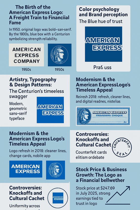
It is fun to imagine Amex putting its logo through one of these tools. The brief would be very specific: a blue Centurion, minimal but regal, suggesting trust and prestige. The software could produce plenty of drafts, but they would need a lot of refining to reach Amex’s level of gravitas, and some suggestions, such as a neon Centurion or a heavy 3D rendering, would be thrown out immediately. Any real team would use the output as a starting point and finish the work by hand. The tools speed things up. The judgment still has to come from the designers.
Where the Logo Goes Next
By 2030 the logo will probably have changed again, perhaps with holographic effects or animations built for augmented reality. Its core, the blue, the boldness and the Centurion, is likely to stay. That is the hardest thing for any designer to pull off: a mark that outlives its makers.
The Amex logo got there by changing slowly. It took a freight company’s nameplate, turned it into a blue box with a soldier in it, and then left it mostly alone for decades. Most brands redesign far more often than they need to. Amex is a good argument for patience.


