The Mastercard Logo: What Two Circles Teach About Branding
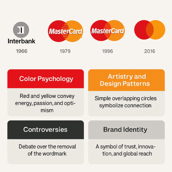
Mastercard is confident enough in two overlapping circles that since 2019 it has often left its own name off the logo. Very few brands could get away with that, and the reasons it works go back to 1969, when a red circle and a yellow one first appeared side by side on a credit card.
The mark is about as simple as a logo can be. That makes it a useful case study for anyone building a brand identity today, whether by hand or with a logo generator that works from a text prompt, because almost everything it does well comes from what it leaves out.
From InterBank to Master Charge
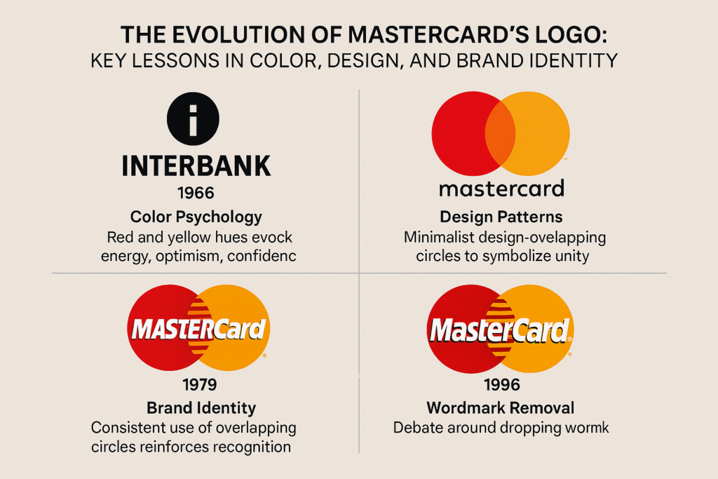
In 1966 a group of U.S. banks formed the InterBank Card Association to launch a card that could compete with Bank of America’s BankAmericard, which later became Visa. The first logo was a clunky lowercase “i” in a circle next to the word “InterBank.” It did the job and nobody remembers it.
In 1969 the card was renamed Master Charge, and the interlocking red and yellow circles arrived with it. Circles were a smart choice. They are the shape of coins, they suggest unity and inclusion, and they don’t belong to any one culture. The mark looked accessible, like a card for everyone rather than a club for the well-off. When the name changed to Mastercard in 1979, the circles stayed, and they have stayed ever since.
The design was also a competitive move. The circles gave the new network a visual shorthand for trust in a crowded market, and they became the face of a company that now handles trillions of dollars in transactions a year.
Red and Yellow
The palette is warm on purpose. Red carries energy and urgency, the color of “do it now.” Yellow is optimistic and friendly. Together they are hard to ignore, and they encourage people to act while still feeling safe doing it. Visa took the opposite approach with a cooler blue that leans on stability. Mastercard’s warmer pair is the more inviting of the two, a small nudge toward reaching for the card.
The exact shades have shifted over the years. The 1990 redesign deepened the red and brightened the yellow to make the mark more vivid. By 2019 the company was confident enough in the colors to drop the text in some uses and let the circles stand alone. That only works when the colors themselves are doing a lot of the identifying, and here they are.
Two Shapes and an Overlap
Two circles overlapping like a Venn diagram make a third shape in the middle, a lens where they meet. It is a very modernist piece of design: almost nothing there, and nothing that could be removed. Good logos often work like a short poem, compressing a big idea into a few strokes, and this one compresses “two parties meeting” into a single overlap.
That overlap is easy to read as connection, between buyer and seller or between what you want and what you can pay for. Earlier versions added horizontal lines or gradients for texture. By 1996 Mastercard had moved to flat design, and it has stayed flat. Flat color suits screens and reads clearly on a phone or a billboard, and the 2019 version without text pushed the idea as far as it could go.
Compare it with the busier American Express emblem or PayPal’s word-heavy logo. Mastercard’s mark has avoided passing fashions and still looks current. It shows how much restraint can do.
Criticism and Confusion
Dropping the name in 2019 was a risk, and some designers said so: a financial brand, they argued, needs the reassurance of its name. The company’s research suggested otherwise, with about 80% of consumers still identifying the circles correctly without the word.
The earlier switch from Master Charge to Mastercard also caused some confusion, with cardholders unsure whether they were dealing with a new company. The transition was bumpy, but the new name helped. It sounded less like a club for American banks and more like an international network.
There is also a broader critique. As the symbol of a huge financial company, the circles stand for consumer spending, and anti-capitalist groups have targeted them. During Occupy Wall Street, activists parodied the logo as “MasterDebt.” The mark came through that without lasting damage, partly because something so abstract gives critics little to grab hold of. No logo pleases everyone, but a simple one is hard to wreck.
The Circles and the Share Price
Mastercard went public in 2006 at $39 a share. By 2025 its stock (MA) was above $500, with a market value of more than $450 billion. A consistent logo doesn’t create that kind of growth, but it does reinforce the trust that investors and customers place in a payments company.
Visa’s stock grew in a similar way, while American Express, with its narrower focus, lagged behind. Mastercard’s circles signal that the card is accepted almost everywhere, and that broad appeal has helped the business grow. The 2019 refresh happened to coincide with a 25% rise in the stock. That is a correlation rather than proof, but it shows a strong design can sit comfortably alongside a strong balance sheet.
A Logo for Each Era
The circles have tracked a series of economic shifts. In the 1960s they announced the credit boom and freedom from cash. In the 1980s they suited a spend-big decade. By the 1990s, with globalization, ATMs and the beginnings of e-commerce, their clean lines looked right for an international network.
In the 2010s came digital wallets, and the logo shrank to fit apps without losing its punch. The textless 2019 version suits a world where screens are full of icons. Each change reflected the culture of the moment while the core shapes stayed put, which is how a logo manages to be timeless and timely at once.
What a Logo Generator Can Learn From Mastercard
The company publishes its rules for using the mark, and its brand requirements make a decent primer on logo design in general. Three things stand out. Keep it simple: two circles beat a cluttered emblem. Make it versatile: the logo works on cards, apps and neon signs. Give it meaning: the circles suggest unity and trust without a word.
A free AI logo generator will happily give you something “simple, circular and bold” in seconds, and that is a reasonable starting point. What the software can’t do is decide which result actually fits your business. Test your favorite in black and white, check it at a tiny size, and ask whether it has any life in it. Mastercard’s does.
Coins, Globes and Balance
The circles invite all sorts of readings. They look like coins and globes, and some people see a yin-yang kind of balance. Circles suggest harmony in many Eastern traditions and completeness in Western ones. The overlap reads as collaboration, merchant and customer, local and global. Because the shapes are so abstract, people bring their own meanings to them.
The colors add to that. The intensity of the red balances the softer yellow. During the 2020 pandemic, Mastercard’s long-running “Priceless” campaign used the logo to frame acts of kindness, which made a financial brand feel more human than corporate.
Beyond the Swipe
With around 3.3 billion cards in circulation by 2025, the circles have helped make card and digital payment normal and cash less necessary. In developing countries the brand presents itself as a route to financial inclusion, with programs such as Mastercard’s Digital First pushing mobile banking. For many people the logo is a sign they can take part in markets that used to be closed to them.
There is a darker side. Ubiquitous cards feed a culture of debt, and U.S. credit card balances reached $1 trillion in 2024. Critics say the marketing makes spending look glamorous, especially to young people. The “Priceless” idea, which ties purchases to experiences rather than things, softens that message without removing it.
Modernism, Applied
The logo follows the old modernist rule that form follows function. It was born in an era of bold graphics and has shed detail ever since. The 1996 redesign replaced gradients with flat color, and by 2019 the circles had joined Nike’s swoosh and Apple’s apple as marks that can appear without a name.
That leanness suits screens, from a smartwatch face to a subway poster. Many logo tools now offer minimalist templates clearly inspired by brands like Mastercard. Copying the look is easy. The intent behind it, knowing exactly what to remove and why, is the part that takes judgment.
The Basic Rules, Followed
The mark ticks every box on the usual checklist of logo design. It is simple and memorable: you can draw it from memory, so try. It scales from a chip on a card to a billboard. It suits finance while being universal enough for anything. And despite several adjustments it has stayed recognizably the same for decades.
The best logos feel inevitable, as if they could not have been drawn any other way, and this is one of them. Its mix of bold shapes and warm colors keeps it clear of trends. If you are starting out, the case study is simple: don’t chase fashions, build something that will last.
The Logo as the Core of the Brand
Paired with “Priceless,” the circles promise more than a transaction: experiences, freedom, a sense of security. They are what ties together the company’s campaigns, partnerships and products under one banner.
Visa feels functional and Amex feels exclusive. Mastercard manages to seem approachable and aspirational at once, and the 2019 textless logo leaned into that, with a confident message that the brand is recognizable enough to stand alone. Every ad, app and card tells the same story, and that consistency matters more than any one design decision.
Anatomy of the Mark
Break it down and there is very little to it. The logomark is two circles, red and yellow. They are equal in size, and the overlap is symmetrical. The colors are bold primaries warmed slightly. The negative space, that central lens, suggests focus and a meeting point.
Earlier versions carried a wordmark, blocky in the 1970s and sleeker by the 1990s. Offering a version with no text in some contexts in 2019 looked radical but followed logically from everything before it. A logo with this few parts is easy to adapt to almost anything, which is exactly what a global payments brand needs.
What the Circles Say
The message is “global, trusted, here for you,” and the logo gets it across without words. The 1990s tagline “The Best Way to Pay” gave way to “Priceless,” which tied purchases to emotions. The circles are simple enough for a child to understand and polished enough for a boardroom.
In advertising the logo usually sits quietly in a corner and lets the stories do the work. Around the 2022 World Cup it framed moments of celebration and connection. A logo that whispers rather than shouts can make a card payment feel personal, and that restraint is a big part of the brand’s character.
Hashtags and Screens
The circles do well online. Hashtags such as #PricelessSurprises and #MastercardMoments turn payments into stories people want to share, and the 2019 version was optimized for digital, so it reads clearly on Instagram and X. During the 2020 lockdowns #PricelessAtHome trended, linking online events to real-world causes.
Social media demands a logo that works as a tiny profile picture and as a full-screen story. Mastercard’s scales between the two without losing clarity. It was drawn decades before smartphones and suits them perfectly.
From Cards to a Payments Ecosystem
The logo has followed Mastercard from card network to technology company. The 1980s were about ATMs, the 1990s about global reach. In the 2000s e-commerce needed a mark that worked online, and the simple circles fit. Today they appear on blockchain platforms, contactless payments and AI-driven fraud detection.
The growth has been cultural too. Partnerships with FIFA, the Grammy Awards and charities such as Stand Up To Cancer tie the logo to big moments and good causes. A logo has to grow with its company, and these circles have stretched a long way without breaking.
Technology and the Logo
Vector graphics let the mark scale cleanly from a chip to a 4K screen, and the 2019 refresh was built for apps, where space is tight. Contactless symbols, the curved lines that look like a Wi-Fi signal, often sit next to the circles now, an old mark paired with a new one.
Could software reproduce it? Probably, in the sense that circular designs are easy to generate. What the tools don’t supply is the history and judgment that made these particular circles the right ones. Technology serves the design here, not the other way around.
Circles in a Cashless World
As cash fades and crypto grows, the circles will almost certainly stay. They are too well known to scrap. Expect smaller adjustments: perhaps bolder colors, or animated versions for augmented-reality wallets. Sustainability may play a part too, with green-finance campaigns using the logo.
The logo has come through recessions, technological upheaval and cultural change. A logo is a kind of promise, and Mastercard’s promises connection. The circles have kept that promise for more than fifty years, which in a business full of passing trends is worth a great deal.
If you want to try designing something with the same staying power, Semplr is a free AI logo generator worth a look.
For more on visual branding, read our piece on the evolution of Marvel’s logo.


