The Bacardi Logo: How a Bat Became a Rum Brand
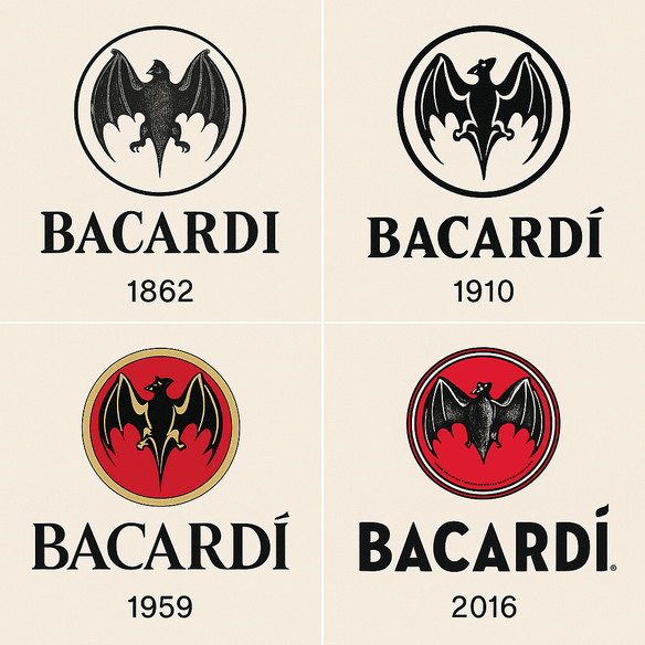
Bacardi’s bat goes back to 1862, when Don Facundo Bacardí Massó found a colony of fruit bats roosting in the rafters of his Cuban distillery and decided they were a good omen. More than 160 years later, the same animal still sits above the name on every bottle. It has outlasted a revolution, Prohibition and the company’s exile from Cuba, and it is still one of the stranger choices a drinks brand has ever made.
A bat is nocturnal, a little sinister and not obviously appetizing. Try pitching it to a marketing department today as the emblem for a premium spirit. Yet the silhouette above Bacardi’s serif lettering has become shorthand for rum, parties and a certain Caribbean confidence, and it has done so with only modest changes to the drawing.
How the Bat Arrived
The bat was not dreamed up in a studio. It came from the building. When Facundo Bacardí Massó noticed the colony in his distillery’s roof, he took it as a sign, and his family adopted it. In local folklore bats stood for good fortune, family unity and resilience, all qualities a new rum business could use, and the animal became the company’s emblem.
It is a good example of how strong logos often come out of circumstance rather than research. Nobody tested the bat with a focus group. It was a specific thing in a specific place, attached to a real family, and that specificity is why it still carries a story about Cuban heritage and entrepreneurial nerve. If you are looking for a symbol of your own, it is worth starting with something that actually belongs to you, a place, an object or an accident, rather than with whatever is fashionable.
Black, Gold and a Little Red
Color does a lot of quiet work in a logo, and Bacardi’s choices are deliberate. The classic palette is black and gold, often with a red accent. Black reads as authority and permanence, the color of a serious, long-established product. Gold adds luxury. Red, which Bacardi uses sparingly in its marketing, brings heat and energy and points toward the late nights the brand is selling.
Marketers like to quote a figure that color influences 85% of purchase decisions, and a 2025 DesignRush piece repeats it while linking red and gold with excitement and prestige. Whatever the precise number, Bacardi’s palette clearly works: the bat manages to look regal and slightly rebellious at the same time. The lesson for your own brand is to choose colors that match its personality, a bright gradient for a playful startup or a muted monochrome for something minimal, and to resist adding more than you need.
The Lettering and the Silhouette
The bat gets the attention, but the type matters just as much. Over the brand’s history the lettering has moved from heavy, ornate 19th-century serifs to a sleeker modern serif that keeps the sense of tradition while reading cleanly. The current wordmark is close in spirit to a typeface like Playfair Display: high contrast, elegant and still legible on a small bottle neck. It is a good example of how well-chosen type can carry a brand’s history at a glance.
The bat itself is very simple. It is a clean, minimal silhouette with no interior detail to fill in, which is why it is recognizable stamped on a bottle cap or blown up on a billboard. That restraint happens to suit current logo fashion, which LogoLounge’s 2025 trend report describes as favoring controlled tension over decorative flourish. The broader point holds at any time: clean lines scale, and a mark has to work everywhere from a cork to a phone screen.
What the Bat Means
In Cuba, bats were associated with good luck and family unity, which fits a company that has stayed in the Bacardi family’s hands. The animal’s nocturnal habits also link the brand to nightlife, from the dance halls of old Havana to Miami clubs. The bat works as a flag and a signature at once, something people can rally around and something that tells them who made the drink.
That kind of built-in metaphor is the hardest part of a logo to fake. Software can generate endless bat shapes, but only one of them came with a family story and a distillery roof attached. If you are working on a mark, try to translate the brand’s mission into a single visual idea first and only then worry about the drawing.
Updated, Never Overhauled
Bacardi’s logo has been through real upheaval. The company left Cuba in the 1960s after the revolution and rebuilt itself abroad, yet the emblem was adjusted rather than replaced. In the 2000s the bat was streamlined and the typography cleaned up, which gave the mark a more modern look without erasing anything people recognized.
That is the right way to handle an old logo, and it is the approach good rebrands generally take: refresh the existing assets rather than throw them away. The bat could sit on a bottle from 1862 or in a virtual-reality ad from 2025 and still be obviously the same animal. For a new brand the lesson is to aim for something that can be updated in small steps, rather than something that will need replacing when the trend passes.
A Logo Through the Eras of Drinking
The bat has tracked the history of the spirits trade. In the 19th century it stood for Cuban craftsmanship. During Prohibition it carried a hint of rebellion. Today it stands for global nightlife. Each period nudged the presentation a little to fit the culture of the time without touching the core idea.
A fresh chapter may be starting now. In 2025 Bacardi ran a global creative review that assigned new agencies to Bacardi Rum, Bombay Sapphire and St. Germain, and the company has said it wants creative work of a consistently high standard across the whole portfolio. For smaller brands the takeaway is that a logo can stay fixed while the campaigns around it change. Testing variations for different markets is cheap now, and worth doing, as long as the core mark stays put.
Knockoffs and Arguments
Any famous mark gets imitated, and knockoff brands have long borrowed the bat, which wears away its exclusivity. In 2023 a small Florida distillery was sued over a bat emblem that looked suspiciously similar, and the case started an argument about whether big brands overreach with their trademarks. Some critics have also suggested that using a symbol rooted in Cuban folklore in global campaigns, far from where it started, edges toward cultural appropriation.
The more visible a logo becomes, the more criticism it attracts. For anyone designing a new one, the practical lesson is about originality. Check that your mark is genuinely your own before you print it on anything, because a design that looks too much like someone else’s can bring a lawsuit instead of customers.
The Business Behind the Bat
Bacardi Limited is privately owned, so there is no share price to follow, but its finances are still tied to the strength of its brands. A 2025 Fitch report noted a 3% fall in revenue in 2024, while debt rose because of strategic acquisitions such as a stake in Teeling whiskey. The bat remains central to the company’s global presence, alongside brands like Grey Goose and Patrón. Family members have described Bacardi as a relatively small company that looks big because its brands travel so far.
That is the commercial case for a strong logo. It is an asset as much as a piece of art, and the designs that earn money are the ones that fit a company’s growth plans, not just the ones that look nice in a pitch deck.
Consistency and the Ready-to-Drink Shift
The bat appears on rum bottles, bar mats and festival sponsorships, and each one reinforces the same idea of celebration. Its outline is unmistakable whether it is lit up in neon or embossed in gold. Many logo services now sell “brand kits” with matching fonts, colors and layouts for social media and business cards. Bacardi got there the old-fashioned way, by using the same mark everywhere for a very long time.
If you are building a small brand, that consistency is worth copying more than any particular shape. Fix your fonts, colors and layout early and use them on every surface, so the logo lives as one thing rather than a dozen slightly different ones.
The brand has also been part of a long run of changes in what people drink at parties, from the alcopop craze of Bacardi Breezers two decades ago to today’s ready-to-drink boom. Cool boxes that once held WKD and Smirnoff Ice now hold hard seltzers and BuzzBallz. Marten Lodewijks of IWSR points to health-conscious drinkers pushing demand toward more varied, lower-sugar options, and Bacardi has had to keep up. Through all of it the bat has stayed the same, sitting on new formats next to rivals as bright and Instagram-friendly as the BuzzBallz spheres Gen Z has taken to. A logo that can sit on a new kind of product without being redrawn has done its job.
What the Bat Says Without Words
The bat suggests freedom, the type suggests class and the colors promise a good time. That lines up with Bacardi’s long-running “Live Passionately” message, which travels from Havana to Ibiza without needing translation. Good logos tend to draw the eye in and give it something to play with, and the bat, with its odd, slightly comic outline, does exactly that.
The general lesson is to start with the message and let the visual language follow. Bacardi sells rum, but the bat sells a mood, and that mood is far more consistent than any individual ad campaign.
On Social Media
The bat has done well online. Hashtags such as #BacardiBat and #LivePassionately tie the logo to photos posted by drinkers themselves, and the silhouette is simple enough to work as a profile picture or even NFT art. Brands increasingly have to design for the screen first, and an old mark built from one solid shape turns out to be well suited to that.
Any new logo should be checked the same way. It has to read on a phone screen as clearly as on a billboard, which usually means high-resolution files, a simple shape and very little fine detail.
AI and the Hand-Drawn Bat
Logo design has changed enormously since a family in Santiago de Cuba adopted the bat. AI logo makers such as Looka, Semplr and Canva now offer friendly onboarding and real-time editing, and anyone can produce a usable logo in minutes, which is a long way from a hand-drawn emblem in 1862.
The catch is that these tools tend toward generic choices unless they are steered. The Bacardi bat works because it is specific: it comes from a real place and a real story. Imagine Bacardi’s own team asking a generator for a “minimalist bat logo, black and gold, premium nightlife, modern serif type.” They would get retro comic bats, 3D bats and a few dozen plausible options, and none of them would carry the distillery-roof story. A speculative 2025 update might add sharper lines, a violet accent for screens or an animated version for AR campaigns, but any of those would still need refining by hand to keep the character. Use the software for speed and range, and use your own judgment to pick and finish.
The Portfolio and Recent News
Bacardi’s portfolio now includes Grey Goose vodka, Patrón tequila and Bombay Sapphire gin as well as its rum, and the company name and bat give that collection some coherence. Recent news suggests a company in transition. The 2025 creative review appointed three London agencies, BBH, Mother and New Commercial Arts, to Bacardi Rum, Bombay Sapphire and St. Germain respectively, which Ad Age read as a push for fresh creative work. Acquisitions such as the Teeling stake show Bacardi wants to grow beyond rum.
As of July 2025 no new Bacardi logo had been unveiled, though there was speculation that the creative shake-up might bring a redesign. If it comes, the bat could get a sleeker outline or bolder colors. It would be a surprise, and probably a mistake, if it disappeared.
Bacardi Against Captain Morgan and Johnnie Walker
Next to its competitors, the bat has more cultural weight. Captain Morgan’s pirate is fun but has none of the bat’s mystery, and Diageo’s Johnnie Walker striding man looks dated beside it. The bat is equally at home on a premium bottle or a festival wristband, and that range gives it an edge.
The comparison shows how much uniqueness is worth. Plenty of drinks logos follow the trend of the moment. The ones that last tend to have a strange, specific idea at their center, the way Bacardi has a bat.
What to Take From the Bat
The bat suggests a short checklist for anyone designing a mark:
- Start from a story. Bacardi’s symbol came from the building where the rum was made.
- Update without erasing. The 2000s refresh tidied the bat but kept it.
- Choose colors for what they say. Black and gold read as premium before anyone sees the name.
- Keep it simple enough to scale, from a bottle cap to a pixel.
- Use software to try lots of options quickly, then finish the best one by hand.
A logo’s first job is to identify, not to sell, and the bat has identified Bacardi for over a century and a half.
A Strange Animal That Worked
The bat should not have worked. It is an odd, slightly unappetizing animal for a drinks brand, and it was chosen for reasons no consultant would sign off on. It worked because it was true to where the company came from, simple enough to draw on anything, and left mostly alone for 160 years.
If you are designing a logo now, for a rum brand or a corner café, the bat is a decent model. Find the specific thing that belongs to you, draw it plainly, and give it time.


