The Prada Logo: A Trunk Plaque That Became a Luxury Icon
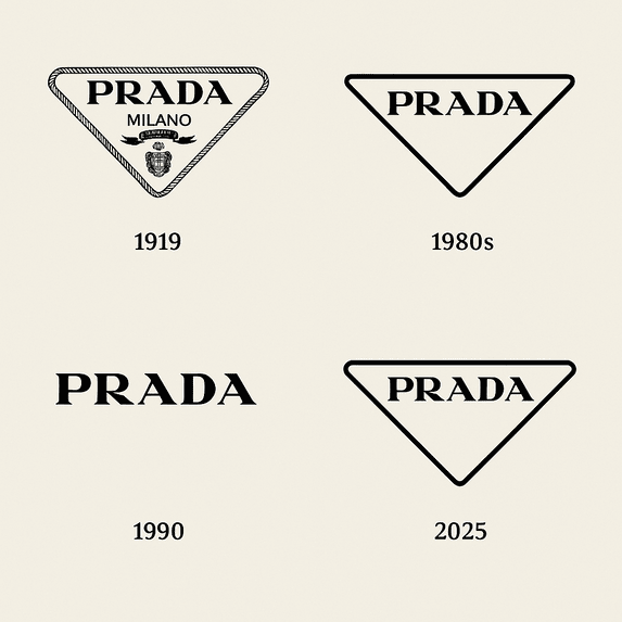
The Prada triangle started life as a metal plaque, the kind riveted onto steamer trunks so a buyer knew who had made them. More than a century later it is still doing the same job, on nylon backpacks, sandals and lab-grown diamonds. It has never been loud. In a business where rivals cover whole bags in initials, Prada has mostly relied on one small inverted triangle with a name inside it, and that restraint has become the brand’s signature.
It has also had to survive a lot: knockoffs by the million, a reinvention of the company in the late 1970s, and, in 2025, an argument about who gets credit for a sandal. The logo came through all of it largely unchanged, which says something about how well it was built in the first place.
A Plaque for Travelers, 1913
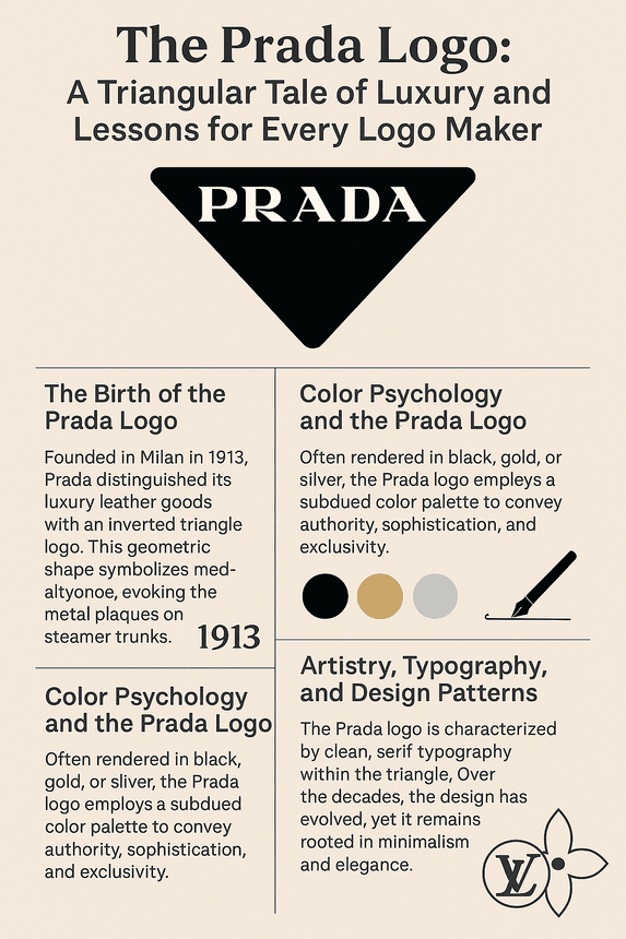
Mario Prada and his brother Martino founded Fratelli Prada in Milan in 1913. The shop sold leather bags, trunks and accessories to a wealthy clientele, and it sold them on craftsmanship. The inverted triangle plaque that Mario attached to the goods became the Prada logo, and it has outlasted almost everything else from that period of the company’s history.
The shape came from the metal plaques fixed to steamer trunks, so from the start it was tied to travel and durability, two things the brand’s first customers cared about. Made in brass or enamel, the plaque carried the name in a serif typeface, with extra decoration around it: a rope-like border and a coat of arms that hinted at a grander heritage. Simple shape, clear name, a bit of ornament for status. It was a sensible piece of design for its time.
What makes it instructive now is that it was useful before it was decorative. The plaque marked a piece of luggage as genuine, on goods meant to survive long journeys. A logo that starts out with a real job tends to keep its meaning longer than one invented purely to look nice. Prada’s told customers, in effect, that the bag would survive a transatlantic voyage.
Black, Gold and Silver
The logo usually appears in black, gold or silver on a neutral background. Black reads as authority and seriousness, and the metallic versions recall the original brass plaque. None of these colors is trying to catch your eye from across the street, and that is the point.
Compare Gucci’s red-and-green stripes or Louis Vuitton’s busy monogram. Prada’s restraint is how it stands out among them. The subdued palette signals exclusivity: you don’t need neon to know you are holding a $2,000 handbag. For anyone designing a mark today, this is a useful corrective to the instinct to make everything bright. A quiet palette can carry more status than a loud one, provided the shape is strong enough to be recognized without help from color.
Type and the Triangle
The lettering is clean, geometric and slightly aristocratic, and it sits comfortably inside the inverted triangle. The original version had the rope border and the crest, a nod to Milanese heraldry. Miuccia Prada’s reinvention in the 1980s cut that back to the essentials: the triangle, the name and very little else.
The lettering that came out of that process is legible and still distinctive, which is harder to achieve than it looks. The triangle does the rest. Its sharp angles suggest precision, while turning it point-down gives it a slightly contrary feel, which suits a house known for unconventional collections.
The lesson in how Prada refined the mark is that it removed things without replacing them. No new flourish arrived to fill the space left by the crest. Every element that survived earns its place. That is rarer than it sounds. Most heritage brands that simplify a crest end up swapping old decoration for new decoration, a gradient here, a custom ligature there. Prada simply took things away and trusted what was left. If you are tidying up an old mark of your own, try the same exercise: list every element, ask what each one does, and delete anything whose only answer is that it has always been there.
The Triangle as Monogram
Unlike Louis Vuitton’s interlocking LV or Chanel’s double C, Prada has no letter monogram. The triangle does that job. It has moved from leather goods to clothing and, in 2024, to jewelry, when Prada reworked the 1913 shape as the Prada Cut, a cut for laboratory-grown diamonds. Few logos can turn into a gemstone cut and still be recognized.
The shape carries plenty of associations. In engineering the triangle is the strongest simple shape, which fits the trunk-making origins. Turned upside down, it feels a little defiant. For Prada it is above all a mark of authenticity, the thing customers look for to tell a real bag from the many fakes. A single shape can carry a great deal once people have learned what it means, and it does not need to be complicated to get there.
A Constant Through Every Fashion Era
When Miuccia Prada took over the company in 1978, she turned a niche leather goods house into a global fashion business. The logo stayed put while everything around it changed. Its modernism comes from refusing to overcomplicate, and that is why it still looks current in 2025, while competitors such as Balenciaga push loud, meme-friendly branding.
You can trace the eras through the products the triangle sat on. In the 1980s it appeared on nylon backpacks that made luxury look utilitarian. In the 1990s it was on minimalist dresses. By the 2000s it was attached to Miuccia’s ironic takes on femininity, with platform heels and odd prints. The clothes kept changing direction. The plaque did not.
That is the practical takeaway. A logo that is going to last should be built for contexts nobody can predict yet, and it should look as good on a billboard as on a keychain. Prada has never needed a dramatic redesign to stay relevant, because the original was sound.
Knockoffs and the Sandal Row
Like every luxury brand, Prada has seen its logo on countless counterfeits, from Canal Street fakes to fast-fashion copies. Fakes dilute exclusivity. They also prove that the mark means something, since nobody bothers to counterfeit a logo that sells nothing.
The 2025 controversy was about credit rather than copying. Prada faced backlash for showcasing sandals resembling India’s Kolhapuri chappals at its Milan show for the 2026 collection, without crediting their long heritage. The criticism spread on social media, and Lorenzo Bertelli acknowledged the inspiration and promised dialogue with the artisans. Some craftsmen welcomed the global attention. Others wanted proper recognition.
The episode raised an old question about whether luxury houses borrow from craftspeople around the world without giving them credit. For designers, the narrower lesson is about cultural symbols in general: if you build a mark on someone else’s tradition, say so, and be prepared to be asked.
The Logo and the Business
Prada’s shares were trading at around €5.60 on the Hong Kong Stock Exchange in June 2025, a sign of resilience in a volatile luxury market. A logo does not move a share price on its own, but consistency builds trust, and the same triangle appears on everything from handbags to lab-grown diamond jewelry.
That clarity has also helped Prada expand into new markets in Asia and the Middle East, where the triangle is recognized without translation. A mark that relies on a shape rather than on wordplay or local references travels well. It reads the same in Shanghai as in SoHo. The same is true at different sizes. A triangle with a short word inside it survives being shrunk onto a zipper pull or blown up across a store window, and it does not depend on a particular material. Brass, enamel, rubber, embroidery and printed nylon all carry it without trouble.
Consistency as a Strategy
Prada’s identity is a contradiction it seems to enjoy: avant-garde but accessible, intellectual but playful. The logo is what holds that together. Because the mark never moves, the company can experiment with eco-friendly fabrics or AI-driven retail experiences without confusing anyone about whose product it is.
Distilled, the Prada logo’s lessons are short. Keep the shape simple, since clean lines stand out better than complexity. Root it in something real; Prada’s mark comes out of Milan and the travel trade. And refine slowly. The logo has changed in small ways over a century without losing its core.
Visual Language, Online and Off
Prada’s visual language mixes irony with elegance, and the triangle is at the center of it. Embossed on a Saffiano leather bag or cut into a diamond, it says the same thing: this brand sets its own direction rather than following someone else’s. Matching a logo to a brand’s voice in that way, whether the voice is playful, serious or somewhere in between, is the hardest part of identity work.
The triangle has also adapted easily to social media. Hashtags like #PradaSymbole and #PradaTriangle circulate on X, and the logo turns up in TikTok fashion hauls and Instagram mood boards. A geometric mark like this works on a phone screen as well as on a shop front, which is a test every logo now has to pass.
Where AI Tools Fit
AI logo makers such as Looka, Canva and Semplr have made design far more accessible. They suggest layouts, fonts and colors in seconds, which is useful for small businesses and startups that need something professional without hiring an agency.
It is fun to imagine Miuccia Prada trying one with prompts like “minimalist,” “timeless” and “Milanese heritage.” The software might offer a neon version or a 3D render. She would strip it back to the triangle. That is the real limit of these tools: they generate options quickly, but the editing, and the clear sense of what the brand is, still has to come from a person. Prada’s logo lasted because of human judgment, not because of how many alternatives anyone looked at.
Products and Recent News
The product range is as varied as the logo is consistent. The triangle appears on Saffiano leather bags, ready-to-wear, sneakers and sustainable jewelry. In 2025 the Prada Cut lab-grown diamonds made headlines by turning the triangle into a facet pattern.
The sandal episode, and Prada’s eventual acknowledgment of the Indian artisans behind the design, started a wider conversation about ethical sourcing. Meanwhile the Milan Fashion Week shows keep setting trends. Across all of it, from a diamond to a debate about footwear, the same small triangle tells you whose name is on the product.
Prada Against Gucci, Louis Vuitton and Chanel
Gucci’s interlocking Gs are bold but busy. Louis Vuitton’s monogram is playful but intricate. Chanel’s double C depends on perfect symmetry. Prada’s triangle is the quiet one in the group, and the least ornamental. Its point-down form feels slightly rebellious next to Chanel’s balance, which fits Miuccia’s avant-garde reputation.
The comparison shows why distinctiveness matters more than polish. Each of these marks owns a shape nobody else in luxury can use. If your logo could be swapped with a competitor’s without anyone noticing, it is not finished. A quick test is to strip the name out and show just the shape to someone who knows the category. Shown only a bare inverted triangle, a lot of people who follow fashion would still guess Prada. Very few new logos pass that test, and almost none pass it in their first decade.
What the Triangle Gets Right
The Prada logo works because it was simple from the beginning, has stayed consistent, and has a real story behind it: a maker’s plaque on a Milanese trunk. It has been stripped of ornament but never reinvented, and that discipline has let the company change almost everything else about itself.
For anyone designing a mark today, the method is unglamorous. Pick one shape, give it a reason to exist, and resist the urge to add to it. Prada has resisted for more than a hundred years.


