The Chanel Logo: History of the Double C
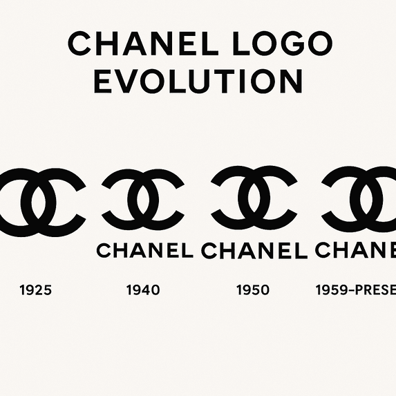
The Chanel logo has barely changed in a century. Two interlocking Cs, one facing each way, black on white, have appeared on quilted handbags, perfume bottles and lipstick cases since 1925, and Chanel has never felt the need to modernize them. In fashion, where most houses redraw their identities every decade or two, that is unusual. It is also the reason the mark works: it was simple enough at the start that there has never been anything to take away.
Where the Double C Came From
Gabrielle “Coco” Chanel introduced the double-C emblem in 1925. The most popular story is that it was inspired by the stained-glass windows of the abbey orphanage at Aubazine, where Chanel spent part of her childhood, and that the interlocking curves echo the looping patterns she saw there. It is a good story, and it may be true. Either way, the logo ties the brand to Chanel herself in a way few corporate marks manage. It reads as a personal signature rather than a company badge.
The design was also a break with its time. Most luxury houses of the period used ornate crests. Chanel’s mark was stark and minimal, closer to the clothes she was making than to the fussy dress of the early twentieth century. Its arrival is tied to the launch of Chanel No. 5, the perfume that changed what luxury smelled like, and the clean lines and monochrome palette fit her well-known line: “Simplicity is the keynote of all true elegance.”
Black and White
The palette is a deliberate choice. Black brings authority and a little mystery; white brings light and a sense of aspiration. Together they are about as neutral as color gets, and that is their strength. A monochrome logo never looks like it belongs to a particular decade, because it never picked a fashionable color in the first place.
There are practical benefits too. The mark looks as crisp on a lipstick case as it does on a billboard, and it can be embossed, stamped in gold or cut into metal without losing anything. Plenty of logo tools default to bright multicolor designs. Chanel shows how much a restricted palette can do, especially when the shape is strong enough to carry the mark alone.
Type and Symmetry
The lettering that accompanies the monogram is a custom sans-serif, sometimes called “Couture” by type enthusiasts. It is clean and modern, yet it has never looked dated, which is the same trick the clothes pull off. Like a well-cut little black dress, it is functional first and elegant because of it. The monogram itself depends on symmetry: two identical Cs mirrored and overlapped, creating a balance that is very simple to describe and surprisingly hard to imitate well.
Set it next to Louis Vuitton’s monogram or Gucci’s double G and the difference is obvious. Vuitton and Gucci are busier and more decorative. Chanel is quieter, and it does more with less. Producing a clean, scalable mark like this is not hard with modern software. Giving it the weight Chanel’s has is another matter, and that weight comes from a century of use, not from the drawing.
What the Monogram Means
Aubazine is only one reading. The obvious one is that the Cs are Coco Chanel’s initials. Another is that they nod to Arthur “Boy” Capel, Chanel’s lover, whose surname also began with C. The round, closed shape suggests continuity, which suits a brand that has come through wars, recessions and every fashion cycle since the 1920s. A great logo tells a story in a glance, and this one manages to hold several.
The same mark now appears on products Coco Chanel could not have imagined, and it adapts without fuss. Logos today have to work in print, on screens and in virtual spaces, and Chanel’s monogram does all three.
Modernist Before Its Time
The logo predates the Bauhaus but shares its instincts: form follows function, and decoration has to earn its place. It is abstract but precise, universal but still exclusive. Its clean geometry also anticipated the digital age, where a logo has to hold up as a few pixels on a phone.
That restraint stands out more now than ever. Plenty of brands chase TikTok virality with playful branding, Wendy’s sassy mascot or Duolingo’s mischievous owl. Chanel has done almost nothing to its logo beyond minor adjustments, and that refusal reads as confidence. A timeless mark is worth more than a trendy one, and Chanel is the proof.
Through the Fashion Eras
The logo has stayed put while fashion turned over around it. In the 1920s it was linked with a new freedom for women: shorter dresses, bobbed hair, no corsets. In the 1980s Karl Lagerfeld made it a status symbol, putting it on oversized jewelry and logo-heavy handbags. More recently it has appeared on eco-friendly collections shown at Paris Fashion Week 2025. The look of the clothes changes. The mark does not.
That continuity has kept Chanel at the center of popular culture for a long time. Audrey Hepburn in Breakfast at Tiffany’s and Blackpink’s Jennie Kim, named a brand ambassador in 2025, sit at opposite ends of the same line, and the double C connects them.
Counterfeits and Controversy
A logo this famous attracts fakes, and Chanel’s are everywhere, from street markets in Bangkok to the metaverse. Every counterfeit erodes a little of the exclusivity the logo is meant to signal. In 2024 Chanel won a $4 million lawsuit against counterfeiters, a win that changes little in a fight that never ends. Counterfeiting is the dark side of being admired, and the more recognizable the logo, the bigger the target.
Chanel has also faced accusations of cultural appropriation. In 2017 its boomerang accessory drew criticism for trivializing Indigenous Australian culture, and some of that criticism stuck to the brand itself. Chanel apologized quickly and has since moved toward more inclusive projects, such as its 2025 collaboration with African artisans.
The Logo as an Economic Engine
Chanel is privately held, so its finances are less transparent than its rivals’, but estimates put its 2024 revenue at $19 billion, up 14% on 2023. The logo is central to that. It turns handbags into something closer to investments: a classic flap bag now costs around $10,000, putting it in Hermès territory. The double C works almost like a currency of its own.
It also gives the company room to move into new categories, such as its first tech wearable, a fitness tracker embossed with the logo. Whether a product like that suits the brand is debatable. That the logo can carry it at all shows how much equity the mark has built up.
Consistency
Chanel’s identity, elegant, independent and inventive, flows from the logo, and the logo never varies. The same double C appears on haute couture and on skincare. A logo is a promise, and consistency is how the promise gets kept.
For a startup, this is the hard part. It is easy to generate a decent logo with an AI tool; Semplr and plenty of others will give you a clean result. Keeping it consistent across a website, packaging and social media takes discipline, and that discipline is what Chanel actually has that most brands lack.
Five Lessons From the Double C
- Simplicity wins. Remove anything extra. A logo should be legible at a glance.
- Scale matters. Make sure it works from a favicon to a billboard.
- Symbolism adds depth. A personal or cultural meaning gives people something to hold on to.
- Timeless beats trendy. Avoid fads that will date the design.
- Consistency builds trust. Use the logo the same way everywhere.
None of these depends on how you make the logo. They apply equally to a hand sketch and to a design that started in software.
The Logo’s Voice
Chanel’s visual language is sleek, bold and understated, and the message it carries is that luxury should look effortless. The logo’s placement backs this up: usually centered, often subtly embossed rather than printed loud. The 2025 “Coco Forever” campaign, launched at Paris Fashion Week, paired the logo with archive footage of Coco Chanel, connecting heritage with something more forward-looking. The logo does not need copy around it to explain itself.
That is a useful model for any brand. A logo should carry the story, not compete with it.
Chanel is also tightening its legal grip on where and how its products are sold, going after unauthorized sellers such as Cesar S.p.A. and Crepslocker for selling genuine goods in ways that clash with its luxury image. In a June 2025 ruling, the Court of Milan upheld Chanel’s selective distribution system and fined Cesar €1,000 per product for sales in mass-market stores that risked harming its reputation. The strategy is clear: for Chanel, a product being authentic is not enough. It has to be sold in a setting the brand approves, or the logo on it loses some of its meaning.
The Double C Online
The logo does well on social media. Hashtags like #ChanelLogo and #CocoChanel have billions of views on TikTok, where younger fans show off logoed accessories. In 2025 Chanel released an AR filter that let users “wear” the logo as virtual earrings, and it went viral. The double C is as recognizable on a screen as on a shop window.
That is partly luck of design: a simple, high-contrast mark survives being shrunk to an avatar or overlaid on a selfie. Any new logo should be tested in those settings, an Instagram grid or a profile picture, before it goes anywhere else.
AI and the Limits of Simplicity
AI tools have changed who can make a logo. Professional-looking designs now cost very little, which levels the field for small businesses. A mark as simple as Chanel’s is exactly the kind of thing software can produce in seconds.
What software cannot produce is the meaning. The weight of the Chanel logo comes from Aubazine, from Coco Chanel’s break with the fashion of her day, and from a hundred years of use. None of that is in the shapes. If you design with AI, use it for speed and options, and supply the story yourself.
Everything the Logo Appears On
- Fashion: tweed jackets to logoed sneakers.
- Accessories: quilted bags and logo necklaces.
- Beauty: No. 5 perfume and Rouge Coco lipsticks.
- Tech: the 2025 Chanel smartwatch, a wearable carrying the logo.
- Sustainability: eco-friendly capsule collections.
Each product adds to the logo’s value rather than spending it, which is what good brand extension looks like.
Chanel Against Its Rivals
Among luxury logos, Chanel’s is the outlier. Louis Vuitton’s monogram is busier, built for all-over pattern. Gucci’s logo, with its serif details, looks less modern. Dior’s wordmark is elegant but lacks a standalone symbol with the power of Chanel’s Cs. Chanel’s mark is precise, versatile and durable in a way the others are not, and it manages to be both distinctive and adaptable.
If Chanel Tried an AI Logo Generator
As a thought experiment, imagine Chanel’s creative team in 2030 typing a brief into an AI logo generator: luxury, futuristic, monochrome, minimalist. The software might return a three-dimensional double C floating like a hologram and pulsing with light. Most of the results would be too Tron for a fashion house, but one might be worth keeping for a virtual runway show.
That is about the right role for these tools at a brand like Chanel: a source of ideas for a campaign or a one-off, never a replacement for the mark. The heritage makes the classic logo untouchable.
Chanel in 2025
Chanel spent 2025 balancing heritage and novelty. Its sustainable collection at Paris Fashion Week 2024, logo-embossed hemp dresses, was well received and fit the priorities of eco-conscious younger customers. A 2025 collaboration with Apple on a logoed smartwatch drew attention on X, where #ChanelTech trended. The brand’s messaging, “Timeless elegance, modern reinvention,” has been carried by ambassadors such as Timothée Chalamet.
Not everything went smoothly. A 2025 row over pricing transparency, with handbags reaching $12,000, tested customers’ loyalty, and Chanel responded by introducing micro-financing options. The logo, as ever, came through unchanged.
What Chanel Shows
The lesson of the double C is mostly about patience. Chanel drew a simple, symmetrical mark with a personal story behind it, kept it black and white, and then had the discipline to leave it alone for a hundred years. That last part is the one most brands fail. If you are designing your own logo, aim for something simple enough that you will never be tempted to redesign it, then add the meaning over time.


