The Jeep Logo: How a Plain Wordmark Became an Icon
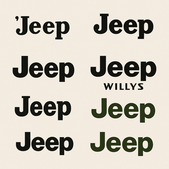
The Jeep logo has no animal, no crest and no shield. It is four letters in a sturdy sans-serif, and it has carried one of the best-known names in the car business since the vehicle came out of World War II. Most car brands lean on a symbol to do the emotional work. Jeep let the word do it, and the word turned out to be enough, because by the time anyone thought of it as a logo, the name already stood for mud, war stories and the freedom of four-wheel drive.
That makes it an odd and useful case for anyone who designs logos. Jeep is proof that a plain wordmark can hold as much meaning as any emblem, provided the brand behind it has earned that meaning first.
A Name Before It Was a Logo
The Jeep logo did not start with a design brief. It started with the U.S. Army, which needed a light vehicle as tough as the soldiers riding in it. Where the word “Jeep” came from is still argued over. One theory says it grew out of the military’s “GP” (General Purpose) designation. Another links it to Eugene the Jeep, a character from the Popeye comic strip. By 1941 Willys-Overland and Ford were building the boxy little trucks in quantity, and the name appeared on them as a simple, bold wordmark in sturdy sans-serif letters. Nothing fancy.
That plainness set the tone for everything after it. The mark was never about decoration. It was about function and reliability, with a promise of adventure underneath, and Jeep’s identity has stayed that way: rugged, and aimed at people who would rather climb the mountain than look at it. The lesson for designers is that simplicity can carry a brand a very long way. A logo does not need to shout. It needs to stick, and four letters that people already associate with something real will stick better than a clever drawing nobody has a reason to remember.
Earth Tones and Steel
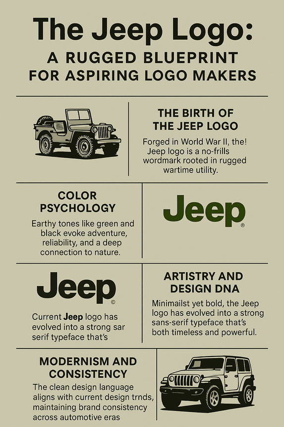
The wordmark itself usually appears in black or silver. The color story happens around it. Jeep’s wider branding leans on greens, grays and browns, the colors of forests, steel and dirt roads. In the usual reading of color psychology in logos, those hues signal reliability, strength and a link to the outdoors, which is exactly the territory Jeep wants to own.
Green in particular does two jobs at once. It suggests adventure, and it also suggests trust, which matters when the pitch is that you can drive somewhere remote and get back again. Set that palette next to Ferrari’s red, which is all speed and passion, or Tesla’s cool silver, which reads as tidy futurism, and you can see how deliberate Jeep’s choice is. It roots the brand in authenticity instead of flash.
The practical point for anyone picking colors for a new brand: decide what the colors have to say before you decide what looks nice. A playful brand might reach for bright orange, a luxury brand for deep blue. Jeep’s palette is the color of dirt under your fingernails after a day off-road, and that is the point.
The Typography
The Jeep wordmark is an exercise in typographic restraint. The current version, in use since the 1990s, is a clean, bold sans-serif, often identified as Futura. It is strong without being aggressive and legible without being dull. That balance suits a brand that wants to feel accessible and aspirational at once: it sells to ordinary drivers, but it promises them something out of the ordinary.
The lettering has changed only gradually. Early versions were hand-painted onto military vehicles, often alongside stars and other wartime insignia. By the 1950s, as Jeep moved into civilian life, the mark became more standardized, with cleaner lines and the wordmark doing all the work. Today’s version is about as minimal as a car badge gets, with none of the swooshes, bevels and chrome flourishes that date weaker logos within a few years.
For designers the takeaway is to put clarity first. A logo should be a distillation of what the brand is, not a place to park every idea that came up in the meeting. If you cannot read it at a glance on the back of a moving car, it is doing too much.
No Emblem, Plenty of Meaning
Brands like Nike and Apple have famous symbols, the swoosh and the bitten apple, that work with no name attached. Jeep relies on its wordmark alone. That does not make it short on symbolism. The word “Jeep” has become a cultural artifact in its own right, standing for resilience and independence with a streak of rebellion. It carries a lot of history in four letters: the war, decades of exploration, and the American idea of wide-open space.
Going without a graphic emblem is an unusual choice in an industry full of prancing horses (Ferrari) and winged Bs (Bentley). It puts all the weight on the typography, and the typography holds up. Designers working on a new brand should take note. A strong wordmark can be as powerful as any icon, especially once there is a real story behind the name. It can also be cheaper to protect and easier to apply, since there is only one thing to get right.
Why It Still Looks Current
Flat design and minimalism have dominated logo work for more than a decade, and the Jeep logo fits that look without trying. Its clean lines and lack of fuss match current tastes, yet its roots in the 1940s give it a weight that newer brands cannot fake. It is a bit like a good pair of work boots: functional, durable and better with age.
That is not luck. Jeep has resisted overhauling its logo every time a trend comes through, unlike some rivals that have gone fully futuristic. Jaguar’s recent rebrand is the obvious example. Talk of a Jeep logo redesign in 2025 has stayed talk, and no major overhaul had been announced as of July 2025. Jeep adjusts its branding quietly instead, keeping it current without throwing away what people recognize. The lesson is to design for the long run. Trends fade, and a mark tied to one of them fades with it.
One Badge, Several Eras
The logo has stayed fixed through several very different chapters of the brand. In the 1940s it was the face of wartime utility. By the 1980s, with the Cherokee and Wrangler, it had come to mean suburban adventure. Now, as Jeep moves into electrified models such as the Wrangler 4xe, it sits between heritage and new technology.
Each era nudged the mark just enough to keep it current. The 1990s brought a bolder, more polished typeface to match Jeep’s growing global reach. In the 2000s the logo was paired with slick marketing that sold lifestyle more than utility. Through all of it the wordmark acted as a fixed point, a reminder that however many hybrid SUVs the company builds, Jeep is still about the trip. For designers this is the case for flexibility: a mark has to work across products, decades and shifts in taste, and the simpler it is, the easier that becomes.
Knockoffs and the Cherokee Question
A logo this recognizable attracts trouble. Knockoffs are everywhere, from cheap T-shirts to dubious off-road accessories, and each one dilutes the brand a little. Being a symbol of freedom means everyone wants a piece of it, legally or not.
The more serious controversy is about names rather than the badge. In 2023, Jeep faced criticism over its use of Native American imagery in marketing, with some accusing the brand of cultural appropriation, a charge that still hangs over the Cherokee and Grand Cherokee names. Jeep responded by stressing its commitment to cultural sensitivity, but the debate has not gone away. It is a reminder that a brand’s meaning includes everything attached to the logo, not just the logo itself.
For smaller brands the practical advice is less dramatic. Make sure your logo is original enough to trademark, keep clean master files, and talk to a lawyer before you need one rather than after.
The Badge as a Business Asset
Jeep’s parent company, Stellantis, leans heavily on the brand to drive growth. In 2024, Jeep’s global sales topped 1.5 million vehicles, led by the Wrangler and Grand Cherokee. The logo’s recognizability supports everything from merchandise to licensing deals, and it contributes to a Stellantis market value of around $200 billion. A logo is a business asset as well as a piece of design, and Jeep’s is worth a great deal because the word has become shorthand for adventure.
The same logic applies at a much smaller scale. A well-made logo builds brand equity, makes a company easier to remember and can make it easier to attract investors. None of that requires a big design budget. It requires a mark that is clear, distinctive and used the same way for long enough that people learn it.
The Same Mark Everywhere
Consistency is the backbone of Jeep’s identity. The wordmark appears on mud-splattered Wranglers and in polished city showrooms, always in the same bold, unyielding form. That uniformity builds trust. Buy a Renegade or a keychain and you get the same Jeep. Consistency can look boring from the inside, but it is strategic: every time the logo shows up unchanged, it keeps a promise made decades ago.
For a new brand the equivalent is a simple style guide. Fix the logo, the fonts and the colors, write down how they are used, and stick to it across the website, the packaging and the social accounts. That is how a logo turns into something people recognize without reading it.
What Designers Can Take From Jeep
Three lessons stand out. The first is simplicity. A cluttered logo is like a cluttered trail, hard to follow and easy to forget. The second is knowing your audience. Jeep’s wordmark works because it speaks to people who want to go places, not to people chasing the latest look. The third is story. Jeep’s four letters carry 80 years of history, from battlefields to back roads, and a logo with a story behind it will always do more than one without.
Testing these ideas has become cheap. Template tools such as Canva or Designs.ai let you try typefaces, colors and layouts in minutes, which puts basic logo design within reach of almost anyone. Just don’t expect a first draft to have the weight Jeep’s badge has. That came from decades of use, not from the drawing.
How the Logo Talks
The Jeep logo has a voice. The bold, no-frills type says the thing is built to last. The lack of ornament says it has nothing to prove. That visual language lines up neatly with the brand’s message of freedom, durability and adventure, and it invites people to imagine where the car might take them.
Your own mark should do the same for your brand. Try different styles while you sketch, playful for a pet brand or sleek for a tech startup, but choose the one that sounds like the company, not the one that looks most impressive in a portfolio.
Jeep Online
On Instagram and TikTok the Jeep logo is everywhere. Hashtags like #JeepLife and #JeepNation have millions of posts, showing Wranglers scaling cliffs or parked on city streets. The wordmark’s simplicity suits these platforms, where clarity matters more than detail. A logo has to work at 50 pixels as well as on a billboard, and Jeep’s does.
That is a good test for any new design. Look at it at the size of a profile picture on a phone screen and export it at high resolution so it stays sharp on social media. In 2025 a logo spends as much of its life on screens as in the physical world.
Could Jeep Ever Use AI for Its Logo?
It is less far-fetched than it sounds. AI logo generators such as Looka, Designs.ai and Semplr offer speed, customization and low cost, and they are spreading fast: the global AI logo generator market is projected to grow at a 20% CAGR in 2025, and 80% of marketers predict AI-generated logos will dominate branding within two years. These tools are trained on thousands of existing logos and fold in color, typography trends and visual hierarchy when they produce a design.
As a thought experiment, imagine Jeep’s marketing team in 2026 feeding words like “rugged,” “timeless” and “adventurous” into one of them, choosing earthy greens and bold sans-serifs, and then reworking the output for the brand’s electric future. One plausible result is a wordmark with a small lightning bolt worked into the “J,” a nod to EVs that keeps the heritage intact. A team could test a hundred variations in a day that way.
Any such logo would still need people to decide whether it honors 80 years of history, and that is the hard part. The software makes iteration faster. It does not make judgment faster. For now Jeep’s logo remains untouched, which is probably the right call.
The Lineup and Recent News
Jeep’s 2025 lineup is as varied as its logo is singular. The Wrangler is still the heart of the brand, with the 4xe hybrid adding some environmental credibility to its off-road ability. The Grand Cherokee, Compass and Renegade are aimed at drivers who mostly stay on pavement, and the upcoming Recon EV signals Jeep’s electric plans. Stellantis is investing $1.5 billion in EV production for 2026, and the marketing leans hard on the badge, with campaigns built around “Go Anywhere, Do Anything.”
The brand also reaches beyond the cars. The Jeep Wave program offers owners perks such as free maintenance and VIP events, which keeps them loyal. The logo turns up on hats and hoodies, and Jeep sponsors outdoor festivals, tying the badge to music, adventure and community as well as off-roading.
Jeep is best known for off-road vehicles that can handle Moab’s red rocks or the swamps of the Everglades, with the Wrangler as the purest example. For buyers who want some of that ability in a more practical daily car, the 2025 Grand Cherokee is the obvious pick. It starts at an MSRP of $36,495 and offers a 3.6L V6 or a 2.0L hybrid, with up to 6,200 lbs of towing capacity and 19/26 mpg (or 56 MPGe for the 4xe). The Grand Cherokee L adds a third row. A plush interior, a McIntosh sound system and a five-star NHTSA safety rating round it out, so the same car can handle the school run and a mountain trail.
Jeep Against Its Rivals
Next to its competitors, the Jeep logo’s strengths are easy to see. Ford’s Blue Oval, with its 116-year legacy, matches Jeep for longevity but feels more corporate than adventurous. Land Rover’s green oval badge suggests luxury exploration but lacks Jeep’s everyday appeal. Tesla’s minimalist “T” looks futuristic but cold. Jeep’s mark wins on honesty: it does not try to be anything other than what the cars are.
That points to differentiation. Before settling on a design, line it up against your competitors’ logos and make sure it does not blend in. Template sites such as Fiverr Logo Maker or BrandCrowd are a quick way to see what is common in a category, which is useful mostly as a list of things to avoid.
Jeep in 2025
Jeep is doing well in 2025. Its sponsorship of the Overland Expo and partnerships with outdoor influencers keep the logo at the center of adventure culture. A recent Wrangler 4xe campaign pushed sustainability without losing the grit, with the badge on a line of eco-friendly merchandise. The redesign rumors have faded, and Stellantis is sticking with the classic wordmark.
The message stays narrow: freedom, exploration, authenticity. The wordmark anchors it in ads that show Wranglers crossing deserts and city streets alike, and it never changes from one ad to the next.
What Jeep Gets Right
The Jeep logo works because of simplicity, a real story and decades of consistency. None of those came from the drawing alone. The wordmark is good, but plenty of good wordmarks have disappeared. This one lasted because the company kept using it the same way while the cars earned the reputation the letters now carry.
If you are building a brand of your own, that is the order to work in. Get a clear, simple mark, pick colors and type that say something true about the business, and then leave it alone long enough for people to learn it. A logo is not finished when the file is exported. It is finished when people recognize it without having to read it.


