Logoluv

Tag

logo generation with prompt page 2

79 LogoLuv stories about logo generation with prompt: logo history, design choices and what they mean.

Iconic Logos

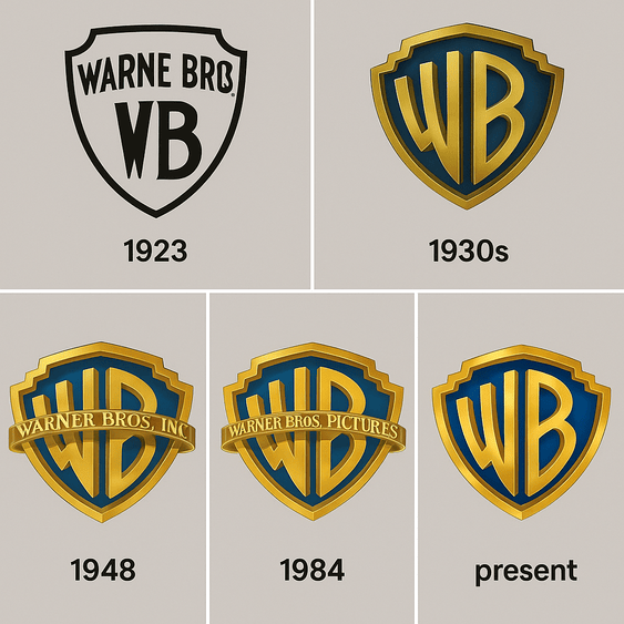
The Warner Bros Logo: A Century of the WB Shield

The Warner Bros shield has introduced films for about a hundred years, and it is one of the few studio logos that changes its mood from movie to movie. It goes dark and weathered before Harry Potter, glossy before Superman, and stays recognizably the same shield every time.
· 8 min read

Iconic Logos

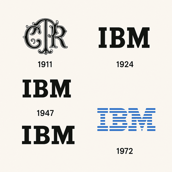
The IBM Logo: Paul Rand’s Stripes and How They Lasted

The IBM logo has not meaningfully changed since 1972. That is a remarkable run for a technology company, an industry that usually redesigns its marks every time it reinvents its products, and IBM has reinvented its products several times over.

· 9 min read

Iconic Logos

The Land Rover Logo: History of the Green Oval

The Land Rover badge was designed to be read on a grille covered in mud. It is a green oval with blocky, utilitarian lettering, and more than seventy years after the first Series I left Solihull it has barely changed.

· 10 min read

Iconic Logos

The Tommy Hilfiger Logo: History, Colors and Meaning

The Tommy Hilfiger flag has hardly changed since 1985, and in that time it has been worn by yuppies, by Snoop Dogg and Aaliyah, and by teenagers who discovered it on TikTok. Very few fashion logos have crossed that many crowds without being redrawn to suit them.

· 11 min read

Iconic Logos

The Chanel Logo: History of the Double C

The Chanel logo has barely changed in a century. Two interlocking Cs, one facing each way, black on white, have appeared on quilted handbags, perfume bottles and lipstick cases since 1925, and Chanel has never felt the need to modernize them.

· 9 min read

Iconic Logos

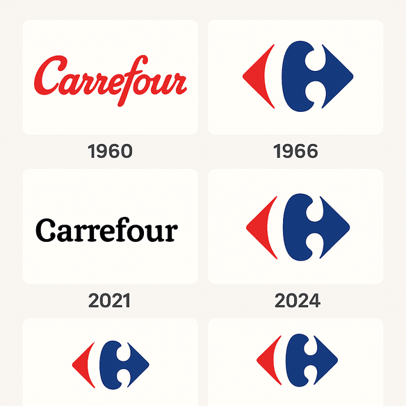
The Carrefour Logo: History, Hidden C and Design

Most shoppers who walk past a Carrefour sign never notice the letter in the middle of it. Between the red arrow and the blue one sits a white “C,” formed entirely by the empty space, and it has been there since 1966.

· 9 min read

Iconic Logos

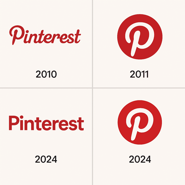
The Pinterest Logo: History, Color and Design

Pinterest’s logo is one letter, a curved red “P” whose tail doubles as the point of a pin. It has stayed largely untouched since 2011, through a decade in which almost every other social app redrew its icon at least once.

· 10 min read

Sports Logos

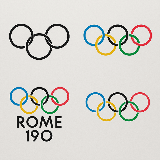
The Olympic Rings: History and Design of the Olympics Logo

The Olympic rings were drawn in 1913 by Pierre de Coubertin, the French baron who founded the modern Games, and the design has not needed to change since. Five interlocking circles in blue, yellow, black, green and red, on white, stand for the five inhabited continents joined together.

· 11 min read

Iconic Logos

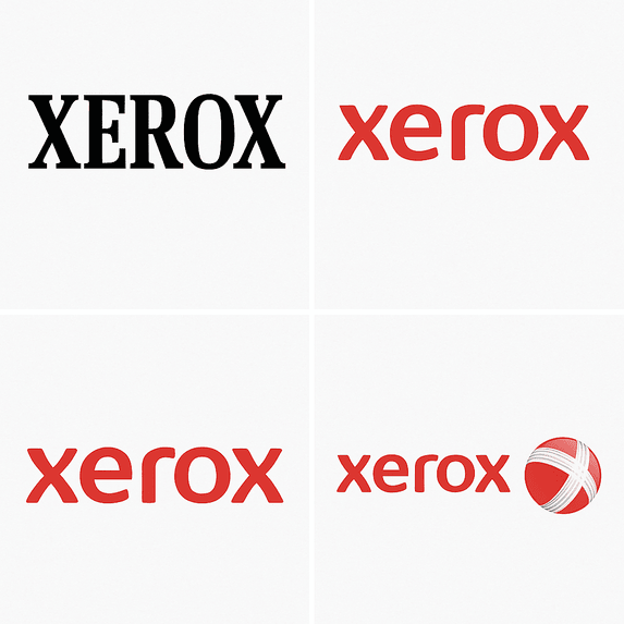
The Xerox Logo: History, Design and Reinvention

Few companies get turned into a verb. Xerox did, so thoroughly that it has had to fight to stop “xeroxing” becoming a generic word for photocopying, and its logo has had to carry that weight through more than half a century of reinvention.

· 10 min read

Iconic Logos

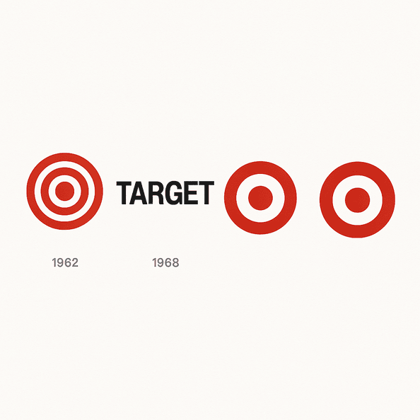
The Target Logo: How the Bullseye Got Simple

Target’s first bullseye, in 1962, had three rings. Six years later it was down to one red ring and a dot, and that stripped-back version has been on carts, bags and Super Bowl ads ever since.

· 10 min read