The Tommy Hilfiger Logo: History, Colors and Meaning
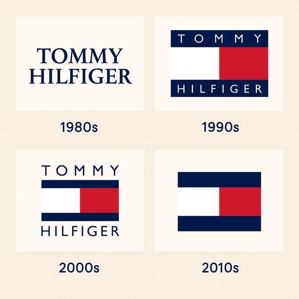
The Tommy Hilfiger flag has hardly changed since 1985, and in that time it has been worn by yuppies, by Snoop Dogg and Aaliyah, and by teenagers who discovered it on TikTok. Very few fashion logos have crossed that many crowds without being redrawn to suit them. The flag managed it with a handful of colored rectangles and no illustration at all.
It is a small, nautical-looking block of red, white and navy that sits on the chest of a polo shirt the way a pennant sits on a mast. It does not show a horse, a crocodile or a crest. It barely shows a letter. That modesty is a big part of why it still works, and it is also why the brand has been able to put it on everything from chinos to racing cars.
How the Flag Began
Tommy Hilfiger launched his namesake brand in 1985, when the fashion of the moment ran to shoulder pads and neon. The logo he went with was the opposite of that: two horizontal bars, one red and one white, flanked by a navy-blue square, with the shapes split diagonally to suggest the letter “H.” It reads less like a modern logo and more like heraldry, the kind of thing you would expect on a yacht-club burgee or an Ivy League blazer.
Hilfiger was a self-taught designer with a good eye for where culture was heading, and the mark reflects that. It looks back to nautical signal flags and the preppy wardrobe the brand was built on, but its clean lines and flat colors keep it from feeling like a costume. That combination of old-fashioned reference and plain geometry is what has carried it through four decades.
Red, White and Navy
The palette is about as American as a palette can get, and that is clearly intended. Red is the color that catches your eye from across a shop floor. White keeps the mark clean and gives the other two colors room. Navy, darker and more serious than a straight flag blue, stops the whole thing from looking like a Fourth of July decoration and nudges it toward tailoring and the sea.
Together they manage to feel patriotic without being parochial, which matters for a brand that now sells far more outside the United States than its founder could have expected in 1985. The same three colors read clearly on a white polo, a navy sweater or a red jacket, and they are a big reason the flag has found its way onto Formula 1 cars: the brand is the apparel partner for the new Cadillac F1 Team, and the logo will appear on its cars and driver suits from 2026.
Geometry, Type and the Hidden H
Next to Louis Vuitton’s ornate monogram or Coca-Cola’s swooping script, the Tommy flag looks almost utilitarian. It is made from rectangles and one diagonal. The “H” formed by that split is easy to miss, and a lot of people who have owned a Tommy shirt for years have never noticed it. That is a strength. A logo that rewards a second look tends to stay interesting longer than one that explains itself immediately.
The type that usually goes with the flag is clean, bold and sans-serif, which suits the plain geometry. In the early years the mark was often paired with the full “Tommy Hilfiger” name in lettering that had a whiff of the college yearbook about it. These days the flag often appears on its own, which tells you how recognizable it has become. The general point for anyone designing a mark is that simple shapes scale, from an embroidered patch the size of a thumbnail to a billboard, and clever ones usually don’t.
What the Flag Stands For
The flag is not a monogram in the traditional sense, since there are no interlocking initials, but it does the job of one. The nautical theme draws on Hilfiger’s love of the sea and on the Kennedy-era image of Cape Cod summers. The “H” is a signature without much ego attached, a founder’s initial tucked into the shapes rather than written large across them.
What the mark means has shifted over time even though the drawing hasn’t. In the 1990s, when hip-hop artists such as Snoop Dogg and Aaliyah embraced the brand, the flag became a badge of crossover between prep and street style. More recently the Spring 2026 “New York Collection” brought back the lion penny crest, a symbol from the brand’s 1993 tailoring line, alongside the flag. The brand can reach for its archive like that without ever touching the main logo.
Why It Still Looks Current
Fashion moves in short cycles, and most logos drawn in 1985 now look like 1985. The Tommy flag doesn’t, mostly because it never contained anything of its moment. There is no airbrushed gradient, no fashionable typeface, no illustration that dates it. Clean lines and flat color are about as close to timeless as graphic design gets.
This is the most useful lesson in the logo. A mark that chases a trend ages with the trend. Hilfiger’s flag is specific enough to be distinctive, thanks to those particular proportions and that diagonal, and plain enough to sit on chinos, watches and F1 cars without looking out of place on any of them.
One Logo, Several Fashion Eras
Each decade has worn the flag differently. In the 1980s it was a status symbol for young professionals chasing the American Dream. In the 1990s it was a hip-hop staple, printed large across oversized tees and championed by Puff Daddy among others. It got through the low-rise-jeans 2000s, and more recently it has picked up a new audience through the preppy revival on TikTok.
The interesting thing is how little of this required any change from the brand. Each audience projected its own meaning onto the same rectangles, from preppy ambition to street style, grunge to normcore, and the logo absorbed all of it. A more literal mark, one that actually depicted a sailboat say, would have had a much harder time being adopted by so many different groups.
Knockoffs and Controversy
A logo this widely recognized gets copied, and the flag has spent decades on counterfeit goods in street markets around the world. The brand has also faced harder questions. In the 1990s its embrace by hip-hop culture led to accusations that it was profiting from Black culture, a charge Hilfiger has always denied, pointing to his genuine collaborations with artists. More recently critics have asked whether a company of its size can square its business with eco-conscious values.
None of this has dented the logo itself. That can make a mark look invulnerable, but it is worth being precise about why. The flag survives because the brand behind it keeps giving people reasons to wear it. A strong design can carry a company through rough patches. It cannot stand in for what the company actually does.
The Logo as a Business Asset
Tommy Hilfiger is part of PVH Corp., which reported revenues of $9.2 billion in 2024, and the Tommy brand contributes a large share of that through global licensing deals and its own retail. The flag is what makes the licensing work. Watches, fragrances, F1 merchandise and eyewear made by other companies can all carry the same small rectangle, and shoppers immediately know whose product they are buying.
That is the practical case for investing in a strong mark. If you are starting a business, think early about where your logo will need to go: a website header, a shipping label, an embroidered cap, a phone screen. A logo that only works in one of those places will cost you later.
Consistency
Whether it is embroidered on a polo or printed on a racing car, the flag is the same flag. That consistency has done a lot to fix the brand’s identity as “classic with a twist,” a phrase the company uses often enough that it has become a kind of slogan.
For a smaller brand the lesson is simple and often ignored. Pick one version of your logo and use it everywhere. A mark that looks slightly different on the website, the business card and the Instagram profile reads as three different companies. Hilfiger settled on his design in 1985 and has barely touched it since.
The brand is also pushing hard into Formula 1’s growing cultural reach. It is the official apparel partner for the Cadillac F1 team, which debuts in 2026, and it sponsors the APXGP Collection tied to F1 The Movie, launched in June 2025 with ambassador Damson Idris. The flag will appear on Cadillac’s cars, driver suits and fanwear, building on earlier F1 ties with Lotus, Ferrari, Mercedes and Lewis Hamilton. Tommy Hilfiger also sponsors F1 Academy driver Alba Hurup Larsen and says it is using AI to build fan experiences around the sport. The timing, alongside the film’s release, puts the brand right where fashion, motorsport and pop culture overlap.
What Designers Can Take From It
Three things stand out. The first is restraint: a limited palette and plain shapes make the flag recognizable at any size. The second is meaning: the nautical “H” carries a story about the sea, the founder and American prep, without any of that being spelled out. The third is range. A logo that works on a shirt, a billboard and a tiny browser favicon is a logo that lasts.
Whatever tools you use to get there, start by deciding what your brand actually is. Software can produce endless options, and it is easy to get lost choosing between them. The options are only useful once you know which one fits.
How the Flag Talks
The flag manages to look confident without looking exclusive. It is preppy but not snobbish, classic but not stuffy. Recent campaigns lean on that balance: the Spring 2026 “New York Collection,” shown at Pitti Uomo, pairs the logo with tailored classics and the revived lion penny crest, and the message is that Tommy Hilfiger is for everyone, from a Florence runway to a TikTok feed.
It is worth thinking about logos in those terms. Before choosing colors or shapes, decide what you want people to feel when they see the mark, and who you want to feel it. The Tommy flag answers both questions in a few square inches: this is American, it is approachable, and it is for you.
On Screens and Social Media
The flag does well online. Tags such as #TommyHilfiger and #TommyJeans fill up with influencers wearing vintage tees and tailored blazers, and the logo shows up constantly on Instagram and TikTok. A recent post on X from @seeklogo sharing a vector version of the logo is a small sign of how much people still want to use it.
Flat color and simple geometry are exactly what a screen needs. The flag stays legible as a tiny profile icon and holds up in a fuzzy phone photo of someone’s shirt. Any new logo should be tested at that scale, and exported as a vector file so it stays sharp wherever it ends up.
AI Tools and a Logo Like This
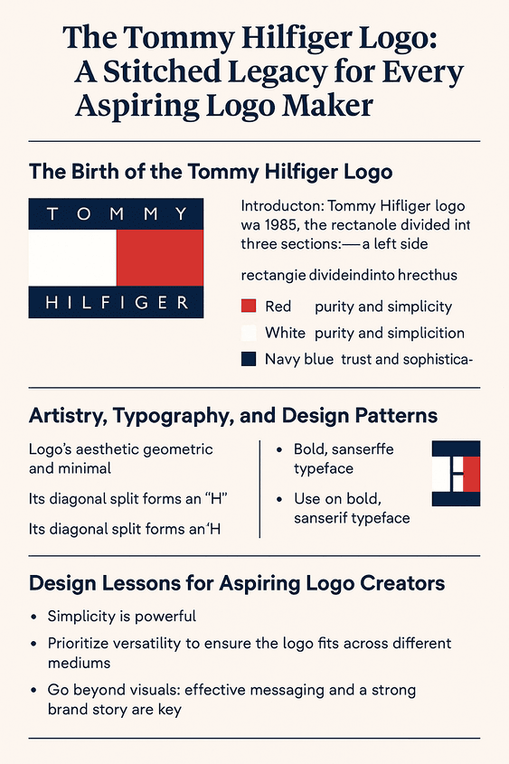
A design this geometric is exactly the kind of thing modern logo software handles well. AI logo makers such as Looka, Canva, BrandCrowd and Semplr can turn a few prompts into a red-white-and-blue flag in minutes, and most export clean vector files. What they could not have done in 1985 is read the moment: notice that preppy clothes were about to become aspirational, and that a quiet, flag-like mark would suit that better than a loud one.
It is still fun to imagine. Give Hilfiger a generator and the words “nautical, preppy, bold,” and it would probably have produced a dozen variations of colored blocks. The hard part, then and now, is picking the one that feels right and knowing why. Software is good for a rough draft and a lot of options. Judgment does the rest.
If the brand ever did revisit the flag, say for its Formula 1 work, the sensible move would be a subtle, more aerodynamic treatment for racing contexts that leaves the core mark alone. Nothing suggests that is planned. It would just be the obvious way to stretch a logo this established without damaging it.
The Products Behind the Logo
Polos and chinos are only the start. The flag appears on watches, fragrances, bags and a long list of licensed products, and from 2026 it will be on Cadillac F1 driver suits, helmets and fan merchandise as well, following the partnership announced in June 2025.
The Spring 2026 “New York Collection,” shown at Pitti Uomo, adds tailored menswear with a navy penny crest, pushing the brand toward the premium end. That stretch from sportswear to tailoring only works because the main logo is neutral enough to sit at both ends. It is a good test for any design: does it work across everything you make, from T-shirts to business cards?
Tommy, Ralph Lauren and Lacoste
All three brands trade on preppy heritage, and their logos tell three different stories. Ralph Lauren’s polo player is aristocratic, a picture of old money. Lacoste’s crocodile is playful and sporty. The Tommy flag sits between them: it aims high but stays accessible.
That middle position gives Tommy more room to move. Ralph Lauren’s horseman pulls toward luxury and Lacoste’s crocodile toward tennis courts, while an abstract flag is not tied to either. The trade-off is that the flag has less personality than a crocodile. For a brand that wants to sell to the widest possible crowd, it has been the right trade.
Recent News
In June 2025 the brand announced its partnership with the Cadillac Formula 1 Team, part of what it calls “fashiontainment,” the overlap of fashion with sport and entertainment. The flag will be front and center. Meanwhile the Spring 2026 “New York Collection” at Pitti Uomo reworks preppy dressing for a younger audience, with tailored pieces and the revived lion penny crest.
The brand’s leadership, including global brand president Lea Rytz Goldman, has described entertainment and sport as part of the company’s heritage from the beginning. The F1 deal fits that story neatly, and the logo is what makes it legible on a car going 200 miles an hour.
The Flag at Forty
Four decades on, the Tommy Hilfiger flag has outlasted the shoulder pads it launched alongside, survived being adopted and dropped by several subcultures, and is about to go racing. It did that by being plain. There is very little in the drawing to go out of fashion, and enough in the hidden “H” and the nautical colors to give it a story.
If there is one thing to borrow from it, it is that restraint. Draw something simple, tie it to a clear idea of who the brand is for, and then leave it alone long enough for people to fill it with meaning of their own.


