Famous Logos and the Hidden Ideas Inside Them
There is a bear standing in the Toblerone mountain, an arrow between the E and the x of FedEx, and the number 31 tucked into the Baskin Robbins initials. Famous logos are full of these small jokes and secrets, and the best of them are also simple, well-colored marks that would work even if nobody ever spotted the trick.
Hidden meanings matter because they reward attention. The Hope for African Children Initiative logo draws an adult and a child whose outlines together form the map of Africa. The US Cyber Command seal hides an MD5 hash in its golden ring. Neither is necessary for the logo to function, but once you have seen them you remember the mark, and you are likely to point them out to someone else. A logo that gets talked about has done more than identify a company.
The designs below share a few habits. They are simple enough to scale from a phone screen to a building, they carry some story, and they have mostly resisted the fashions of the year they were drawn. They are worth studying for those habits more than for the hidden pictures.
From Knights’ Shields to Corporate Marks
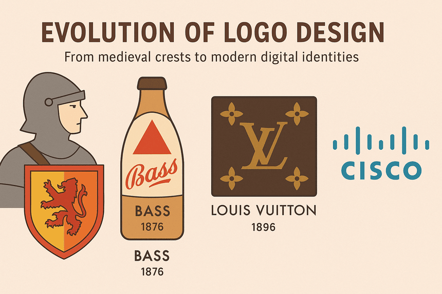
Logos started on the battlefield. Medieval knights painted crests on their shields so that friends and enemies could tell who was inside the armor, and families passed those crests down as proof of lineage. By the 19th century businesses had borrowed the idea. Bass Brewery’s red triangle, registered in 1876, became the UK’s first trademark, a plain scarlet shape that told drinkers they were getting the real ale and not an imitation. In the 20th century logos became a kind of corporate coat of arms, and brands like Coca-Cola and Ford turned their marks into shorthand for whole industries.
Counterfeiting drove one of the most famous designs. Georges Vuitton introduced the Louis Vuitton monogram in 1896 to make the company’s trunks harder to copy. The interlocking L and V, set among Japanese-inspired floral motifs, protected the brand and then became the thing people paid for, moving from steamer trunks to handbags without changing much at all.
Cisco’s logo, designed by Joe Finocchiaro and Jerry Kuyper, is a more recent example of a mark rooted in place. Its blue vertical stripes suggest an electromagnetic signal and the towers of the Golden Gate Bridge at the same time, tying a global networking company to San Francisco. Paul Rand once described a logo as “a flag, a signature, an escutcheon,” and the description still holds. Each of these marks started with a job to do, and the look followed from it.
What Color Does
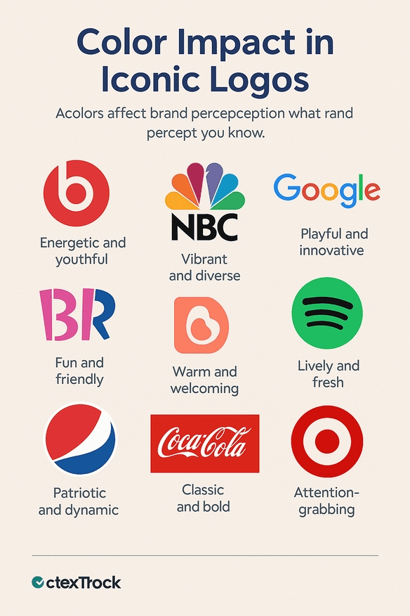
Color is usually the first thing people register about a logo and the last thing they forget. A widely cited figure, attributed to a 2020 study from the University of Loyola, puts the share of brand recognition that comes from color at 80%. Whatever the exact number, the examples back up the idea. McDonald’s golden arches use a warm yellow associated with cheerfulness and appetite. IBM’s blue stripes signal trust and reliability, which is exactly what a company selling to boardrooms wants to say.
A few more cases show how much work a palette can do:
- Beats by Dr. Dre: the red circle, designed by Ammunition Group, is loud on purpose. It was aimed at young listeners and it looks like it.
- NBC: the peacock, credited to John J. Graham and Herb Lubalin in 1956, was a way of showing off color television. Its six feathers stand for the network’s divisions, from news to entertainment to sports.
- Google: the palette is red, yellow and blue, then a green letter breaks the pattern. That small rule-break is the point. It makes the wordmark look playful next to the gray and navy of most tech companies.
- Baskin Robbins: the pink and blue B and R hide the number 31, one flavor for every day of the month.
- Airbnb: the soft coral Bélo, introduced in 2014, was meant to feel warm and communal. Its launch was overshadowed by people comparing it to anatomical sketches.
- Spotify: the green waveform stands out among streaming apps and is easy to spot on a crowded home screen.
- Pepsi: the red, white and blue globe has been redrawn many times, and in its recent forms the white band curves into something like a smile.
- Coca-Cola: the silver script on a red background has defined the brand for more than a century, and the red is as much a part of the trademark as the letters.
- Target: the red bullseye is about as direct as color and shape get. It asks for attention and then tells you the company aims to hit the mark.
The lesson is to pick colors for what they say, not for what is in fashion. A single well-chosen color, used consistently for decades, is worth more than a clever palette that changes every few years.
Drawing and Lettering
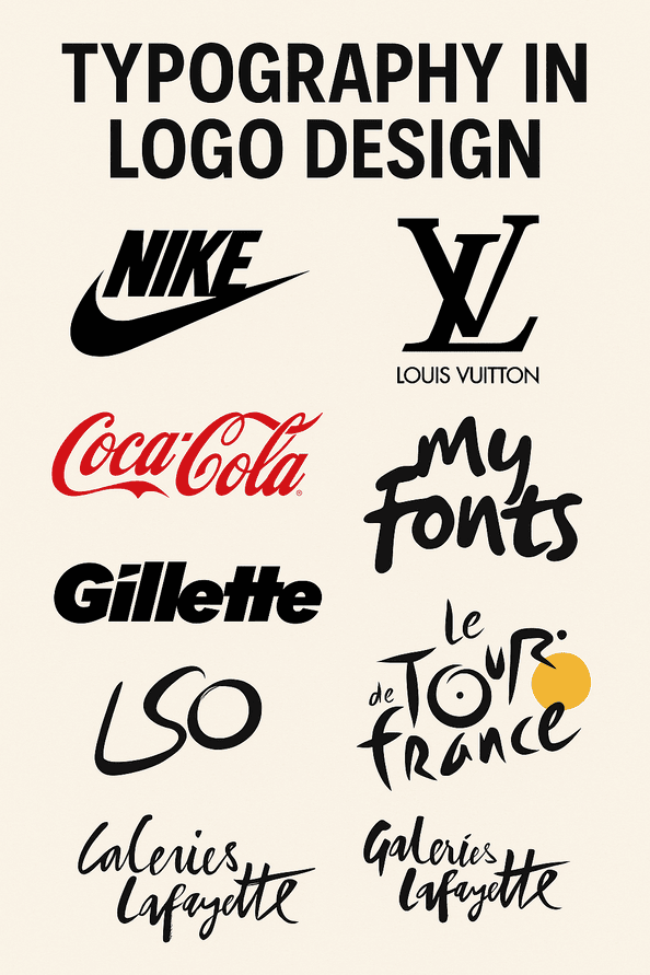
Some of the best-known marks are, at heart, good drawings. Carolyn Davidson designed the Nike swoosh in 1971 for a fee of $35. It is said to draw on the wings of Nike, the Greek goddess of victory, and in one curved stroke it suggests movement and effort. The Louis Vuitton monogram works differently. Its flowers come from Japanese design, and the mix of French initials and borrowed ornament gives it a cosmopolitan feel that has kept it in fashion.
Lettering is where many logos get their personality. Coca-Cola’s cursive script, in use since 1886, still reads like a handwritten label from another century, and that is part of its appeal. The My Fonts logo turns the word “My” into a hand reaching out, a neat image for a shop that wants to put a typeface in your hands. Gillette cuts its G and i at sharp angles, as if they had been sliced by one of its blades. The Tour de France turns the r in its name into a cyclist, so a single letter carries the speed of the race.
Some marks go further and build a picture out of the letters. The London Symphony Orchestra’s LSO script doubles as a conductor in motion, with the loops of the letters standing in for the sweep of a baton. Galeries Lafayette hides the Eiffel Tower in its f, which suits a department store that trades on being Parisian. In each case the type does two jobs at once, spelling the name and telling a small story, and that double duty is what makes it stick.
The Hidden Pictures
This is the part everyone comes for. Some of these are famous, some are obscure, and a few are easy to miss even after someone tells you they are there.
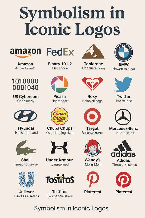
- Amazon: Tim Kent’s design has an arrow running from the A to the Z, a claim that the store sells everything, and the same arrow doubles as a smile.
- FedEx: Lindon Leader put an arrow in the white space between the E and the x. It suggests speed and precision, and it has become the standard example of negative space in logo design.
- Toblerone: a bear stands inside the Matterhorn, a reference to Bern, the “City of Bears,” and to the honey in the chocolate.
- BMW: the blue and white quarters come from the Bavarian flag, not from a spinning propeller, though the propeller story refuses to die.
- London Symphony Orchestra: the LSO initials form a conductor’s silhouette.
- Eighty 20: a grid of squares spells out 80 and 20 in binary, which suits an analytics firm.
- US Cyber Command: the gold ring of the seal carries an MD5 hash, a puzzle for the kind of people the agency wants to hire.
- Picasa: the camera shutter forms a little house, a play on “casa,” Spanish for home, as a home for your photos.
- Roxy: the heart is made of two Quiksilver logos, mirrored, for the parent brand’s line aimed at women.
- Twitter, before it became X: Simon Oxley’s bird stood for freedom and easy conversation in the platform’s early days.
- Hyundai: the slanted H is also two people shaking hands, a picture of trust between company and customer.
- Shell: the scallop shell has been in use since 1904 and carries old associations with pilgrimage and reliability.
- Lacoste: the crocodile comes from René Lacoste’s nickname, earned for his tenacity on the tennis court.
- Chupa Chups: Salvador Dalí designed the daisy, which hides a lollipop at its center.
- Mastercard: the overlapping circles form a simple Venn diagram, two worlds meeting in the middle.
- Mercedes-Benz: the three-pointed star stands for ambition on land, at sea and in the air.
- Target: the bullseye is the most literal mark on this list.
- Under Armour: the U and A lock together into one compact monogram.
- Wendy’s: the collar of Wendy’s blouse spells “Mom,” a quiet nod to home cooking.
- Adidas: the three stripes, staggered into a mountain, stand for the challenges athletes have to climb.
- Unilever: the U is built from small icons for the company’s products, from Dove soap to Ben & Jerry’s ice cream.
- Tostitos: the letters “tit” in the middle of the name form two people sharing chips and salsa.
- Pinterest: the P is shaped like a pushpin, which is what the site lets you do with ideas.
The best of these work in two stages. At a glance you get a clean mark. On the second or third look you get the joke. The weaker ones depend on the joke and look cluttered without it.
Modernism and Staying Power
Modernist design is built on taking things away, and Apple’s logo is the obvious example. Rob Janoff drew the bitten apple in 1977, and its clean outline and rainbow stripes, used until 1998, made it look nothing like the cluttered badges of other early computer companies. Adidas’ three stripes, rearranged into a mountain, have changed shape over the years without losing the idea behind them.
The Museum of London took a looser route. Its logo is a set of colored blobs tracing the outline of the city at different points in its history, so the mark itself shows change and continuity at once. Shell’s scallop, in use since 1904, makes the case from the other side: a simple shape, redrawn carefully over a century, has outlasted every trend it lived through. If a design only makes sense in the year it was made, it will need replacing soon. The goal is something that would have looked fine in 1925 and still looks fine now.
Logos as Markers of Their Time
Some logos end up standing for an era. Chanel’s interlocking double C dates from 1925 and carries the polish of Art Deco luxury, which is why it looks equally at home on a flapper dress and on a modern runway. Roxy’s heart, made from two Quiksilver logos, caught the 1990s surf scene and its growing number of women riders. Lacoste’s crocodile, introduced in 1933, became the badge of preppy dressing, from Ivy League campuses to country clubs.
The Newman logo reads the same upside down, a neat fit for the 1980s taste for versatile, multi-purpose clothing. Spotify’s waveform, launched in 2013, became a symbol of the streaming years, its green and its moving shape matching the shift of music onto phones. The pattern is that a logo picks up the mood of its moment, and the ones that last keep enough of that mood to feel authentic without becoming a period piece.
When Logos Cause Arguments
Logos can get brands into trouble. Louis Vuitton’s monogram has faced accusations of cultural appropriation over its Japanese-inspired motifs, a debate that shows how complicated borrowing across cultures can be. Airbnb’s Bélo was mocked within days of its 2014 launch for its resemblance to anatomical sketches, and the jokes spread faster than the official explanation about belonging.
The Schizophrenic logo, with two faces, one sad and one smiling, set off discussions about mental health. It was meant to raise awareness, but critics argued that it risked oversimplifying the illness. Even Nike’s swoosh took a hit during the sweatshop scandals of the 1990s, when the mark that stood for aspiration became a target for protesters. Controversy can deepen a logo’s place in culture, but it is not something to plan for. Testing a design with people from different backgrounds before launch is cheaper than apologizing afterward.
The Money Behind the Marks
A logo is also a financial asset. Apple’s bitten fruit, with the branding built around it, sat on top of a company whose stock rose from $7 in 1998 to over $400 by 2025. Nobody would credit the logo alone for that, but it is part of what made the products recognizable. LVMH, Louis Vuitton’s parent company, reached a €400 billion market value in 2023, and the monogram is its best-known face, a symbol people around the world read as luxury.
Beats by Dr. Dre is a cleaner case. Its red b, which looks like a head wearing headphones, was central to a brand that Apple bought for $3 billion in 2014. Interbrand’s 2019 study linked strong branding to a 23% boost in revenue. The precise figures are open to argument, but the direction is not. A well-made logo is closer to an investment than to an expense.
Changing Slowly
Consistency is what turns a mark into something people recognize without thinking. Starbucks’ siren has been redrawn several times since 1971, losing detail at each step but never losing the mermaid, so she reads instantly on a cup or on a billboard. Vaio’s logo, which combines a wave for analog and a 1 and 0 for digital, has stayed true to Sony’s technical roots through all the changes in the computers it appeared on.
Target’s bullseye has been the store’s mark since 1962, and shoppers connect the red circle with value without any help from the name. The Mercedes-Benz three-pointed star, introduced in 1909, has been refined many times but has never stopped being the star. These brands changed their logos in small steps, and none of the steps was big enough to make customers look twice.
What These Logos Teach
Five rules come out of these designs fairly clearly:
- Keep it simple. Apple’s apple is legible on a smartwatch and on the front of a store.
- Give it a story. Amazon’s arrow from A to Z says something about the business.
- Know who it is for. The Tostitos logo, with two people sharing a snack, speaks to people who eat chips with friends.
- Make it scale. Mastercard’s circles work on a plastic card, a phone screen and a shop window.
- Ignore trends. Shell’s scallop has lasted more than a century.
The British Blind Sport logo puts several of these together. It uses the Union Jack as the pupil of an eye, a design that is clever and immediately clear, and that fits a charity whose work is about inclusion.
Saying It Without Words
Good logos communicate before anyone reads them. The Swan and Mallard logo builds an ampersand out of a swan and a mallard, which suggests the care of a good restaurant before you see a menu. LG’s mark is a face, with the L as a nose and the G as a smile, and it makes a large electronics company look friendly.
The Mercedes-Benz three-pointed star projects confidence, a claim of engineering reach over land, sea and air. The Kölner Zoo logo is the most ambitious of the lot: inside the outline of an elephant it fits a giraffe, a rhino and Cologne Cathedral, so the logo shows the range of animals and the zoo’s civic pride in one shape. That is a lot to ask of a single drawing, and it works because each animal is drawn with the fewest lines possible.
On Screens and Shelves
Most logos now spend more time on screens than on signs. Nike’s #JustDoIt campaign, paired with the swoosh, lifts engagement by 30% according to a 2024 Sprout Social report. Pinterest’s pushpin P connects the digital boards on the site with the cork boards they imitate.
Spotify’s green waveform stands out among streaming apps and signals music without spelling it out. Twitter’s bird, before the change to X, spread across the internet because it was so simple and so easy to share. A logo that works on a shelf but turns to mush as an app icon is only half finished, so test both before you commit.
AI Tools and Human Judgment
AI tools such as Midjourney can now produce logo ideas in seconds. They are useful for getting options on the table, but the best ideas on this list came from people noticing things. Lindon Leader’s FedEx arrow is a case in point: it took a designer staring at letter spacing to see the arrow in the negative space. Picasa’s shutter-as-house depended on someone thinking about what the word “casa” meant for a photo app.
Salvador Dalí’s 1969 Chupa Chups daisy is the clearest example. A surrealist painter hid a lollipop inside a flower and produced one of the most recognizable candy logos in the world. It is hard to imagine a prompt that would have led there. Generators can brainstorm. The context, the humor and the sense of which idea is right still come from people.
One Logo, Many Products
For big companies a logo has to hold many products together. Unilever’s U is made of small icons for the things it makes, from Dove soap to Ben & Jerry’s ice cream, so the mark doubles as a map of the business. The Tostitos logo, with its two figures sharing chips and salsa, works on a bag in a supermarket and in a Super Bowl ad.
Under Armour’s interlocked U and A appear on clothes, shoes and fitness technology, and they look equally at home on all of them. Louis Vuitton’s monogram covers handbags, scarves and even dog collars. When you design a mark, try it on a T-shirt, a website and a delivery van before you decide it is finished. A logo that only works in one place will hold a brand back.
Look Twice
From the cathedral inside the Kölner Zoo elephant to the handshake in Hyundai’s H, these logos show how much can be packed into a small, simple shape. The hidden pictures are fun, but they are not what makes the logos last. What lasts is the discipline underneath: a clear shape, a color used the same way for decades, and a story that makes sense to the people who see it.
Next time a logo catches your eye, look at it a second time. There may be a bear, a smile or a line of code hiding in it.


