The Coca-Cola Logo: A Script That Barely Changed
A Logo That Was Written, Not Designed
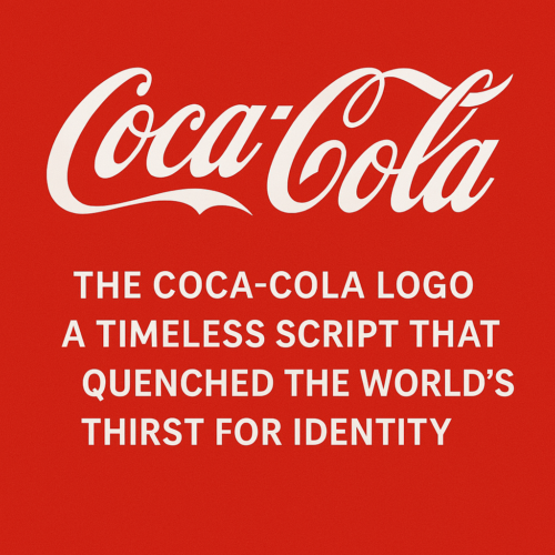
The Coca-Cola logo was written, not designed. In 1886 Frank Mason Robinson, the bookkeeper to the drink’s inventor, wrote the name out in the Spencerian handwriting taught in American schools, and that piece of penmanship is still on every can. It has been tidied, boxed, ribboned and once, briefly, replaced. But the script that started on a pharmacy counter in Atlanta has outlasted every trend in graphic design since, which makes it about the strongest argument there is against redesigning a logo just because it is old.
Logo fashions now change about as fast as social media trends, and new brands redraw their marks constantly. Coca-Cola has done the opposite. Its advantage has been consistency, and an emotional connection built over more than 130 years of advertising that always used the same lettering.
Frank Mason Robinson’s Script
In Atlanta in 1886, John Pemberton was working out the formula. His bookkeeper, Frank Mason Robinson, supplied the name and the look. Robinson suggested “Coca-Cola” because he thought the two Cs would look good in advertising, and he wrote it out in Spencerian script, the formal cursive then taught in American schools.
Spencerian handwriting carried associations of elegance, professionalism and trust. That mattered for a product launched into the unregulated world of nineteenth-century patent medicines, where looking respectable was half the battle. Graphic design was not yet a profession, but Robinson understood something designers still repeat: the lettering itself can carry the brand.
How the Logo Changed
Coca-Cola has mostly resisted change, but the logo has evolved quietly at a few key points.
Key Moments in the Logo’s History
| Year | Change | Description |
|---|---|---|
| 1887–1890s | Debut script | An ornate version with flourishes and descriptive lines such as “Delicious and Refreshing.” |
| 1941 | Refinement | The swirl under “Coca” was removed to simplify the script. |
| 1958 | Fishtail logo | The script was set inside a fishtail shape, Coca-Cola’s first true emblem. |
| 1969 | Arden Square | The white wave, or Dynamic Ribbon, was introduced beneath the script in a red square. |
| 1985 | New Coke | The classic script was briefly replaced by a modern sans-serif and widely rejected. |
| 2003–today | Digital refinements | Small adjustments for clarity on screens, with every major element kept. |
Many brands now swap templates every few months. Coca-Cola’s slow, deliberate changes over more than a century show what restraint can achieve.
Why It Works
Strip the logo down and four things are doing most of the work.
1. The Spencerian script
- Handwriting suggests authenticity and care, and the script feels elegant without being stiff.
- It builds trust quickly, which is why so many brands still try to imitate the look of a human hand.
2. Red and white
- Coca-Cola red is energetic and grabs attention anywhere in the world.
- Paired with white, it looks clean and fresh.
- It is so strongly owned that the color alone can bring the brand to mind.
3. The Dynamic Ribbon
- The white wave introduced in 1969 echoes soda flowing from a glass bottle.
- It is both decoration and a small piece of storytelling.
4. It scales
- The logo works on billboards, cans, social media and augmented reality ads.
- A script is a risky choice for a mark that has to work at small sizes, and Coca-Cola’s works because its letterforms are bold and familiar enough to read even when tiny.
Controversies and Mistakes
The logo has had a few bad moments.
New Coke, 1985
- The script was replaced with a geometric sans-serif.
- The backlash was immediate, and the original script was back within 77 days.
Cultural backlash, 2013
- A campaign using Gaelic script in Ireland drew accusations of appropriation.
- Coca-Cola apologized and said it had meant to celebrate Irish heritage.
Greenwashing accusations, 2020
- Greenpeace criticized Coca-Cola for using eco-friendly-looking logo variations while remaining one of the largest contributors to plastic waste.
The common thread is that logos do not exist in isolation. People read them in the context of everything the company does.
The Logo in Coca-Cola’s Best-Known Campaigns
The script has been at the center of several campaigns that defined their generations.
“Hilltop,” 1971
- “I’d Like to Buy the World a Coke” aired during the Vietnam War.
- The logo came to stand for unity and hope.
“Share a Coke,” 2011
- The script on the bottle was replaced with common first names.
- The personalization led to a 2% rise in U.S. sales, proof that even the biggest brands can benefit from customization.
“Real Magic,” 2020
- The logo was broken into abstract shapes to celebrate inclusion and diversity.
- It showed that the brand could flex a long way without losing recognition.
The Script in the Digital Age
Coca-Cola keeps showing that a brand can evolve without rebranding. A few examples:
AR and virtual spaces
- Coca-Cola has used animated 3D versions of the logo in virtual environments: liquid-looking scripts that ripple and glow.
Sustainability
- The 2023 “Universal Bottle” uses an etched logo instead of a printed label, reducing waste and ink.
Personalization
- Dynamic versions of the logo that change with the time of day, the viewer or the campaign, while keeping the core script.
AI logo platforms are now trying to offer similar flexibility, with dynamic templates and variations that adjust color to mood. Coca-Cola is a reminder that this only works if the core mark is stable.
Common Questions About the Coca-Cola Logo
Why hasn’t Coca-Cola changed its logo the way Pepsi has?
Because Coca-Cola is the market leader and does not need to reinvent itself. Pepsi, as the challenger, redesigns to stay noticed.
Is there a hidden message in the logo?
Some people see smiling mouths or open arms in the Cs. Coca-Cola has never confirmed it, but fans like the theory.
How much is the Coca-Cola logo worth?
It has no official price, but branding experts estimate it accounts for more than $50 billion of the company’s $97 billion-plus valuation.
Lessons for Your Own Logo
| Lesson | What it means | How to apply it |
|---|---|---|
| Timeless over trendy | Avoid fads and aim for an emotional connection. | Stick to classic letterforms and symbols that mean something. |
| Color is identity | Red means Coca-Cola; yellow means McDonald’s. | Choose one color you can own, and test how it reads to people. |
| Consistency matters | Repetition builds recognition. | Use the same logo everywhere, including YouTube, email and packaging. |
| Flexibility wins | One core identity, many forms. | Create a few variants (full, icon, single color) to cover different media. |
Tools for Getting Started
If you want to try these ideas on your own brand, plenty of tools can help with a first draft. Semplr is good for prompt-based logo creation, and Looka, Canva, LogoMakr, Hatchful by Shopify and Adobe Express cover everything from simple drag-and-drop templates to more customizable professional work. Whichever you use, treat the output as a starting point, and judge it against the four lessons above.
The Script That Became a Symbol
The Coca-Cola logo is a bookkeeper’s handwriting that has survived wars, cultural upheaval and several technological revolutions. Its one serious redesign, in 1985, was reversed in less than three months. That says less about the genius of the original drawing than about the value of time: a mark used consistently for long enough becomes impossible to replace.
While other brands race to redesign, Coca-Cola mostly stands still, and it keeps winning. Good branding has more to do with resonance than reinvention. When you work on your own logo, by hand or with software, it is worth asking one question:
Will this logo last a hundred years?
If the honest answer is yes, you are on the right track.
To start a logo of your own, try the AI-powered logo generator at semplr.com.
For another brand that has kept its identity over decades, see our breakdown of the McDonald’s logo evolution.


